Question 32
An ice cream shop manager recorded the maximum daily temperature and the total ice cream sales for 10 days. The information is shown on the scatter graph.
| Temperature (∘ ^\circ\,∘C) | Sales (£) |
|---|---|
| 10 | 100 |
| 12 | 140 |
| 15 | 210 |
| 18 | 250 |
| 20 | 300 |
| 22 | 330 |
| 25 | 410 |
| 28 | 460 |
| 30 | 520 |
| 32 | 580 |
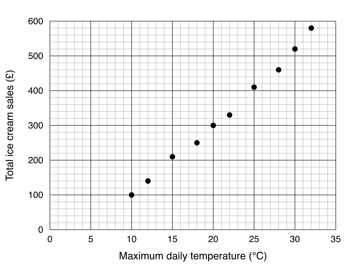
a.[1]
What type of correlation does the scatter graph show?
b.[2]
On another day, the total ice cream sales were £450. Estimate the maximum temperature on this day.
Scatter Graphs Questions
55 exam-style questions on Edexcel GCSE Maths Scatter Graphs. Each one has a worked solution and a mark scheme showing where the marks go.