Question 1
The scatter graph shows the daily maximum temperature (∘C^\circ\text{C}∘C) and the number of ice cream cones sold at a shop over 10 days.
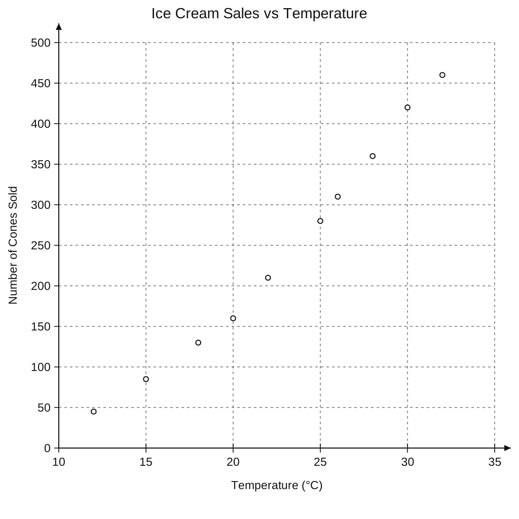
| Temperature (∘C^\circ\text{C}∘C) | Cones Sold |
|---|---|
| 12 | 45 |
| 15 | 85 |
| 18 | 130 |
| 20 | 160 |
| 22 | 210 |
| 25 | 280 |
| 26 | 310 |
| 28 | 360 |
| 30 | 420 |
| 32 | 460 |
a.[1]
What type of correlation does the scatter graph show?
b.[2]
On another day, the maximum temperature was 24∘C24^\circ\text{C}24∘C. Estimate the number of ice cream cones sold on this day.
Scatter Graphs Questions
55 exam-style questions on Edexcel GCSE Maths Scatter Graphs. Each one has a worked solution and a mark scheme showing where the marks go.