
GCSE Statistics Key Terminology Mistakes That Cost Marks
GCSE statistics key terminology mistakes explained: learn the precise words examiners expect for data, sampling, averages, graphs and correlation in exams.
A statistics answer can contain a correct calculation and still feel strangely incomplete. The number is there. The method is sound. Yet a mark disappears because the conclusion says “average” instead of “median”, calls a sample a population, or claims that correlation proves causation.
That is why GCSE statistics key terminology mistakes deserve deliberate revision. The quickest solution is to learn each term as a precise mathematical tool: identify what it means, recognise what it does not mean, and use it in the context of the question. This matters in GCSE Maths statistics for Edexcel, AQA, OCR and Eduqas, as well as in the separate GCSE Statistics qualification.
MathsGenie’s GCSE Statistics revision hub brings together lessons, questions, worksheets and past papers, but first you need to know what the exam language is actually asking you to say.
Your statistics terminology checklist
Before moving on from a written statistics question, check that you have:
- named the exact average or measure of spread;
- distinguished the population, sampling frame and sample;
- identified the data type correctly;
- described correlation by direction and, where appropriate, strength;
- avoided presenting association as proof of causation;
- used “estimate” when working from grouped data or a graph;
- interpreted the result using the variables and units in the question;
- compared like with like rather than listing unrelated facts.
These are small decisions. That is precisely why they are dangerous: under exam pressure, small words are easy to treat as interchangeable.
Population, sample and sampling frame are different things
A population is the complete group about which an investigation aims to draw conclusions. It does not necessarily mean everyone in a country. Depending on the context, it could be all pupils in a school, every component produced by a factory that day, or all journeys on a particular bus route.
A sample is the smaller group from which data is actually collected. Conclusions from that sample may then be used to infer something about the population.
A sampling frame is the list or source from which the sample can be selected. A school register might be a sampling frame for pupils currently enrolled at a school. Calling the register “the sample” confuses the selection tool with the people eventually selected.
A census collects data from every member of the population. It is not simply a very large sample.
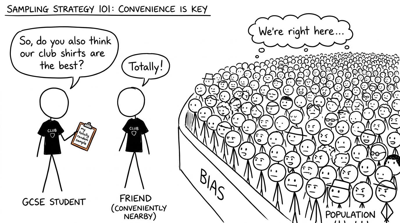 A student discovers that one nearby friend may not represent an entire population
Random does not mean chosen without much thought
In everyday speech, “random” can mean casual or unexpected. In statistics, a simple random sample requires every member of the population to have an equal chance of selection.
Choosing whoever is nearby is opportunity sampling, not random sampling. Asking only volunteers can introduce voluntary response bias. A large sample can still be biased if the selection method systematically excludes part of the population.
A representative sample reflects relevant characteristics of the population reasonably well. It is not automatically representative merely because it is random, although random selection can reduce selection bias.
In systematic sampling, selections are made at a regular interval, normally after an appropriate starting position has been chosen. In stratified sampling, the sample contains groups in proportion to their presence in the population. The stratified allocation for a group is based on:
group sample size=group populationtotal population×total sample size\text{group sample size}=\frac{\text{group population}}{\text{total population}}\times\text{total sample size}group sample size=total populationgroup population×total sample sizeThe key word is proportion. Simply including somebody from each group does not necessarily create a stratified sample.
Data types that students blur together
Statistics begins with the kind of data being collected. Using the wrong description can lead to the wrong diagram or method.
Qualitative data, also called categorical data, records qualities or categories. Examples include travel method or favourite subject. Quantitative data is numerical and records counts or measurements.
Within quantitative data:
- discrete data takes separate, countable values, such as the number of siblings;
- continuous data can take any value within an interval, such as mass, time or length.
A whole-number-looking result is not automatically discrete. A recorded time may have been rounded to the nearest second, but time itself remains continuous.
Primary data is collected first-hand for the investigation. Secondary data was collected previously by somebody else or for another purpose. The distinction concerns who originally collected it and why, not whether it appears online or on paper.
Bivariate data contains paired observations for two variables. Each point on a scatter graph represents one pair. Two separate unpaired lists are not automatically bivariate data.
Mean, median, mode and modal class
The word average is often used loosely, but mean, median and mode describe different features.
- The mean uses every value and is calculated by dividing the total by the number of values.
- The median is the middle value after the data has been placed in order.
- The mode is the individual value occurring most frequently.
- The modal class is the class interval with the greatest frequency.
A modal class does not reveal the exact mode because the individual values inside that interval are unknown. Likewise, a mean calculated from grouped data is an estimate, since class midpoints stand in for unknown values:
estimated mean=∑(class midpoint×frequency)∑frequency\text{estimated mean}=\frac{\sum(\text{class midpoint}\times\text{frequency})}{\sum \text{frequency}}estimated mean=∑frequency∑(class midpoint×frequency)Calling this an exact mean overstates what the data tells you. The averages from frequency tables revision guide develops the distinction between exact and grouped information.
An outlier is an unusually high or low observation relative to the wider distribution. Avoid calling every maximum value an outlier. Whether it is unusual depends on the rest of the data or on a rule supplied by the question.
Range and interquartile range measure spread
The range is not the largest value. It is the difference between the largest and smallest values:
range=maximum−minimum\text{range}=\text{maximum}-\text{minimum}range=maximum−minimumThe interquartile range, or IQR, measures the spread of the middle half of the ordered data:
IQR=Q3−Q1\text{IQR}=Q_3-Q_1IQR=Q3−Q1A smaller range or IQR suggests less variation. In a suitable context, that may be described as greater consistency. It does not mean the values are lower, and it says nothing by itself about the mean or median.
Cumulative frequency means a running total, not the frequency in one class. On a cumulative frequency graph, quartiles and the median are usually estimates because they are read from a curve. Revise this language alongside cumulative frequency graphs and box plots.
Histogram, bar chart and frequency density
A bar chart displays separate categories or discrete values. A histogram represents grouped continuous data, and its bars touch because the class intervals form a continuous scale.
The most costly terminology mistake is saying that histogram height is frequency. When class widths differ, area represents frequency and height represents frequency density:
frequency density=frequencyclass width\text{frequency density}=\frac{\text{frequency}}{\text{class width}}frequency density=class widthfrequencyTherefore:
frequency=class width×frequency density\text{frequency}=\text{class width}\times\text{frequency density}frequency=class width×frequency densityA tall, narrow histogram bar can represent a smaller frequency than a shorter, wider one. The GCSE histograms revision guide is useful when this distinction still feels counter-intuitive.
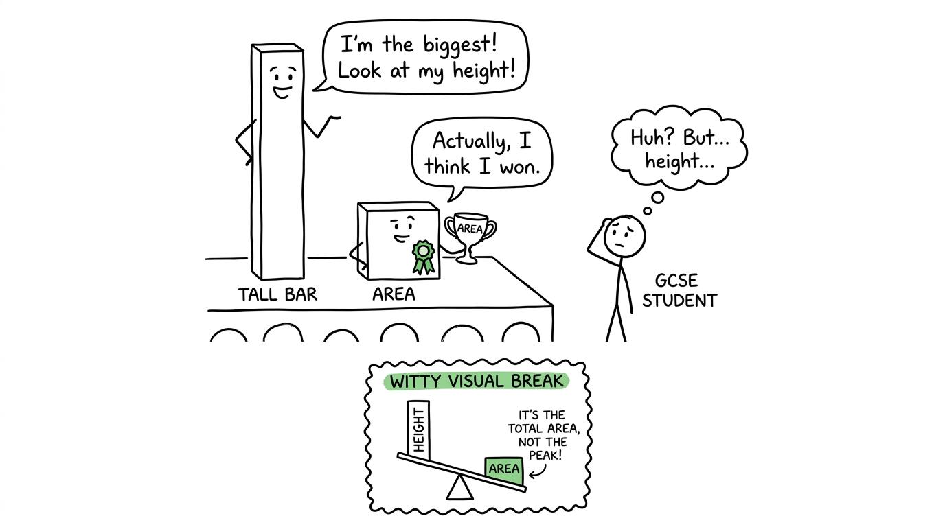 Two histogram bars argue about whether height or area deserves the trophy
Correlation is not causation
A correlation is an association between two variables. Positive correlation means one variable tends to increase as the other increases. Negative correlation means one tends to decrease as the other increases. No correlation means there is no clear association of the relevant kind.
“Positive” does not mean good, and “negative” does not mean bad. These words describe direction.
The strength describes how closely points follow the overall pattern. When the question provides a scatter graph, use language such as strong positive correlation, weak negative correlation or no correlation only when the pattern supports it.
Causation is a stronger claim: changing one variable produces a change in another. A scatter graph alone cannot normally establish that. Other variables may influence both quantities, or the apparent relationship may have another explanation.
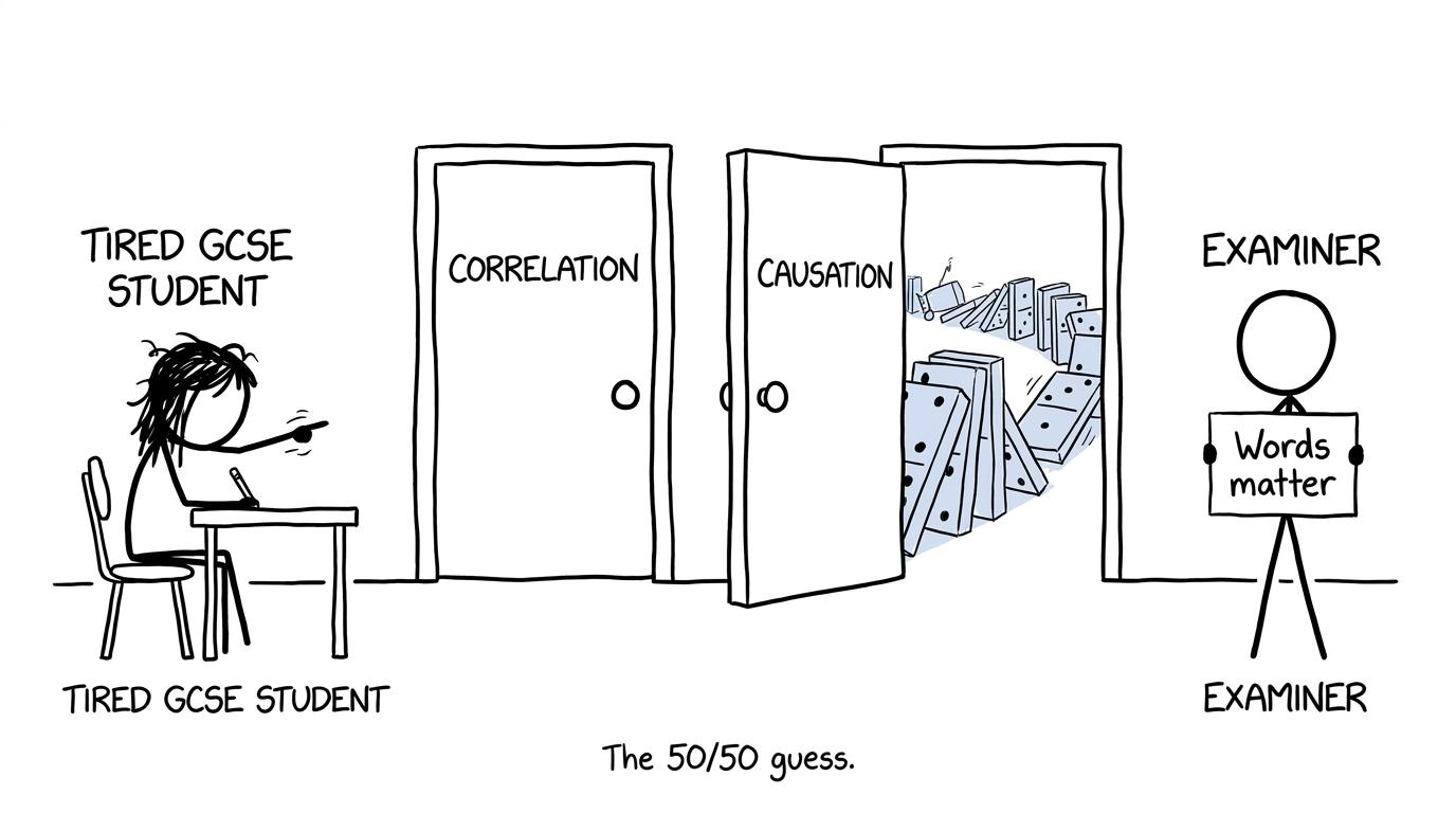 Correlation and causation appear as two very different exam doors
A line of best fit summarises the trend. It is not a dot-to-dot line and does not need to pass through every point. An interpolation predicts within the observed data range. An extrapolation predicts beyond it, where the existing trend may no longer continue. Extrapolated predictions are therefore generally less dependable.
How to compare distributions without wasting words
A complete comparison normally needs a measure of centre and a measure of spread, interpreted in context. Compare medians with medians or means with means. Then compare IQRs, ranges or another appropriate measure of spread.
A statement such as “Group A has a higher median” is a numerical observation. Improve it by explaining what a higher typical value means in the situation. Similarly, “Group A has a lower IQR” should be connected to reduced variation or greater consistency.
Do not say that one distribution is “better” unless the context establishes what better means. A shorter completion time may be preferable, while a higher test mark may be preferable. Statistics cannot supply that judgement without context.
For a wider map of what appears at each tier, use the GCSE Maths topics by exam board and tier guide.
Common GCSE statistics terminology mistakes
These short substitutions can protect marks:
| Risky wording | More precise wording |
|---|---|
| “The average is higher” | Name the mean, median or mode. |
| “The range is the highest value” | The range is maximum−minimum\text{maximum}-\text{minimum}maximum−minimum. |
| “The middle group is the median” | For grouped data, the median is estimated from the relevant class or graph. |
| “This proves one variable causes the other” | The data shows association, not necessarily causation. |
| “The sample is everyone being investigated” | That is the population; the sample is the selected subset. |
| “The histogram height is the frequency” | Bar area represents frequency when frequency density is used. |
| “The graph gives the exact quartile” | A value read from a drawn curve is normally an estimate. |
| “The results are reliable because the sample is large” | Sample size can help reliability, but selection bias may remain. |
Also watch the words valid and reliable. A conclusion is valid when it is supported by suitable evidence and reasoning. Reliability concerns consistency or the likelihood of similar findings under repetition. Repeating a badly biased method can produce consistently misleading evidence.
Turn vocabulary into marks
Do not revise terminology by reading a glossary repeatedly. Test it inside questions. After each statistics answer, underline the noun doing the mathematical work: population, median, IQR, estimate, correlation or extrapolation. Then use the mark scheme to check whether your wording made the intended claim.
Start with the Edexcel GCSE Statistics revision area or the broader statistics hub for your course. Use revision lessons to repair definitions, practice questions and mini tests to make the language automatic, and past papers to practise choosing terms under time pressure. Near the exam, GCSE predicted papers can add fresh questions, while mark schemes and video solutions show how a complete response is communicated.
Add recurring vocabulary errors to your MathsGenie revision planner. A missing word may look like a tiny problem, but tiny problems repeated across a paper become lost grades. Learn the distinctions, practise them in context, and make every correct piece of statistical thinking visible to the examiner.