Histograms
Teach Genie
Review Histograms by teaching Genie
Teach it back in your own words, spot gaps, and remember it better.

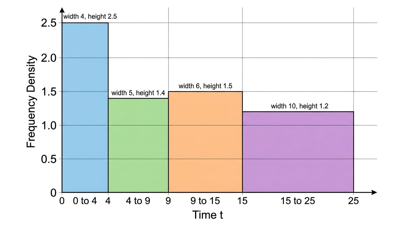 A histogram is used for grouped continuous data such as time, length, or mass. Unlike an ordinary bar chart, the class intervals can have different widths, so the width of each bar matters.
In a histogram, frequency is shown by the area of a bar, not by height alone. That is why the vertical axis is usually frequency density rather than frequency.
The bars touch because the intervals join up with no gaps. For example, 0≤t<50 \le t < 50≤t<5 includes 0 up to but not including 5, so a value of exactly 5 goes in the next class.
Question 1
3 marksThe table shows information about the age of 80 teachers.
| Age (years) | Frequency |
|---|---|
| 20<a≤3020 < a \leq 3020<a≤30 | 20 |
| 30<a≤3530 < a \leq 3530<a≤35 | 22 |
| 35<a≤4035 < a \leq 4035<a≤40 | 16 |
| 40<a≤5040 < a \leq 5040<a≤50 | 13 |
| 50<a≤6550 < a \leq 6550<a≤65 | 9 |
In a histogram, what does the area of a bar represent?
Histograms Revision Guide
Revision notes for Edexcel GCSE Maths Histograms: explanations and worked examples.