
GCSE Statistics Examiner Reports: What They Reveal
GCSE statistics examiner reports reveal recurring mistakes in graphs, sampling and interpretation. Learn how to turn examiner feedback into smarter revision.
A statistics answer can contain the right calculation and still lose marks. That is one of the most useful lessons hidden inside GCSE statistics examiner reports. Examiners repeatedly draw attention not only to what students know, but to whether they select an appropriate method, show enough working and interpret their result in the context of the question.
The practical message is simple: revise the decisions around the calculation as carefully as the calculation itself. Know why a sample may be biased, what a graph actually demonstrates and whether a value is exact or estimated. Examiner reports vary by board and examination series, but their recurring themes provide a valuable map of where marks tend to escape.
Start with the GCSE Statistics revision hub to find resources for your exam board, then use the lessons below to shape how you practise.
What examiner reports are really telling you
An examiner report is not an unofficial prediction of the next paper. It is a review of how students responded to a completed examination. It normally discusses questions that were handled well, approaches that caused difficulty and misunderstandings visible across many scripts.
That makes it different from a mark scheme. A mark scheme explains what could earn marks on a particular question. An examiner report explains how students actually approached that question and where their reasoning broke down.
Read together, the two documents answer three useful questions:
- What knowledge did the question test?
- What evidence did the mark scheme require?
- What stopped students from providing that evidence?
Although wording and assessment structures differ between Edexcel, AQA and other boards, similar statistical weaknesses also appear in reports covering statistics questions within GCSE Maths specifications, including OCR and Eduqas. Always check the documents for your own qualification, tier and examination series rather than assuming that every board uses identical rules.
A quick examiner-report revision checklist
Use this checklist when reviewing a topic or completed paper:
- Can I choose the correct statistical technique without being prompted?
- Can I explain an answer using the context and data?
- Do I distinguish correlation from causation?
- Can I identify bias and suggest a practical improvement?
- Are graph scales, labels and plotted values accurate?
- Do I show substitutions and intermediate calculations?
- Do I recognise when grouped data produce estimates?
- Can I compare both the centre and spread of two distributions?
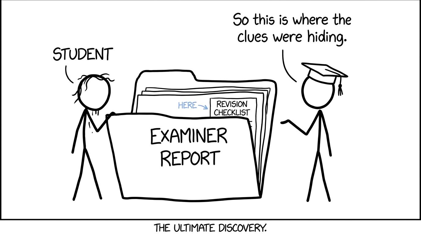 A student discovers that an examiner report contains useful revision clues
Interpretation is often harder than calculation
Many students feel safest when a statistics question contains a familiar formula. The more difficult part often arrives in the sentence afterwards: interpret, compare, criticise or explain.
A numerical answer is not automatically a statistical conclusion. If you compare two distributions, for instance, a complete response will usually need an appropriate measure of location and an appropriate measure of spread. The median can describe a typical value, while the interquartile range describes the spread of the middle half:
IQR=Q3−Q1\mathrm{IQR}=Q_3-Q_1IQR=Q3−Q1But stating that one median is larger is only the beginning. The comparison should say what that difference means for the people, objects or measurements in the question. Similarly, a smaller interquartile range suggests greater consistency, but the word “consistent” must refer to the relevant variable.
This is why vague statements such as “group A is better” are weak. Better in what sense? A higher typical result? Less variation? Fewer unusually low observations? Statistics rewards precise claims supported by evidence.
The box plots revision guide is useful for practising this connection between numerical features and written comparisons.
Sampling answers must be practical, not generic
Sampling questions reveal whether a student can think beyond a definition. Knowing that a random sample reduces selection bias is helpful, but exam questions often require you to judge a method in a particular setting.
Examiner feedback commonly distinguishes between a general criticism and a contextual one. “The sample is biased” does not identify the source of the problem. A stronger answer identifies who is under-represented, who had a greater chance of selection or why the time and location of data collection could distort the outcome.
When evaluating a survey or investigation, ask:
- What is the target population?
- Is the sampling frame appropriate and complete?
- Does every relevant member have a fair chance of selection?
- Could non-response affect the findings?
- Is the question leading, ambiguous or too personal?
- Is the sample large and representative enough for the proposed conclusion?
A larger sample can reduce sampling variability, but size alone does not repair a biased method. Surveying many people from the wrong population can produce a very precise answer to the wrong question.
Graphs are judged as statistical communication
Graph questions can look like straightforward drawing tasks. Examiner comments and mark schemes show why that assumption is risky. A graph communicates only if its scale, labels, plotting and chosen representation are appropriate.
For cumulative frequency graphs, students need to use cumulative totals and plot them against the appropriate class boundaries. The curve should not decrease because a running total cannot become smaller. Quartiles are then estimated at positions related to the total frequency nnn:
n4,n2,3n4\frac{n}{4},\qquad \frac{n}{2},\qquad \frac{3n}{4}4n,2n,43nHistograms create a different difficulty. Frequency is represented by area, not simply by bar height. For unequal class widths, the relevant relationship is:
frequency density=frequencyclass width\text{frequency density}=\frac{\text{frequency}}{\text{class width}}frequency density=class widthfrequencyStudents who treat a histogram as an ordinary bar chart can produce a neat diagram that communicates the wrong frequencies.
Other avoidable losses include missing axis labels, uneven scales, inaccurate plots, gaps where bars should touch and lines of best fit distorted by joining points. Accuracy matters because the diagram is part of the statistical argument, not decoration.
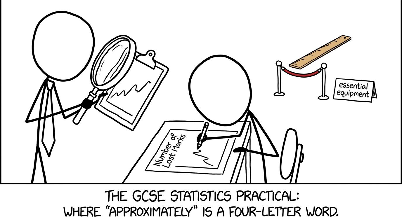 An examiner inspects a graph while the ruler waits behind a velvet rope
Correlation does not prove causation
Scatter diagrams invite a tempting shortcut: two variables move together, so one must cause the other. Examiner reports regularly warn against conclusions that go beyond the evidence.
Correlation describes an association. It may be positive, negative or absent. It does not, by itself, establish a causal relationship. Another variable may influence both measurements, the direction of influence may be unclear, or the pattern may be coincidental.
Interpolation and extrapolation also need different levels of caution. Estimating within the range of observed data is generally more defensible than extending a trend beyond that range. When extrapolating, the existing relationship may not continue.
A good revision habit is to challenge every conclusion with two questions: “What does the evidence support?” and “What am I merely assuming?” That pause prevents many overconfident answers.
Estimates and accuracy need explicit recognition
Grouped data do not reveal every original value. Consequently, a mean calculated from class midpoints is an estimate:
estimated mean=∑fx∑f\text{estimated mean}=\frac{\sum fx}{\sum f}estimated mean=∑f∑fxHere, xxx represents a class midpoint rather than a known individual value. Writing an answer as though it were exact overlooks an important limitation of the data.
The same principle applies when reading a value from a cumulative frequency curve or line of best fit. The graph and plotting accuracy limit the precision of the result. Sensible answers acknowledge estimation and avoid reporting an unjustified number of decimal places.
This is a broader statistical lesson: precision in a calculator display is not the same as accuracy in the evidence.
Showing working protects method marks
A calculator can produce an answer without revealing whether the correct method was used. That is dangerous when a question awards marks for selecting a process, substituting values or reaching an intermediate result.
Write down the formula or relationship you are using, substitute clearly and retain enough unrounded figures until the final step. If the final answer is incorrect, visible working may still demonstrate valid progress. An unexplained calculator value cannot do that.
Use the Edexcel GCSE Statistics resources to combine topic questions with worksheets, papers and mark schemes. If you are preparing for statistics content within GCSE Maths rather than the separate qualification, choose your board through the GCSE Maths revision hub.
Common mistakes highlighted by examiner feedback
The recurring mistakes are usually small enough to fix, but expensive when repeated across a paper:
- Answering without context: Giving a correct numerical comparison without mentioning the variable or groups involved.
- Using imprecise language: Calling a result “better” without identifying whether its centre, spread or another feature supports that claim.
- Claiming causation: Treating correlation as proof that one variable causes the other.
- Giving generic sampling criticism: Writing “biased” or “not representative” without explaining why.
- Ignoring class width: Using frequency as histogram height when intervals have unequal widths.
- Plotting the wrong values: Using class midpoints instead of upper class boundaries on a cumulative frequency graph.
- Treating estimates as exact: Forgetting that grouped data, graph readings and lines of best fit produce estimates.
- Premature rounding: Rounding intermediate values and introducing avoidable error.
- Hiding the method: Entering everything into a calculator and recording only the final display.
- Misreading the command word: Calculating when asked to criticise, or describing when asked to compare.
Do not turn this list into something merely to memorise. Turn each item into an action you can see on the page: label the axes, write “estimate”, name the source of bias and connect comparisons to the context.
How to turn reports into smarter revision
The most effective use of an examiner report happens after a timed paper. Complete a suitable paper, mark it strictly, then use the report to understand why common answers failed. MathsGenie’s guide to using GCSE past papers properly explains this paper, mark, fix, and retest cycle.
Create an error log with four short entries for every lost mark:
- the statistical topic;
- what you wrote or omitted;
- what the mark scheme required;
- the rule you will follow next time.
Separate knowledge gaps from communication errors. If you cannot calculate frequency density, return to a revision lesson. If you calculated it correctly but drew an inaccurate graph, practise presentation and equipment use. If the mathematics was correct but the conclusion was vague, practise complete sentences using data and context.
Then retest the exact weakness. A new full paper may hide whether you have fixed it. A focused set of practice questions or mini test gives faster feedback.
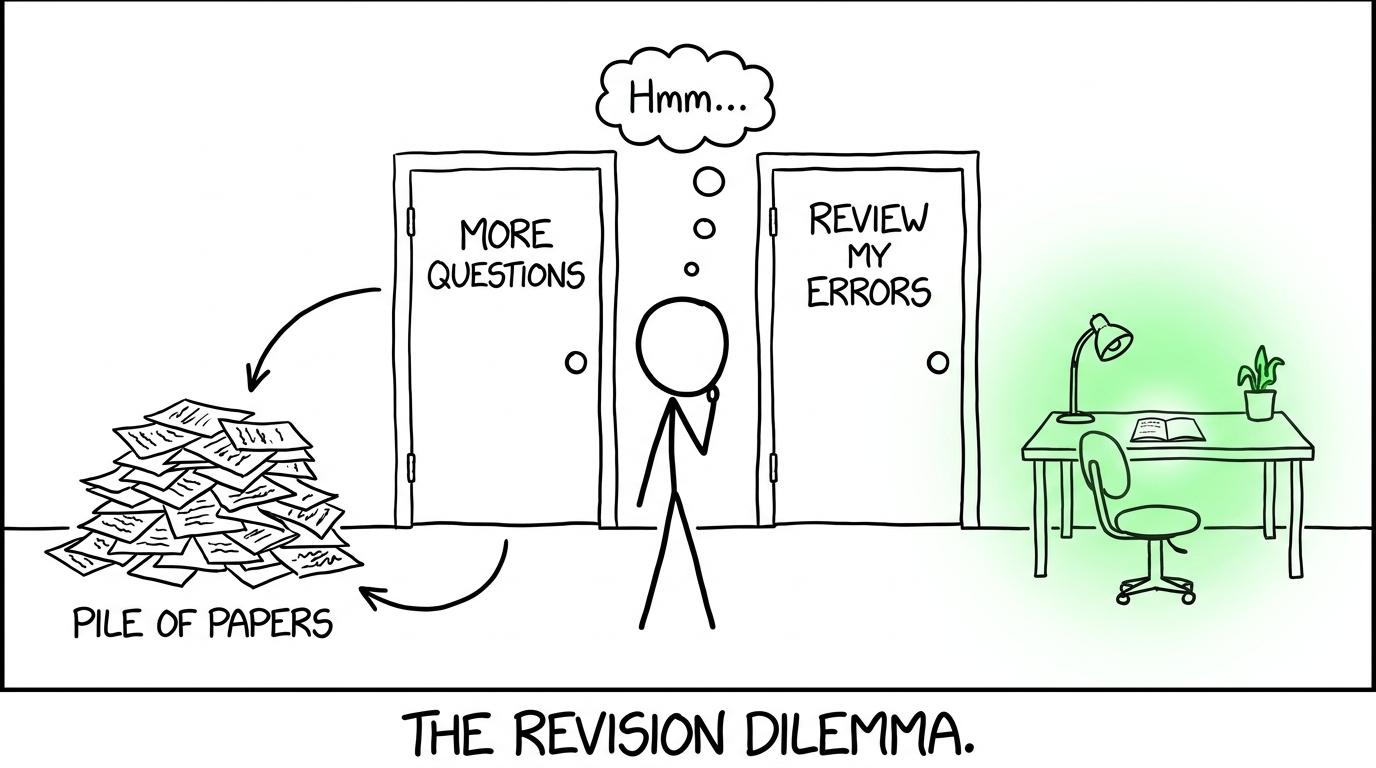 A student chooses error review instead of walking around another loop of untouched papers
Read reports as patterns, not predictions
An examiner report describes one examination series. It cannot guarantee which topics will appear next or how a future question will be phrased. Its real value is more durable: it exposes habits that remain important whenever statistics is assessed.
Use past papers for authentic questions, reports for diagnostic commentary and mark schemes for evidence about how marks are awarded. Near the examination, GCSE predicted papers can provide an unfamiliar rehearsal, but they should supplement rather than replace complete specification coverage.
A structured schedule also helps you revisit corrected weaknesses instead of abandoning them after one session. The GCSE one-month revision plan offers a practical framework that can be adapted around your examination dates and school commitments.
Make examiner insight part of your next paper
The quiet lesson in GCSE statistics examiner reports is that marks are often lost between knowing and communicating. Students may know the formula but choose it poorly, see the trend but overstate its meaning, or reach a sensible conclusion without supporting it from the data.
Those are trainable weaknesses. Choose the correct MathsGenie revision page for your board and tier, work through a focused lesson, complete practice questions and check every answer against the mark scheme. Then move to past papers, mini tests and predicted papers, using video solutions where available to repair any method you could not complete.
Do not simply complete more questions. Let each marked question change what you do next. That is how examiner feedback becomes smarter revision, and how small improvements become marks on the real paper.