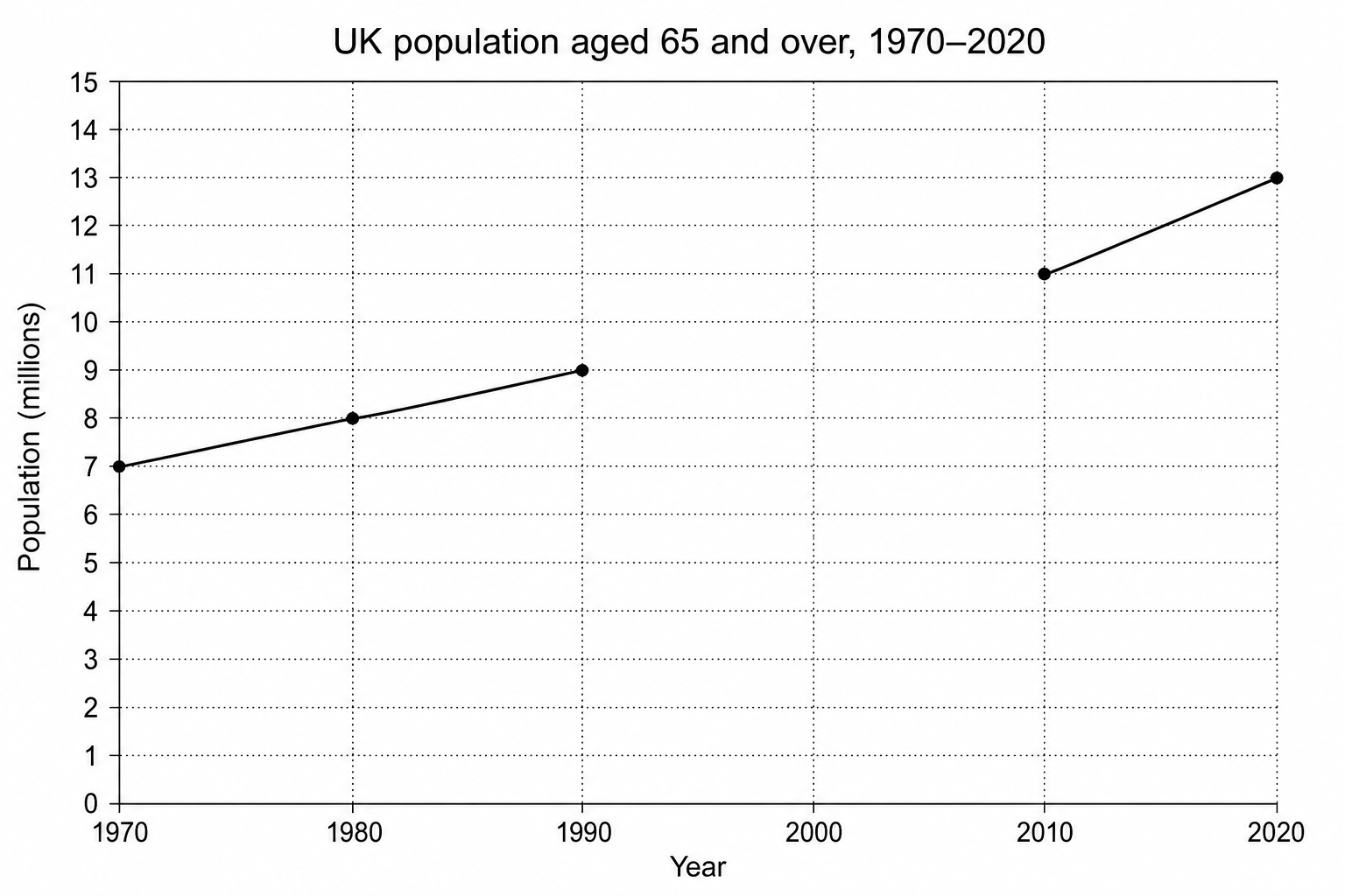
The line graph below shows changes in the UK's elderly population (aged 65 and over) from 1970 to 2020.
Use the data from the table below to complete the line graph [1].
Draw on this