Question 14
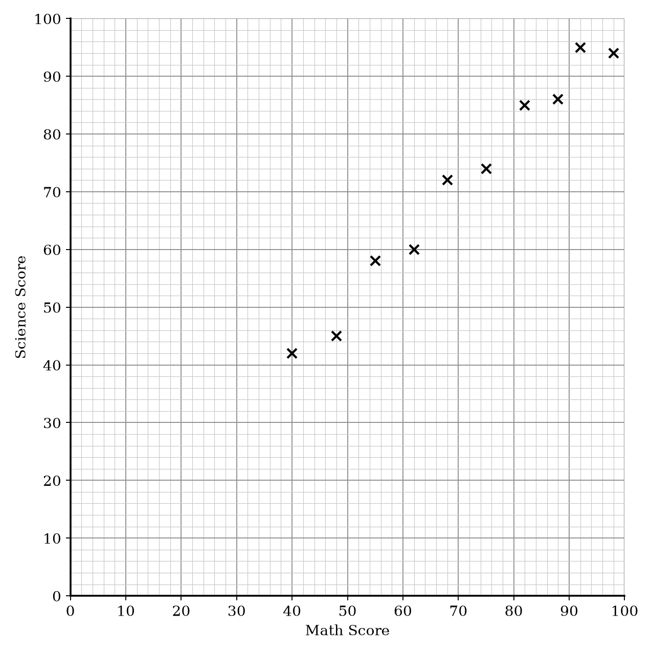
Mrs. Smith recorded the Math test scores and Science test scores of 10 students. The information is shown on the scatter graph.
| Math Score | Science Score |
|---|---|
| 40 | 42 |
| 48 | 45 |
| 55 | 58 |
| 62 | 60 |
| 68 | 72 |
| 75 | 74 |
| 82 | 85 |
| 88 | 86 |
| 92 | 95 |
| 98 | 94 |
a.[1]
What type of correlation does the scatter graph show?
b.[2]
Another student scored 68 in their Science test. Estimate the score this student achieved in their Math test.
Scatter Graphs Questions
54 exam-style questions on AQA GCSE Maths Scatter Graphs. Each one has a worked solution and a mark scheme showing where the marks go.