Question 17
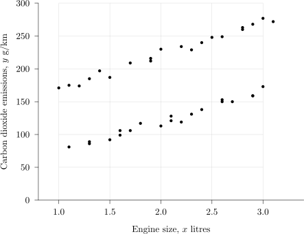
A researcher records the engine size, x x\,x litres, and the carbon dioxide emissions, y y\,y g/km, of each car in a random sample of 40 cars.
The scatter diagram below shows her data.
The product moment correlation coefficient for all 40 cars is 0.51.
a.[1]
The researcher's scatter diagram contains two distinct sections. State what feature of the diagram shows this.
b.[1]
Suggest what distinguishes the two sections.
c.[2]
Explain why fitting a single regression line of y y\,y on x x\,x to all 40 cars would be misleading.
d.[2]
The researcher separates the data by fuel type and finds that the correlation coefficient within each fuel type is greater than 0.51. Explain why this is consistent with the scatter diagram.
2.2 L: Data presentation and interpretation Questions
244 exam-style questions on AQA A Level Maths 2.2 L: Data presentation and interpretation, covering 2.2.1 Single-variable data diagrams, 2.2.2 Scatter diagrams and correlation, 2.2.3 Central tendency, variation and standard deviation, 2.2.4 Outliers and cleaning data, and 2.2 L: Data presentation and interpretation. Each one has a worked solution and a mark scheme showing where the marks go.