Question 13
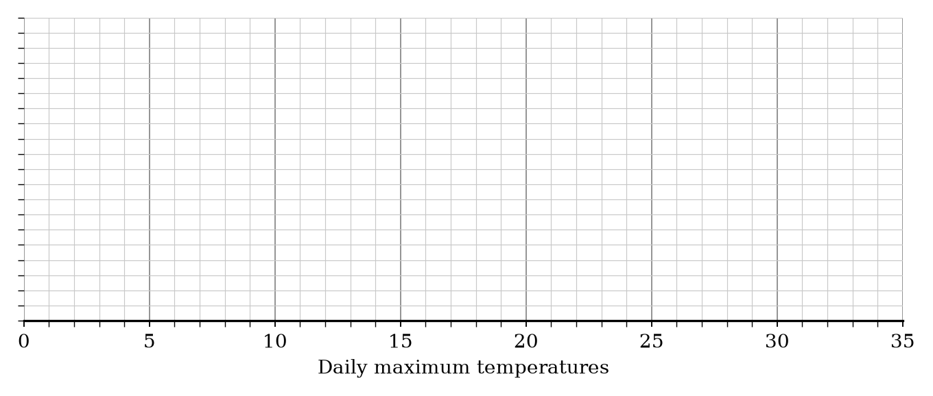
The table shows information about the daily maximum temperatures, in ∘C^{\circ}\text{C}∘C, recorded in City X over one month.
| Inter Quartile Range | Minimum | Median | Upper Quartile | Maximum |
|---|---|---|---|---|
| 8 | 10 | 18 | 22 | 30 |
a.[2]
Draw a box plot for the temperatures in City X.
b.[2]
The box plot below shows the distribution of daily maximum temperatures recorded in City Y during the same month.
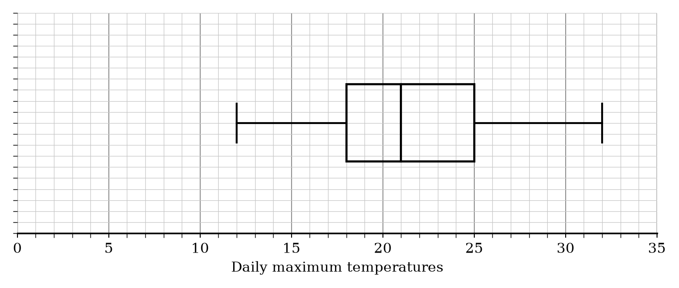
Compare the distribution of temperatures in City X and City Y.
Box Plots Questions
27 exam-style questions on OCR GCSE Maths Box Plots. Each one has a worked solution and a mark scheme showing where the marks go.