Question 32
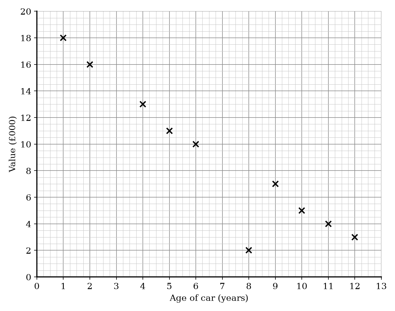
The age of 10 different cars and their market values are recorded. The scatter graph shows this information.
| Age of car (years) | Value (£000) |
|---|---|
| 1 | 18 |
| 2 | 16 |
| 4 | 13 |
| 5 | 11 |
| 6 | 10 |
| 8 | 2 |
| 9 | 7 |
| 10 | 5 |
| 11 | 4 |
| 12 | 3 |
a.[1]
What type of correlation does the scatter graph show?
b.[1]
One of the points is an outlier. Write down the coordinates for this point.
c.[2]
Another car is 7 years old. Estimate the value of this car.
Scatter Graphs Questions
54 exam-style questions on OCR GCSE Maths Scatter Graphs. Each one has a worked solution and a mark scheme showing where the marks go.