Question 48
The average daytime temperature for 10 days is recorded. A shop also records its ice cream sales for each of the 10 days. The scatter graph shows this information.
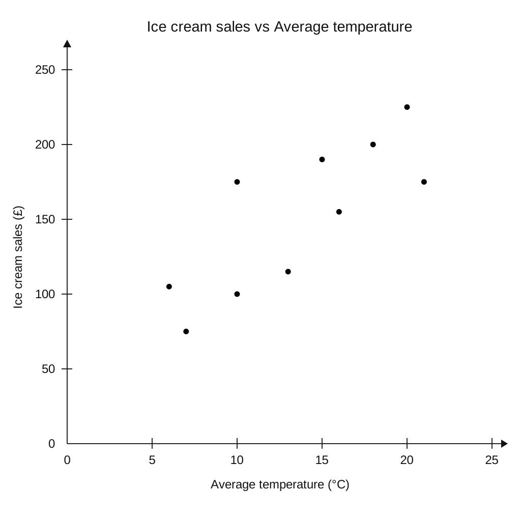
| Average temperature (°C) | Ice cream sales (£) |
|---|---|
| 6 | 105 |
| 7 | 75 |
| 10 | 100 |
| 10 | 175 |
| 13 | 115 |
| 15 | 190 |
| 16 | 155 |
| 18 | 200 |
| 20 | 225 |
| 21 | 175 |
a.[1]
What type of correlation does the scatter graph show?
b.[2]
On the 11th day the temperature was 12°. Estimate the ice cream sales on the 11th day.
c.[1]
The shop's manager wants to use the scatter graph to predict the ice cream sales for a day with an average temperature of 2°. Comment on the reliability of this prediction.
Scatter Graphs Questions
55 exam-style questions on CCEA GCSE Maths Scatter Graphs. Each one has a worked solution and a mark scheme showing where the marks go.