
What you'll learn
- How to read graphs and charts accurately: title, axes, units, scale and trends.
- How to interpret economic data such as unemployment figures, exports and imports.
- How to use numbers to support a decision, not just describe them.
- How to avoid common data traps, such as confusing percentage points with percentages.
Why quantitative data matters
Economics is not just about opinions. You need to use evidence to support your reasoning.
Quantitative data
Quantitative data means numerical information, such as prices, unemployment rates, export values, inflation rates or GDP figures.
Quantitative data helps consumers, producers and governments make better decisions. For example, a government might use unemployment data to decide whether to fund training schemes, while a business might use export figures to judge whether overseas demand is growing.
Data plus reasoning
A strong economics answer does not just quote a number. It explains what the number shows, why it matters, and how it supports a decision or judgement.
Reading graphs and charts
A graph or chart presents data visually. Before interpreting it, slow down and check the basics.
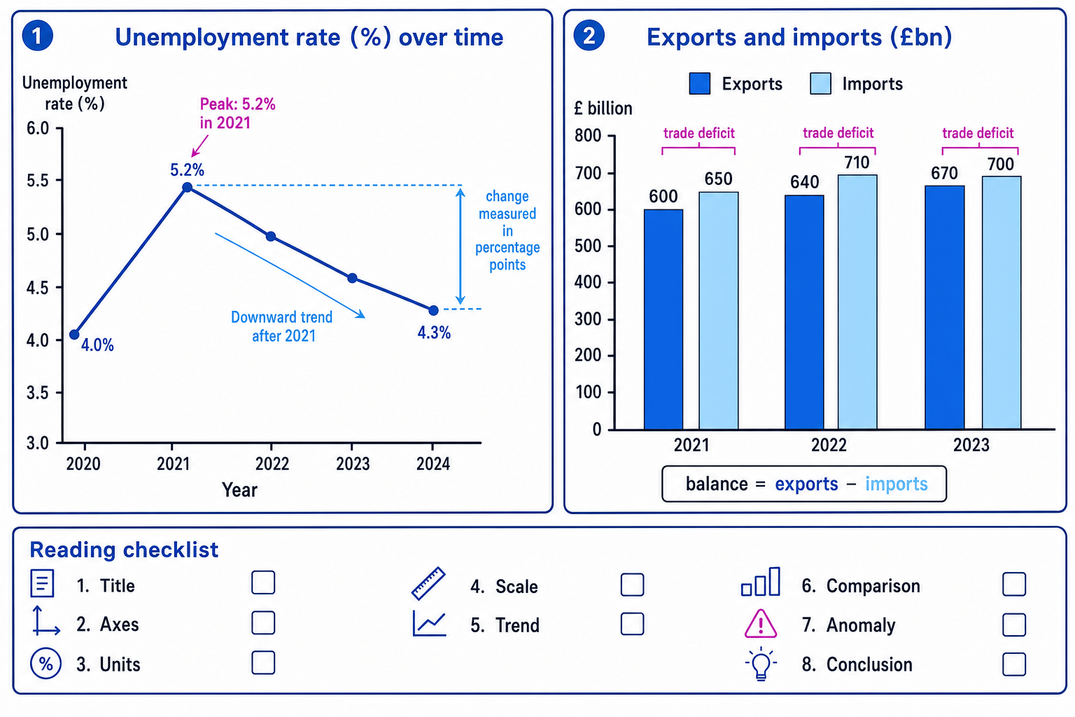
The graph-reading checklist
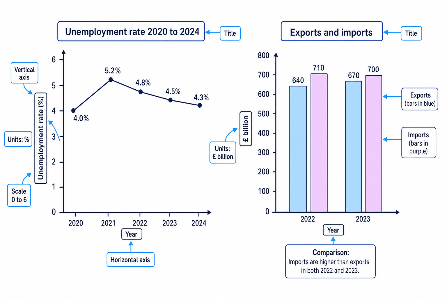
A variable is something that can change, such as price, quantity, unemployment or exports.
An axis is one of the labelled lines on a graph. The horizontal axis is usually the x-axis, and the vertical axis is usually the y-axis.
A unit tells you what the numbers are measured in, such as %, £ million, £ billion or number of people.
A scale shows how the numbers increase along an axis, for example in steps of 10, 100 or 1,000.
The diagram below shows two common GCSE Economics data displays: a line graph for unemployment over time and a bar chart comparing exports and imports.
Trends, comparisons and anomalies
A time series is data shown over time, such as unemployment rates from 2020 to 2024.
A trend is the general direction of the data. It might rise, fall, stay fairly stable or fluctuate.
An anomaly is a value that does not fit the general pattern. For example, one unusually high year in an otherwise stable series might be an anomaly.
Percentage point
A percentage point is the difference between two percentages. If unemployment falls from 5.2% to 4.3%, it has fallen by 0.9 percentage points, not 0.9%.
Reading an unemployment line graph
-
Identify what is being measured: the graph shows the unemployment rate as a percentage over time, with years on the horizontal axis and unemployment rate on the vertical axis.
-
Read the two values being compared: unemployment is 5.2% in 2021 and 4.3% in 2024.
-
Calculate the change in percentage points: 4.3% minus 5.2% = -0.9 percentage points, so unemployment fell by 0.9 percentage points.
-
If asked for the percentage change, compare the fall with the original value:
4.3−5.25.2×100≈−17.3%\frac{4.3 - 5.2}{5.2} \times 100 \approx -17.3\%5.24.3−5.2×100≈−17.3%So the unemployment rate fell by about 17.3% from its 2021 level.
-
Add interpretation: the labour market appears to have improved after 2021, but unemployment in 2024 is still slightly above the 2020 rate of 4.0%.
Percentage points vs percentages
Do not say “unemployment fell by 0.9%” when it fell from 5.2% to 4.3%. That is a fall of 0.9 percentage points. A percentage change is a different calculation.
Interpreting economic diagrams
Some economics graphs are not just charts of past data. They show relationships, such as the relationship between price and quantity.
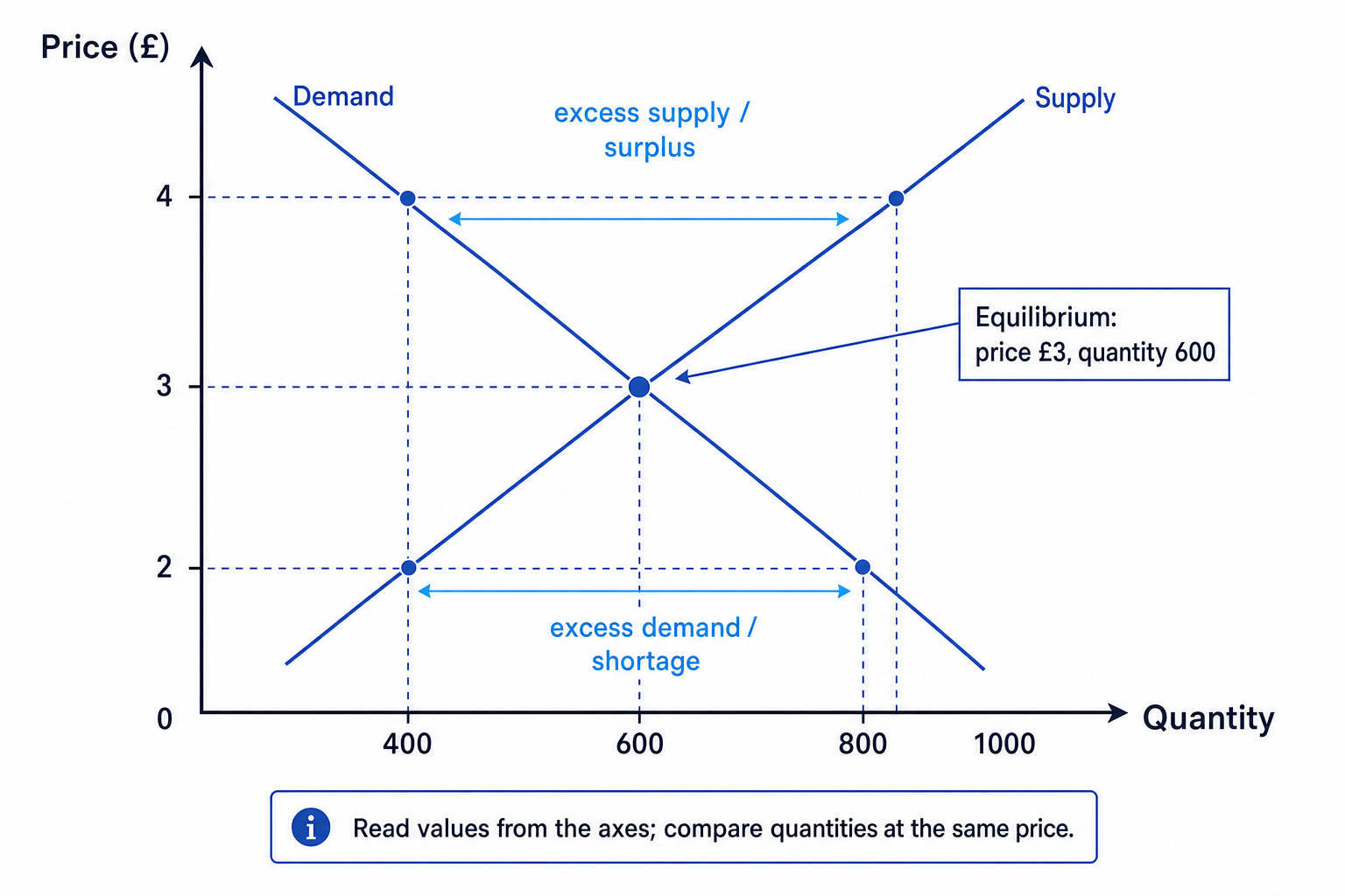
For example, a demand curve shows the quantity consumers are willing and able to buy at different prices. A supply curve shows the quantity producers are willing and able to sell at different prices. Equilibrium is where demand and supply are equal.
Interpreting shortage and surplus
-
At a price of £2, quantity demanded is 800 units and quantity supplied is 400 units.
-
Compare the quantities at the same price: 800 minus 400 = 400 units, so there is excess demand, also called a shortage.
-
At a price of £4, quantity supplied is 800 units and quantity demanded is 400 units.
-
Compare again: 800 minus 400 = 400 units, so there is excess supply, also called a surplus.
-
Interpret the pressure on price: shortages tend to put upward pressure on price, while surpluses tend to put downward pressure on price.
Read before you explain
On any graph, first read the actual values carefully. Then explain the economic meaning. Accurate reading comes before analysis.
Using unemployment data
Unemployment means people are without a job, are available for work and are actively seeking work.
The labour force means people who are either employed or unemployed and actively seeking work.
Unemployment rate
The unemployment rate is the percentage of the labour force that is unemployed.
The formula is:
unemployment rate=number unemployedlabour force×100\text{unemployment rate} = \frac{\text{number unemployed}}{\text{labour force}} \times 100unemployment rate=labour forcenumber unemployed×100Claimant Count
The Claimant Count is a UK measure of unemployment based on the number of people claiming unemployment-related benefits.
The Claimant Count is useful, but it is not perfect. Some unemployed people may not claim benefits, so they may not appear in the Claimant Count.
Calculating the unemployment rate
-
Use the data: 1.5 million people are unemployed and the labour force is 34.0 million.
-
Substitute the values into the formula:
1.534.0×100≈4.4%\frac{1.5}{34.0} \times 100 \approx 4.4\%34.01.5×100≈4.4% -
Interpret the result: about 4.4% of the labour force is unemployed.
-
Link to decisions: if unemployment is rising, the government may consider policies such as training schemes, while producers may worry about weaker consumer spending.
Using export and import data
Exports and imports
Exports are goods and services sold to other countries. Imports are goods and services bought from other countries.
If exports are greater than imports, more money flows into the country from trade than flows out. If imports are greater than exports, more money flows out than comes in from trade.
Balance of payments on current account
The balance of payments on current account records trade in goods and services, plus income flows and transfers, between a country and the rest of the world. At GCSE, when a question gives only exports and imports, you usually compare exports minus imports to identify a deficit or surplus.
A current-account deficit means the current account is negative. In simple export/import data, this means imports are greater than exports.
A current-account surplus means the current account is positive. In simple export/import data, this means exports are greater than imports.
Calculating a current-account deficit from exports and imports
-
Use the 2023 data: exports are £670 billion and imports are £700 billion.
-
Calculate exports minus imports: £670 billion minus £700 billion = -£30 billion.
-
Interpret the negative result: the country has a current-account deficit of £30 billion on this simplified export/import measure.
-
Compare with 2022: exports were £640 billion and imports were £710 billion, so the deficit was £70 billion.
-
Make a judgement from the data: the deficit narrowed from £70 billion to £30 billion, which suggests an improvement, but you would still need to check causes such as exchange rates, inflation, UK-EU trade barriers and changes in consumer demand.
Other economic data you should recognise
GDP means gross domestic product: the total value of goods and services produced in an economy over a period of time. It is used to measure economic growth.
GDP per capita means GDP divided by the population. It gives a rough average output or income per person, but it can hide inequality.
Consumer Price Index (CPI)
The Consumer Price Index (CPI) measures the average price level of a typical basket of goods and services bought by households. It is used to calculate inflation.
Inflation means a sustained rise in the average price level. During the UK cost-of-living pressures of 2021–23, high inflation meant many households found that wages did not keep up with rising prices.
Using CPI inflation to interpret a price rise
-
Suppose a weekly food basket costs £100 and CPI inflation is 8%.
-
An 8% rise means the new price is 108% of the old price, so £100 becomes £108.
-
If income rises by only 4%, £100 of income becomes £104, while the food basket becomes £108.
-
Interpret the effect: real purchasing power has fallen because prices rose faster than income.
Nominal data can mislead
Nominal data is measured in current prices, so it can rise simply because prices have risen. Real data adjusts for inflation, so it is better for judging changes in actual output or living standards.
Using data to justify economic decisions
To justify a decision, do more than quote figures. Build a chain:
- State the relevant data.
- Make a comparison or calculation.
- Explain the economic meaning.
- Link it to consumers, producers or government.
- Add a limitation before making a judgement.
Justifying a government decision using unemployment data
-
Compare the figures: a region has unemployment of 7%, while the national rate is 4%, so the region is 3 percentage points higher than the national average.
-
Explain the impact: higher unemployment may reduce household incomes, lower consumer spending and increase government spending on benefits.
-
Link to a decision: the government could fund retraining if local firms have vacancies but workers lack the right skills.
-
Balance the judgement: retraining is more likely to work if it matches real job opportunities; otherwise it may be costly without reducing unemployment much.
Correlation is not causation
If two data series move together, do not automatically assume one caused the other. You need an economic mechanism, such as higher interest rates increasing borrowing costs and reducing consumer spending.
Use a three-part data sentence
Try: “The data shows ___, which means ___, so ___.” For example: “Imports were £30 billion higher than exports, which means a deficit, so the government may be concerned about reliance on overseas goods.”
In the exam
-
Start by reading the title, axes, units and scale before making any conclusion from a graph.
-
Quote figures precisely and include the unit, such as %, £ million, £ billion or number of people.
-
When using data to justify a decision, make a comparison, explain the consequence, and finish with a balanced judgement.
Check yourself
- What is the difference between a percentage change and a percentage point change?
- How would you calculate a current-account deficit using export and import figures?
- Why might the Claimant Count not show the full level of unemployment?