

What you'll learn
- How to turn a table of economic data into a clear graph.
- How to choose axes, scales, labels and units.
- How to construct line graphs from data such as unemployment, exports or imports.
- How to draw supply and demand curves from data and identify equilibrium.
Why graphs matter in GCSE Economics
Graphs help you see patterns in data quickly. Instead of reading a long table, you can spot a rise, fall, turning point or comparison almost instantly.
In OCR GCSE Economics, graphs often appear with data on topics such as prices, unemployment, exports, imports, supply and demand. You need to be able to construct a graph accurately, not just describe one.
Constructing a graph
To construct a graph means to draw it from data, using suitable axes, scales, labels, plotted points and, where needed, a line or curve.
Accuracy first
A good economics graph is not just neat. It must show the correct economic variables, use the correct units, and plot the data accurately.
The building blocks of a graph
Before drawing any graph, you need to understand the main parts.
Data and variables
Data and variables
Data are pieces of information, usually numbers, collected about something. A variable is something that can change, such as price, quantity, year, unemployment, exports or imports.
For example, if a table shows UK imports from 2020 to 2023, the variables are year and imports.
Axes
Axes
The horizontal axis runs left to right and is often called the x-axis. The vertical axis runs bottom to top and is often called the y-axis.
In many economics graphs:
- Time, such as years or months, goes on the horizontal axis.
- The measured amount, such as unemployment rate, exports in £bn, or price level, goes on the vertical axis.
- For supply and demand diagrams, quantity goes on the horizontal axis and price goes on the vertical axis.
Scale and units
Scale and units
A scale is the pattern of numbers on an axis, such as going up in 1s, 5s, 10s or 100s. Units tell you what is being measured, such as %, £, £bn, tonnes or millions.
A graph without units can be misleading. “Exports = 800” means very little unless you know whether it means £800, £800 million or £800 billion.
Scale sanity check
Choose a scale that fits all the data and uses most of the graph paper. If the biggest value is 48, a vertical scale from 0 to 50 is usually sensible; 0 to 500 would squash the pattern.
Choosing the right type of graph
Different data need different graphs.
Line graphs
A line graph shows changes over time. It is useful for data such as:
- the Claimant Count for unemployment over several years
- exports and imports over time
- CPI inflation over time
- GDP or GDP per capita over time
Time series
A time series is data collected at different points in time, such as monthly inflation rates or yearly unemployment figures.
Bar charts
A bar chart compares separate categories. For example, you might compare different sectors of the economy or different sources of government revenue.
Supply and demand graphs
A supply and demand graph shows how price and quantity are related in a market. It is drawn using economic conventions: price on the vertical axis and quantity on the horizontal axis.
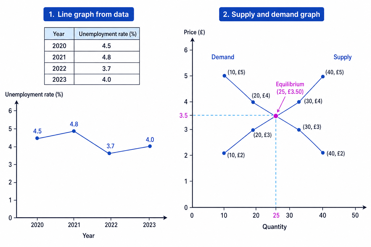
The diagram below shows two common GCSE constructions: a line graph from time-series data, and a supply and demand graph from market data.
Constructing a line graph from data
A line graph is best when the data are in time order. You plot each data point, then join the points in sequence.
Suppose you are given this data:
| Year | Unemployment rate |
|---|---|
| 2020 | 4.5% |
| 2021 | 4.8% |
| 2022 | 3.7% |
| 2023 | 4.0% |
Constructing a line graph from unemployment data
-
Put Year on the horizontal axis because the data are arranged over time. Put Unemployment rate (%) on the vertical axis because this is the amount being measured.
-
Choose a vertical scale that includes every value. The highest value is 4.8%, so a scale from 0% to 6% gives enough space and makes the changes visible.
-
Plot each point in the correct place: 2020 at 4.5%, 2021 at 4.8%, 2022 at 3.7%, and 2023 at 4.0%.
-
Join the points in year order. This shows unemployment rising from 2020 to 2021, falling in 2022, then rising slightly in 2023.
-
Add a clear title, such as Unemployment rate, 2020–2023, and make sure both axes have labels and units.
Forgetting the units
Writing “Unemployment” on the vertical axis is not precise enough. Write Unemployment rate (%) if the data are percentages, or Claimant Count with the correct unit if the data show the number of claimants.
Constructing supply and demand curves from data
Supply and demand graphs are a special type of economics graph.
Demand
Demand is the quantity of a good or service that consumers are willing and able to buy at different prices.
Supply
Supply is the quantity of a good or service that producers are willing and able to sell at different prices.
A demand curve usually slopes downwards from left to right. This shows that, as price falls, consumers usually want to buy more.
A supply curve usually slopes upwards from left to right. This shows that, as price rises, producers are usually willing to supply more.
Market equilibrium
Market equilibrium is the price and quantity where demand and supply are equal. On a graph, it is where the demand curve and supply curve cross.
A demand and supply schedule
A schedule is a table showing values. A demand schedule shows price and quantity demanded. A supply schedule shows price and quantity supplied.
| Price | Quantity demanded | Quantity supplied |
|---|---|---|
| £5 | 10 | 40 |
| £4 | 20 | 30 |
| £3 | 30 | 20 |
| £2 | 40 | 10 |
Constructing a supply and demand graph
-
Draw the axes using the economics convention: Price (£) on the vertical axis and Quantity on the horizontal axis.
-
Plot the demand points by matching each quantity demanded with its price. For example, when price is £5, quantity demanded is 10, so the point is at quantity 10 and price £5.
-
Join the demand points and label the line Demand. It should slope downwards from left to right.
-
Plot the supply points by matching each quantity supplied with its price. For example, when price is £5, quantity supplied is 40, so the point is at quantity 40 and price £5.
-
Join the supply points and label the line Supply. It should slope upwards from left to right.
-
Find where the two curves cross. In this data, they cross between £3 and £4, at about price £3.50 and quantity 25.
Reversing the axes in supply and demand
The table often lists price first, but the graph still uses quantity on the horizontal axis and price on the vertical axis. Do not copy the table order blindly.
Reading and checking your graph
Once your graph is drawn, check that it makes economic sense.
For line graphs
Ask yourself:
- Does time move from left to right?
- Are the points joined in the correct order?
- Does the graph show the correct trend: rising, falling or fluctuating?
For supply and demand graphs
Ask yourself:
- Does demand slope downwards?
- Does supply slope upwards?
- Are both curves labelled?
- Can you identify the equilibrium price and quantity?
Do not over-interpret a constructed graph
A graph drawn from a few data points shows the pattern in that data. It does not prove every cause. For example, a rise in unemployment on a graph does not by itself prove why unemployment increased.
Common graph-construction checklist
Use this order whenever you are asked to draw a graph from data:
- Read the table headings and units carefully.
- Decide which variable goes on each axis.
- Choose a sensible scale that includes all values.
- Label both axes, including units.
- Plot the points accurately.
- Join the points if a line or curve is needed.
- Add a clear title and label curves if there is more than one.
Use pencil first
In the exam, draw graphs in pencil if allowed. It makes it easier to correct a scale, point or curve without making the graph messy.
Graphs with exports and imports
For trade data, you may be asked to plot exports and imports on the same graph. Both are often shown in £bn.
If exports and imports are measured over time, use a line graph with:
- year on the horizontal axis
- value in £bn on the vertical axis
- one line for exports and one line for imports
- a key or labels to show which line is which
If imports are higher than exports, the UK is buying more from abroad than it is selling abroad for that part of trade. In wider trade questions, this links to the balance of payments on current account, which records trade in goods and services, plus some income flows and transfers.
Using two different scales for two lines
If exports and imports are on the same graph, use the same vertical scale for both lines. Different scales can make the comparison unfair or confusing.
In the exam
-
Copy the exact wording and units from the data table into your axis labels, such as Price (£), Quantity, Exports (£bn) or Unemployment rate (%).
-
For supply and demand graphs, always put price on the vertical axis and quantity on the horizontal axis, then label the demand and supply curves.
-
Before moving on, check one plotted point against the table. If one point is wrong, the line or equilibrium may also be wrong.
Check yourself
- What should go on the vertical axis of a supply and demand graph?
- How would you choose a sensible scale for data with values between 12 and 48?
- Why is it important to include units such as %, £ or £bn on a graph?
