

What you'll learn
- How to process qualitative and quantitative results from practical work.
- How to choose useful calculations such as means, rates and percentage change.
- How to use significant figures correctly without losing precision.
- How to plot, read and analyse graphs, including gradients and intercepts.
Why analysis matters
In biology practicals, collecting results is only the start. Analysis means turning raw observations or measurements into evidence that answers the investigation question.
Raw data are the values or observations recorded directly during the experiment. Processed data are raw data that have been transformed in a useful way, such as by calculating a mean, a rate, a percentage change, or plotting a graph.
A strong analysis should help you decide whether the results support a valid conclusion, rather than just describing “what happened”.
Qualitative and quantitative results
Data types
Qualitative data are descriptive observations, such as “solution turned purple” or “precipitate formed”. Quantitative data are numerical measurements with units, such as length in millimetres, time in seconds, or concentration in mol dm⁻³.
Qualitative results are common in biochemical tests, microscopy observations and ecological surveys. They can still be analysed carefully if the categories are clear. For example, colour changes can be recorded using a fixed scale, such as “blue”, “green”, “yellow”, “orange” and “brick-red” in a Benedict’s test.
Quantitative results allow more mathematical processing. You might calculate a mean from repeats, compare treatments, calculate a rate, or show a relationship on a graph.
A valid conclusion
A valid conclusion is supported by the results, refers to the experimental variables, includes relevant processed data, and does not claim more certainty than the method allows.
An anomalous result is a result that does not fit the pattern shown by the other results. It may be caused by experimental error, but it could also be real biological variation. You should not remove an anomaly unless there is a sensible reason.
Processing data step by step
Useful processing methods include:
- calculating a mean, which is the sum of values divided by the number of values
- calculating a range, which shows spread by comparing the largest and smallest values
- calculating a rate, which is change per unit time
- calculating a percentage change, which compares change with the original value
The mean is often written as:
xˉ=∑xn\bar{x}=\frac{\sum x}{n}xˉ=n∑xwhere xˉ\bar{x}xˉ is the mean, ∑x\sum x∑x is the sum of the values, and nnn is the number of values.
A rate can be written as:
rate=change in dependent variabletime taken\text{rate}=\frac{\text{change in dependent variable}}{\text{time taken}}rate=time takenchange in dependent variableA percentage change can be written as:
percentage change=changeoriginal value×100\text{percentage change}=\frac{\text{change}}{\text{original value}}\times 100percentage change=original valuechange×100Processing repeat measurements
Seedlings were grown with and without nitrate ions. Radicle length was measured after 3 days.
- No nitrate: 8.0 mm, 9.0 mm, 7.0 mm, 8.0 mm
- With nitrate: 18.0 mm, 19.0 mm, 20.0 mm, 42.0 mm, 18.0 mm
-
The value 42.0 mm in the nitrate treatment is much higher than the other nitrate repeats, so it is likely to be anomalous. If there is a method reason, such as recording the wrong seedling, it can be excluded and the exclusion should be stated.
-
Calculate the mean for no nitrate:
xˉ=8.0+9.0+7.0+8.04=8.0 mm\bar{x}=\frac{8.0+9.0+7.0+8.0}{4}=8.0\ \text{mm}xˉ=48.0+9.0+7.0+8.0=8.0 mm -
Calculate the mean for nitrate, excluding the justified anomaly:
xˉ=18.0+19.0+20.0+18.04=18.75 mm\bar{x}=\frac{18.0+19.0+20.0+18.0}{4}=18.75\ \text{mm}xˉ=418.0+19.0+20.0+18.0=18.75 mm -
Compare the processed data: nitrate increased the mean radicle length from 8.0 mm to 18.75 mm, an increase of 10.75 mm.
-
A valid conclusion is that, under these conditions, nitrate ions increased seedling radicle growth. The conclusion is stronger if repeats are consistent and other variables, such as temperature and water availability, were controlled.
Correlation is not always causation
If the investigation is controlled and only the independent variable was changed, you can discuss the effect of that variable. If the data are observational, describe an association or correlation unless the method justifies a causal claim.
Using mathematical skills appropriately
“Appropriate maths” means choosing calculations that answer the biological question. You do not need to calculate everything possible.
For example:
- Use a mean to summarise repeat measurements.
- Use a rate when time is involved, such as enzyme activity per second.
- Use a percentage change to compare changes from different starting values.
- Use standard form for very small or very large values, such as 2.5×10⁻⁶ m2.5 \times 10^{-6}\ \text{m}2.5×10⁻⁶ m.
- Use graph gradients to calculate rates or relationships between variables.
Always carry units through calculations. If distance is in millimetres and time is in seconds, a rate has units of millimetres per second, written as mm s⁻¹.
Significant figures
Significant figures
Significant figures are the meaningful digits in a number, starting from the first non-zero digit. They show the precision of a value without implying more certainty than the measurements support.
For example, 0.00452 has 3 significant figures: 4, 5 and 2. Leading zeros are not significant; they only show place value.
In practical biology, your final answer should usually be rounded to a sensible number of significant figures, often matching the least precise data used in the calculation.
Rounding safely
Do all calculations with unrounded values first, then round the final answer. This avoids accumulating rounding errors.
Rounding a calculated rate
A student calculates the rate of movement of a bubble in a potometer as 0.034872 mm s⁻¹. The original distance and time measurements were recorded to 3 significant figures.
-
The first non-zero digit is 3, so counting significant figures gives 3, 4 and 8 as the first three significant figures.
-
The next digit is 7, so the third significant figure, 8, is rounded up to 9.
-
The rate should be reported as 0.0349 mm s−10.0349\ \text{mm s}^{-1}0.0349 mm s−1 to 3 significant figures.
False precision
Do not give a final answer like 18.746382 mm if the measurements were only recorded to the nearest millimetre. Too many digits suggest a level of precision the experiment did not have.
Choosing and plotting graphs
A graph helps you see patterns that are hard to spot in a table.
The independent variable is the variable changed or selected by the investigator. It normally goes on the x-axis. The dependent variable is the variable measured as the outcome. It normally goes on the y-axis. Controlled variables are variables kept constant so the test is fair.
Graph choice
Use a line graph or scatter graph for relationships between two continuous variables, such as time and product formed. Use a bar chart for separate categories, such as habitat type or treatment group.
When plotting a graph:
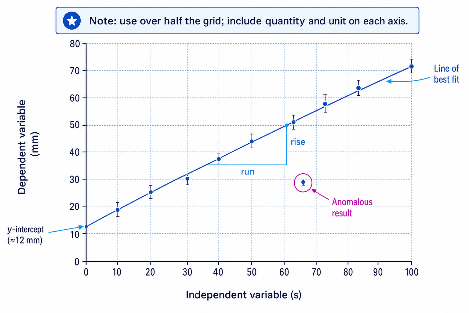
- label each axis with the quantity and unit, such as time / s or length / mm
- choose a scale that uses more than half of the grid
- use equal intervals on each axis
- plot points accurately with small crosses or dots
- draw a line or curve of best fit when showing a trend
- do not simply join point to point unless the data are discrete or you are told to
The diagram below shows the main features OCR expects you to recognise and use when analysing experimental graphs.
Forcing the origin
Do not force a line of best fit through zero unless the biology or the data justify it. A relationship can have a non-zero intercept.
Gradients and intercepts
The gradient of a line describes how steep it is. In biological graphs, it often represents a rate, such as change in length per second or change in concentration per minute.
For a straight line:
gradient=ΔyΔx\text{gradient}=\frac{\Delta y}{\Delta x}gradient=ΔxΔywhere Δy\Delta yΔy means change in the y-value and Δx\Delta xΔx means change in the x-value.
An intercept is where a line crosses an axis. The y-intercept is where the line crosses the y-axis, when the x-value is zero. Intercepts can be biologically meaningful, such as an estimated initial value, but only if the line is reliable near that point.
For a curve, the gradient changes along the line. To estimate the gradient at one point, draw a tangent, which is a straight line that just touches the curve at that point, then calculate the gradient of the tangent.
Measuring a gradient and intercept
A line of best fit shows distance moved by an organism in millimetres against time in seconds. Two points on the line are 30 s, 32 mm and 100 s, 72 mm. The line crosses the y-axis at about 12 mm.
-
Calculate the change in distance:
Δy=72 mm−32 mm=40 mm\Delta y=72\ \text{mm}-32\ \text{mm}=40\ \text{mm}Δy=72 mm−32 mm=40 mm -
Calculate the change in time:
Δx=100 s−30 s=70 s\Delta x=100\ \text{s}-30\ \text{s}=70\ \text{s}Δx=100 s−30 s=70 s -
Substitute into the gradient formula:
gradient=40 mm70 s=0.57 mm s−1\text{gradient}=\frac{40\ \text{mm}}{70\ \text{s}}=0.57\ \text{mm s}^{-1}gradient=70 s40 mm=0.57 mm s−1 -
Interpret the gradient biologically: the organism’s average speed over this section of the best-fit line is about 0.57 mm s−10.57\ \text{mm s}^{-1}0.57 mm s−1.
-
Interpret the y-intercept: the graph estimates an initial distance of about 12 mm when time is 0 s, but this should only be trusted if the line near the intercept is supported by the data.
Interpreting patterns
Once you have processed and graphed data, describe the pattern precisely before explaining it biologically.
Good interpretation uses phrases such as:
- “As temperature increased from 10 °C to 35 °C, the rate increased…”
- “Above 40 °C, the rate decreased, suggesting enzyme denaturation…”
- “The mean was higher in treatment A, but the ranges overlapped…”
- “The graph shows a positive correlation, but this method does not prove causation…”
Describe then explain
First state what the data show, using numbers and units. Then link the pattern to biological knowledge.
Avoid vague statements such as “it went up a lot”. Instead, say how much it changed and over what range.
In the exam
-
Quote processed data with units when making a conclusion, rather than relying on general descriptions.
-
For graphs, check axes, units, scale, best-fit line, anomalies, gradient and intercept before answering interpretation questions.
-
Use sensible significant figures: keep unrounded values during working, then round the final answer appropriately.
Check yourself
- What is the difference between qualitative and quantitative data?
- Why should you usually calculate a mean from repeat measurements?
- How do you calculate the gradient of a line of best fit, and what might it represent biologically?
