Skip to content

Course home

Real Life and Distance Time Graphs

Real Life and Distance Time Graphs

MediumHard
123456789
Question 7

John draws a graph to show the amount of petrol his car used on a 250 mile journey.
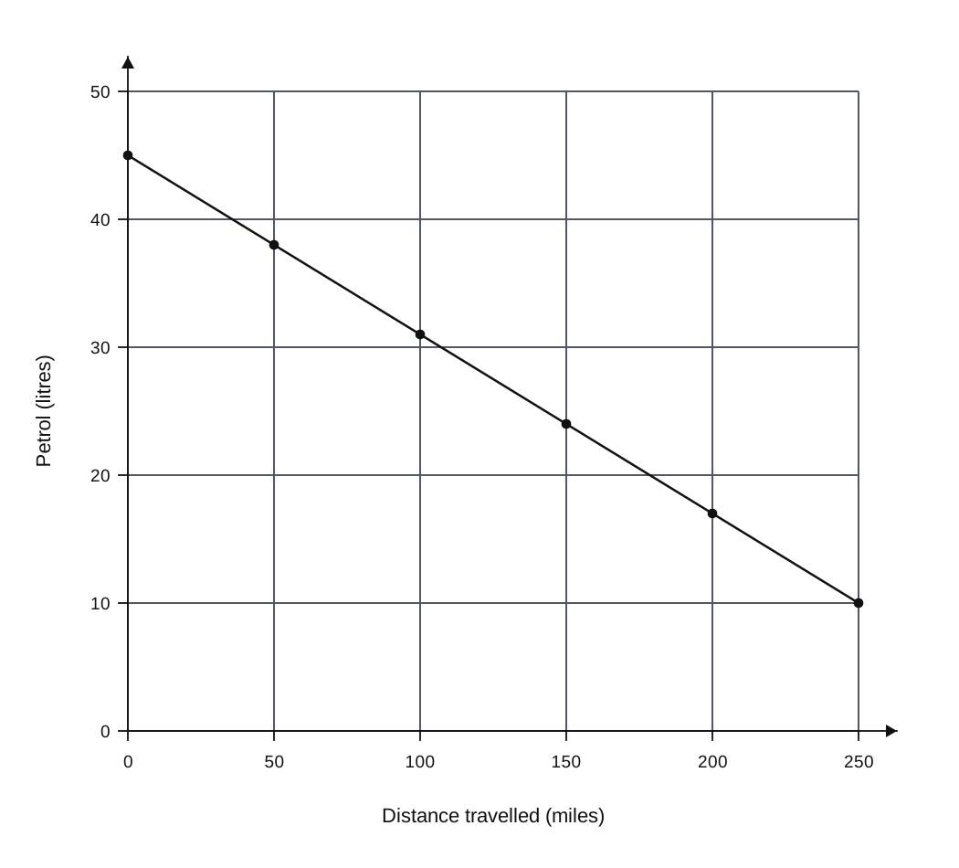
A line graph showing the relationship between distance travelled (miles) on the x-axis and petrol (litres) on the y-axis. The x-axis ranges from 0 to 250 with major grid lines every 50 units and minor grid lines every 10 units. The y-axis ranges from 0 to 50 with major grid lines every 10 units and minor grid lines every 2 units. A straight line starts at (0, 45) and ends at (250, 10).

Distance travelled (miles)Petrol (litres)
045
5038
10031
15024
20017
25010

A line graph showing the relationship between distance travelled (miles) on the x-axis and petrol (litres) on the y-axis. The x-axis ranges from 0 to 250 with major grid lines every 50 units and minor grid lines every 10 units. The y-axis ranges from 0 to 50 with major grid lines every 10 units and minor grid lines every 2 units. A straight line starts at (0, 45) and ends at (250, 10).

a.

How much petrol was in John's car at the start of his journey?

[1]
b.

How many more miles can John's car travel before it runs out of petrol?

[1]
c.

What assumption have you made to calculate your answer to (b)?

[1]
Markscheme

Real Life and Distance Time Graphs Questions

  1. IGCSE
  2. /Maths
  3. /Real Life and Distance Time Graphs

14 exam-style questions on Edexcel IGCSE Maths Real Life and Distance Time Graphs. Each one has a worked solution and a mark scheme showing where the marks go.

Question bank