Question 36
The number of hours 10 students spent studying for a test and their resulting scores are recorded. The scatter graph shows this information.
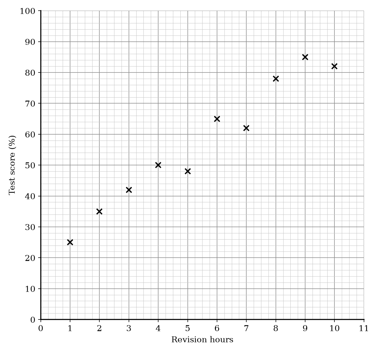
| Revision hours | Test score (%) |
|---|---|
| 1 | 25 |
| 2 | 35 |
| 3 | 42 |
| 4 | 50 |
| 5 | 48 |
| 6 | 65 |
| 7 | 62 |
| 8 | 78 |
| 9 | 85 |
| 10 | 82 |
a.[1]
What type of correlation does the scatter graph show?
b.[2]
A student studied for 4.5 hours. Estimate the test score for this student.
c.[1]
A teacher wants to use the scatter graph to predict the test score for a student who studied for 0.5 hours. Comment on the reliability of this prediction.
Scatter Graphs Questions
54 exam-style questions on Eduqas GCSE Maths Scatter Graphs. Each one has a worked solution and a mark scheme showing where the marks go.