
What you'll learn
- How to choose the best graph or chart for different types of geographical data.
- How to draw graphs accurately using sensible scales, labels, keys and annotations.
- How to interpret patterns, trends, relationships and anomalies.
- How to evaluate whether a graph communicates data fairly and clearly.
Why graphical skills matter in Geography
Geography is full of data: rainfall totals, population structures, river measurements, development indicators, questionnaire results and map-based information. Graphical skills help you turn that data into something visual, so you can spot patterns quickly.
You may use these skills at a local scale in fieldwork, such as river width along a transect, or at a global scale, such as comparing population structures between countries like Japan and Nigeria.
Data, variables and scale
Data are recorded observations or measurements. A variable is something that can change or be measured, such as rainfall, population, distance or temperature. An axis is a graph line used for plotting values, and a graph scale is the set of equal numerical intervals shown on an axis or in a symbol key.
The first decision: what job does the graph need to do?
Before drawing anything, ask: What do I want the reader to see? A graph that is excellent for one job may be poor for another.
Choose the graph by the job
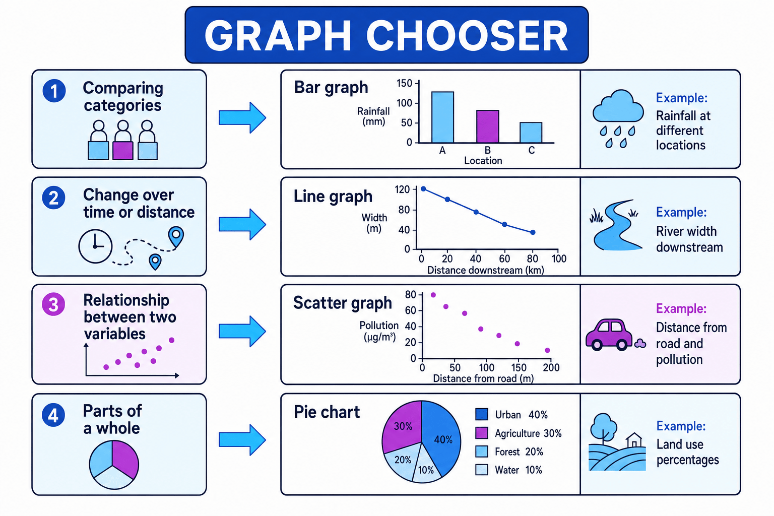
If you are comparing categories, use a bar graph. If you are showing change over time, use a line graph. If you are showing a relationship between two variables, use a scatter graph. If you are showing parts of a whole, use a pie chart or divided bar.
Use this chooser as a quick first decision before you start drawing.
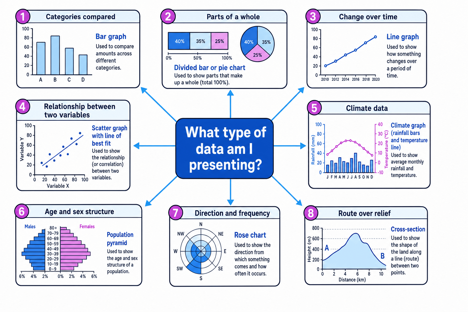
Graph and chart chooser
| Graph or chart | Best used for | Geography examples |
|---|---|---|
| Vertical bar graph | Comparing separate categories | Rainfall at different locations; land-use counts |
| Horizontal bar graph | Comparing categories with long labels | Questionnaire responses; countries ranked by GNI per capita |
| Divided bar graph | Showing parts of a whole, often as percentages | Employment structure: primary, secondary, tertiary |
| Histogram | Grouped continuous data with equal class intervals | Pebble size groups; traffic counts grouped by speed |
| Line graph | Change over time or distance | River discharge over time; temperature change through a year |
| Scatter graph | Relationship between two variables | Distance from CBD and land value; river width and distance downstream |
| Dispersion graph | Spread, range and clustering of values | Pebble sizes at different beach sites; environmental quality scores |
| Pie chart | Proportions that add to a meaningful total | Land use in a town centre; energy mix |
| Climate graph | Monthly rainfall and temperature together | Manaus, Brazil; London, UK |
| Proportional symbols | Values located on a map | City populations; earthquake magnitudes by location |
| Pictogram | Simple visual communication using repeated symbols | Tourist numbers; survey results for a younger audience |
| Cross-section | Side view of land height along a line | Valley shape across a river; coastal cliff profile |
| Population pyramid | Age and sex structure of a population | Youthful population in Nigeria; ageing population in Japan |
| Radial graph | Cyclical data around a circle | Monthly sunshine hours; seasonal river flow |
| Rose chart | Direction and frequency | Wind direction; longshore drift direction |
Constructing graphs accurately
A graph should be easy to read without you standing next to it explaining it. That means it needs a clear title, labelled axes, units, an even scale, and a key or legend where needed.
An annotation is a short note added to a graph to point out something important, such as “highest rainfall” or “possible anomaly”. An anomaly is a value that does not fit the general pattern.
The TAILS check
Before you finish a graph, check Title, Axes, Intervals, Labels or legend, and Source or scale. This catches most avoidable graph errors.
Choosing a scale for a line graph
A fieldwork group measures river width at five sites downstream on the River Tees: 2 m, 4 m, 7 m, 11 m and 16 m.
- The sites are in downstream order, so the graph needs to show change along a route. A line graph is more useful than a bar graph because the order matters.
- The independent variable is distance downstream or site number, so it goes on the x-axis. The measured river width goes on the y-axis, with the unit metres.
- The largest value is 16 m, so a sensible y-axis scale would be 0 to 20 m using equal 5 m intervals. This uses the graph space without making the pattern look exaggerated.
- After plotting the points, joining them shows the trend: river width increases downstream, with the biggest increase between the later sites.
Bar graphs, divided bars, histograms and dispersion graphs
A bar graph compares categories. The bars usually have gaps because the categories are separate, such as “bus”, “car”, “walk” and “cycle”.
A divided bar graph is a bar split into sections to show proportions. It is useful when the total is 100%, such as employment structure or land-use percentage.
A histogram looks like a bar graph, but it shows grouped continuous data. Continuous data can take any value within a range, such as sediment size or rainfall. In this GCSE specification, histograms use equal class intervals, so the bar heights show frequency and the bars touch.
A dispersion graph shows how spread out data values are. It is good for seeing clusters, gaps, range and outliers, especially in fieldwork data.
Bar graph or histogram?
Use a bar graph for separate categories, such as transport types. Use a histogram for grouped continuous data, such as pebble sizes from 0–10 mm, 10–20 mm and 20–30 mm.
Pie charts and proportional data
A pie chart shows how a total is divided into parts. Each sector must be part of the same whole, and all the sectors together must add to 100%.
To construct a pie chart, convert values into percentages or angles.
sector angle=category valuetotal×360∘\text{sector angle} = \frac{\text{category value}}{\text{total}} \times 360^\circsector angle=totalcategory value×360∘Calculating pie-chart sectors
A land-use survey records 50 grid squares: 20 residential, 10 commercial, 5 industrial and 15 green space.
- Find the total: 20+10+5+15=5020 + 10 + 5 + 15 = 5020+10+5+15=50 grid squares.
- Convert each category to a percentage: residential is 2050×100=40%\frac{20}{50} \times 100 = 40\%5020×100=40%, commercial is 20%, industrial is 10%, and green space is 30%.
- Convert percentages to angles: residential is 40100×360∘=144∘\frac{40}{100} \times 360^\circ = 144^\circ10040×360∘=144∘, commercial is 72°, industrial is 36°, and green space is 108°.
- Check the angles add to 360° and the percentages add to 100%, so the pie chart represents the whole dataset correctly.
Pie charts need a real total
Do not use a pie chart if the categories overlap or do not add to one meaningful whole. For example, “reasons tourists like a place” may not work if each tourist could choose more than one reason.
Line graphs, scatter graphs and best-fit lines
A line graph shows change across ordered data, usually time or distance. It is useful for trends, such as changes in river discharge after rainfall.
A scatter graph shows whether two variables may be related. A correlation is a relationship between variables. A positive correlation means both variables tend to increase together; a negative correlation means one increases while the other decreases; no correlation means there is no clear relationship.
A line of best fit is a straight or smooth line drawn through the general middle of scatter points. It should show the overall trend, not join every point.
Best fit is not dot-to-dot
On a scatter graph, do not join each point in order. Draw one best-fit line through the centre of the pattern, with roughly balanced points on either side.
Interpreting a scatter graph
A local fieldwork scatter graph compares distance from a main road with nitrogen dioxide levels.
- Points close to the road have higher pollution values, while points further away tend to have lower values. This shows a negative correlation.
- A best-fit line would slope downwards from left to right, showing the general relationship while ignoring small random variation.
- If one far-away site has unusually high pollution, treat it as an anomaly and suggest a possible reason, such as a bus stop, traffic lights or a short-term congestion event.
- Evaluate the evidence: the graph suggests a relationship, but it does not prove the road is the only cause because wind direction, time of day and sampling method could also affect results.
Climate graphs
A climate graph combines two types of data for each month: rainfall as bars and temperature as a line. It normally uses two y-axes, one for rainfall in mm and one for temperature in °C.
Climate graphs help you describe seasonal patterns. For example, Manaus in Brazil has high rainfall and warm temperatures throughout the year, typical of a tropical rainforest climate, though exact values depend on the climate dataset used.
Reading a climate graph
A simplified climate graph for Manaus shows annual rainfall of about 2300 mm, a highest monthly mean temperature of 28°C and a lowest monthly mean temperature of 26°C.
- Add the monthly rainfall bars to find the annual rainfall total, which is about 2300 mm. This indicates a very wet climate.
- Calculate the temperature range: 28∘C−26∘C=2∘C28^\circ\text{C} - 26^\circ\text{C} = 2^\circ\text{C}28∘C−26∘C=2∘C. This shows very little seasonal temperature variation.
- Combine both patterns: high rainfall plus consistently high temperatures supports the conclusion that Manaus has a hot, wet equatorial climate.
Map-based and shape-based graphs
Proportional symbols are symbols on a map whose size represents a value. They are useful for showing spatial patterns, such as larger cities having larger circles. The area of the symbol should represent the value, so doubling the radius would make the circle much more than double in size.
A cross-section is a side view of relief along a line. To construct one from a map, mark where the transect crosses each contour line, transfer the heights onto graph paper, then join the plotted points smoothly. A contour line joins places of equal height above sea level.
A population pyramid shows males and females in age bands. A wide base suggests a high birth rate; a narrow top suggests fewer elderly people; a bulge can suggest migration, a baby boom or a past change in birth rate. Countries such as Nigeria often have more youthful pyramids, while Japan has a more ageing structure.
Radial graphs and rose charts
A radial graph plots values around a circle, often for data that repeats in cycles, such as months of the year. The distance from the centre shows the size of the value.
A rose chart shows direction and frequency. A wind rose, for example, shows which direction the wind most often comes from. The longest sector or bar shows the most frequent direction.
Extract, interpret, analyse, evaluate
When reading a graph, move from simple to complex:
- Extract: read exact values from the graph.
- Interpret: describe the pattern, trend or relationship.
- Analyse: explain what the pattern may mean geographically.
- Evaluate: judge how reliable or useful the graph is.
Good evaluation might mention sample size, date of data, missing data, anomalies, uneven scales, unclear categories or whether the graph type is suitable.
In the exam
- Identify the graph type first, then check the title, axes, units, key and scale before reading values.
- Use data in your interpretation: quote figures, differences, percentages or named categories rather than saying “it goes up a lot”.
- When evaluating, comment on both the graph and the data: scale choice, anomalies, sample size, source, date and whether the graph type is appropriate.
Check yourself
- Which graph would you choose to show the relationship between distance from a river source and river width?
- How would you calculate the angle for a pie-chart sector?
- What is the difference between describing a trend and evaluating a graph?