Draw both curves on one set of axes
- Put price on the vertical axis and quantity on the horizontal axis, using the same axes for both curves, as in 2.2.2 and 2.3.2.
- Draw demand falling from top left to bottom right and label it D, then supply rising from bottom left to top right and label it S.
- Use one quantity axis for both, because the whole point of the diagram is to compare the two quantities at the same price.
Mark the equilibrium where the curves cross
- The crossing point is the only place on the diagram where quantity demanded equals quantity supplied.
- Drop a dashed line down to the quantity axis and across to the price axis, then label them Pe and Qe.
- Label the crossing point itself if the question asks you to refer to it later, since a labelled point is easier to write about.
Show a shortage or surplus off equilibrium
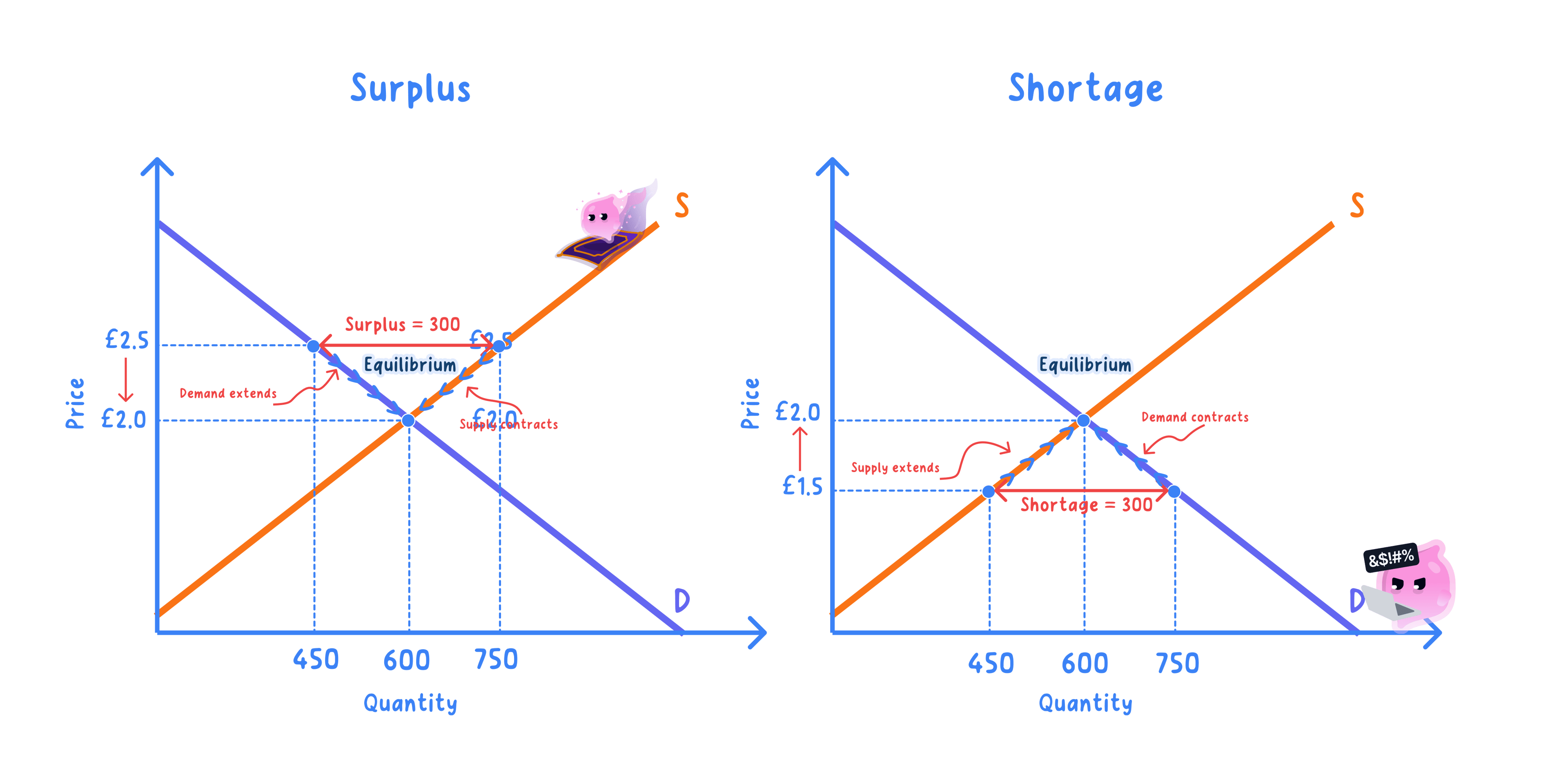
- Draw a horizontal line at the price the question names, then read the quantity where it meets each curve.
- Below equilibrium the demand quantity is the larger one, so mark the gap between the curves and label it excess demand.
- Above equilibrium the supply quantity is the larger one, so the same gap is labelled excess supply.
- Add an arrow on the price axis showing which way the price will move, because that is what the gap causes.
Show a shift as a second complete curve
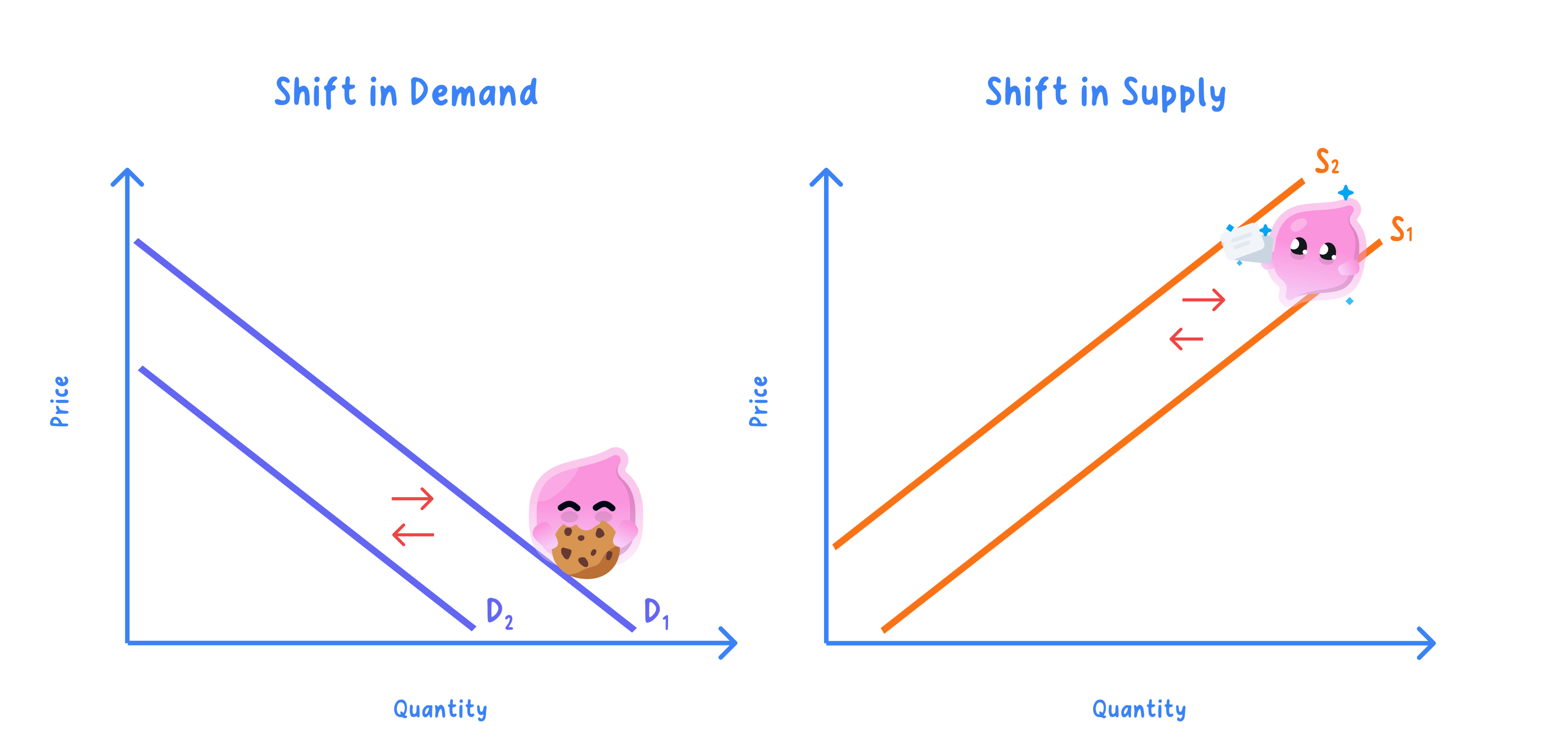
- Draw the new curve as a whole line roughly parallel to the original, label it D1 and D2 or S1 and S2, and add an arrow.
- Mark the new crossing point and label the new price and quantity, since the shift is only worth drawing if its effect is visible.
- Move one curve at a time unless the question says both have changed, because two shifts at once make the outcome ambiguous.
Common Mistake
- Do not move a curve because the good's own price changed, since that is a movement along it, as covered in 2.2.4 and 2.3.4.
- Do not rub out the original curve, because the comparison between old and new is what the diagram exists to show.
Exam technique
- Use a ruler and leave the construction lines in, because the dashed lines to the axes are part of showing the answer.
- Refer to the diagram in your writing by its labels, since a diagram and an answer that never mention each other are marked as two separate things.
Self review
- Which variable goes on the vertical axis of a demand and supply diagram?
- Where on the diagram is the equilibrium?
- How would you show excess demand on a diagram?
- How is a shift of supply drawn?
- Why should the original curve be left on the diagram when showing a shift?
