Plot the schedule to get the curve
Demand schedule: a table of prices with the quantity a consumer would buy at each of those prices.
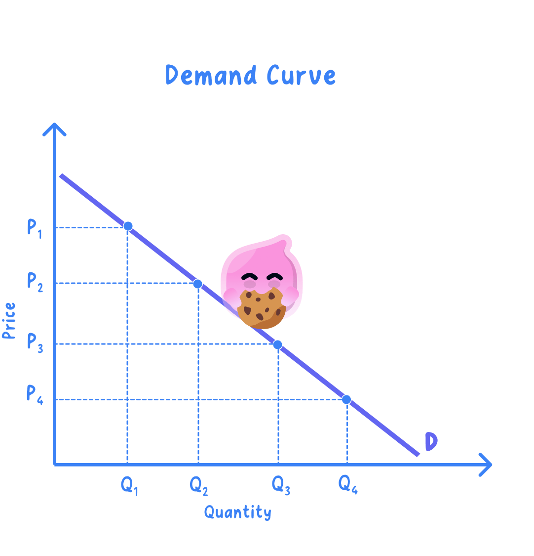
Demand curve: the same information drawn as a line, with each row of the schedule plotted as one point.
Ceteris paribus: the assumption that nothing except the good's own price has changed while the curve is drawn.
- Price goes on the vertical axis and quantity demanded on the horizontal axis, on every demand and supply diagram.
- Plot each row of the schedule as one point, join them into a single line falling from top left to bottom right, and label it D.
- The finished curve holds ceteris paribus, so incomes, tastes and the prices of other goods are all frozen while price alone changes.
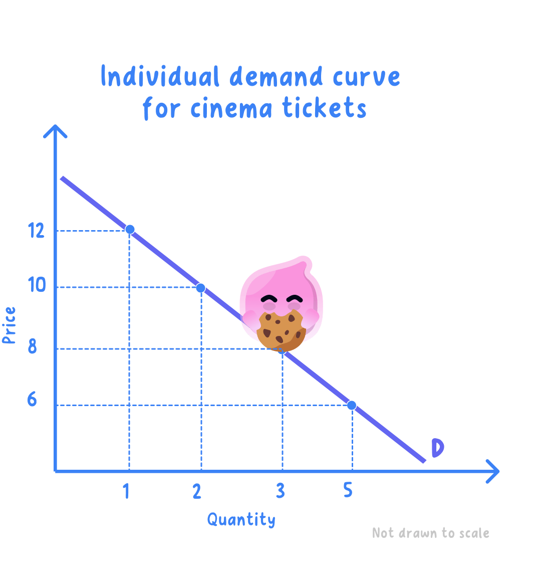
- One student's cinema tickets: the schedule shows how many tickets she would buy in a month at each price.
| Price per ticket | Tickets a month |
|---|---|
| £12 | 1 |
| £10 | 2 |
| £8 | 3 |
| £6 | 5 |
Step 1: plot £12 against 1 ticket, £10 against 2, £8 against 3 and £6 against 5, then join the points and label the line D.
Step 2: subtract the quantity at the highest price from the quantity at the lowest:
5−1=4 tickets a month 5 - 1 = 4\text{ tickets a month} 5−1=4 tickets a month- A fall from £12 to £6 raises her quantity demanded by 4 tickets a month, and all four points sit on the one curve D.
Individual demand is one consumer's buying plan
Individual demand: the quantities one consumer would buy at each price.
Market demand: the quantities all the consumers in a market would buy at each price, found by adding their individual demands together.
- A single consumer's schedule gives an individual demand curve, which is what the cinema table above draws.
- A producer needs the market curve instead, because no firm sells to one buyer alone.
Add the quantities across at each price
- Take one price, read off what every consumer would buy at that price, and add those quantities together.
- Repeat for each price in the schedule, then plot the totals to get the market demand curve.
- The addition is done across, never down, so quantities are summed at a fixed price rather than prices being added up.
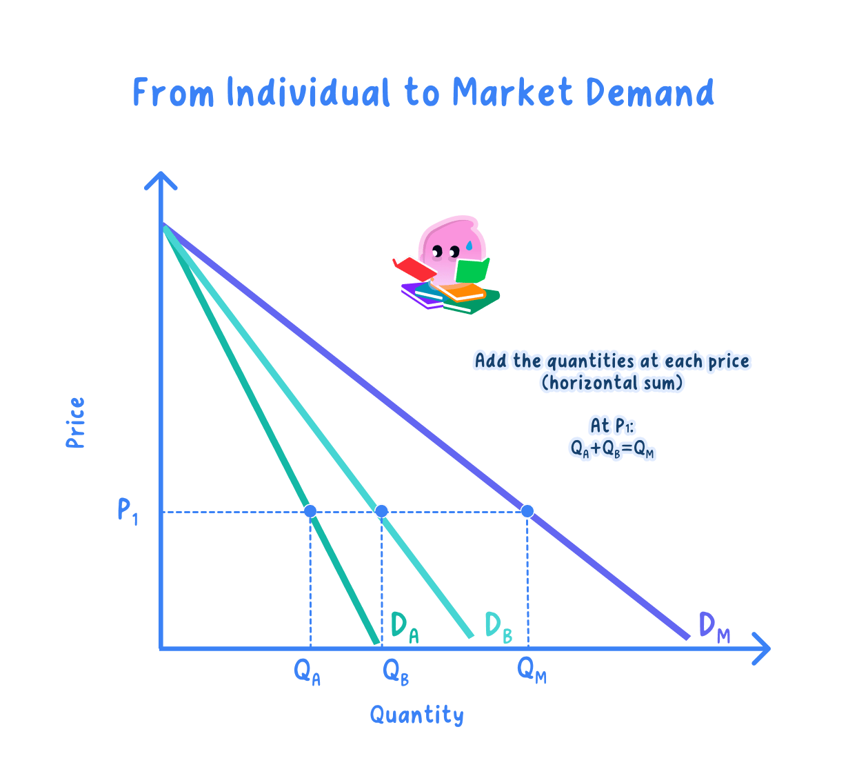
- A second student's plans are added to the first to build market demand for this small market.
| Price per ticket | Student A | Student B | Market demand |
|---|---|---|---|
| £12 | 1 | 0 | 1 |
| £10 | 2 | 1 | 3 |
| £8 | 3 | 2 | 5 |
| £6 | 5 | 3 | 8 |
Step 1: at £8, add the two quantities:
3+2=5 tickets a month 3 + 2 = 5\text{ tickets a month} 3+2=5 tickets a monthStep 2: repeat at every price to complete the final column, then plot those totals against price.
- The market curve slopes down like each individual curve but is flatter and lies further to the right, because it counts more buyers at every price.
Label the diagram before adding anything else
- Label both axes with the variable and the units before drawing, because an unlabelled axis cannot be credited.
- Label the curve D, and state whether it is individual or market demand.
- Never put quantity on the vertical axis, because swapped axes make every reading of the diagram wrong.
- Do not join the points into a line that rises, since a demand curve falling from left to right is the whole point of the diagram.
- Plot from the table rather than sketching a rough line, because a question giving you data expects that data on the diagram.
- Say which curve you have drawn when both appear, since individual and market demand are marked as different things.
- Which variable goes on the vertical axis of a demand diagram?
- Using the cinema schedule, how many tickets would the student buy at £10?
- What is the difference between individual and market demand?
- At £6, Student A buys 5 and Student B buys 3. What is market demand at £6?
- Why is market demand found by adding across at a price rather than down a column?
