

What you'll learn
- How demand and supply interact to determine the market price.
- Why excess demand and excess supply put pressure on prices to change.
- How to use supply and demand diagrams to analyse real-world markets.
- How to show a producer’s revenue as a rectangle on a market diagram.
The building blocks: markets, demand and supply
A market is any situation where buyers and sellers exchange a good or service. It does not have to be a physical place: the market for trainers, Netflix subscriptions, rental housing, or coffee can all be analysed using demand and supply.
Demand means the quantity consumers are willing and able to buy at different prices over a period of time. The demand curve usually slopes downwards because, as price falls, consumers tend to buy more.
Supply means the quantity producers are willing and able to sell at different prices over a period of time. The supply curve usually slopes upwards because, as price rises, selling becomes more profitable, so producers are willing to supply more.
Demand and supply curves
A demand curve shows the quantity demanded at each possible price. A supply curve shows the quantity supplied at each possible price. On GCSE diagrams, price goes on the vertical axis and quantity goes on the horizontal axis.
The axis rule
For supply and demand diagrams, remember: Price is high or low, so it goes up the side. Quantity spreads across, so it goes along the bottom.
3.1.3.3 How equilibrium price is determined by supply and demand
The equilibrium price is the price where quantity demanded equals quantity supplied. At this price, the market “clears”: buyers can buy what they want at that price, and sellers can sell what they planned to sell.
The equilibrium quantity is the amount bought and sold at the equilibrium price.
Equilibrium price
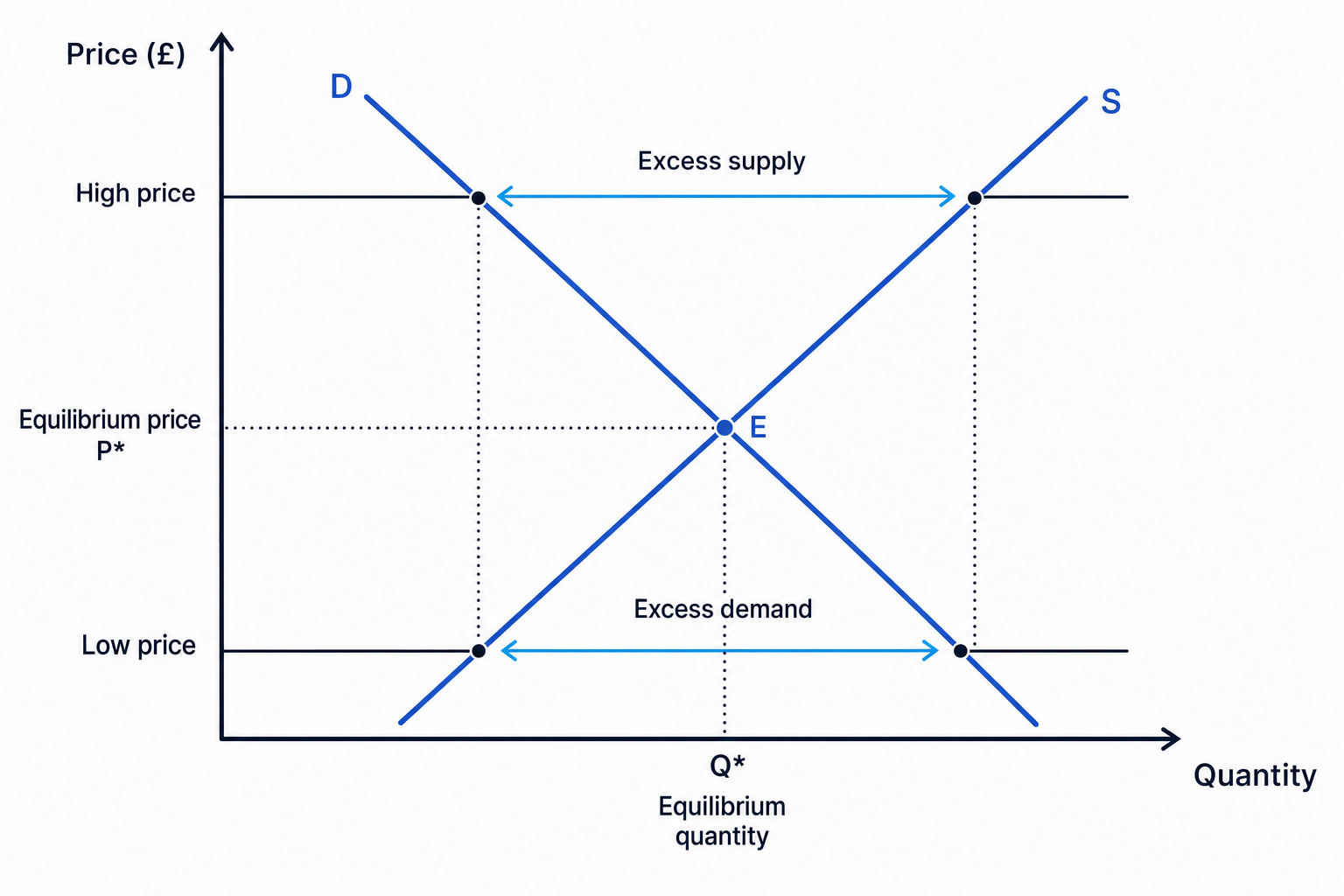
The equilibrium price is the market price where quantity demanded equals quantity supplied. On a diagram, it is found where the demand curve and supply curve intersect.
On the diagram, the equilibrium is point E, where demand and supply cross. The dotted lines show the equilibrium price and quantity.
Why the price moves towards equilibrium
If the price is below equilibrium, quantity demanded is greater than quantity supplied. This creates excess demand, also called a shortage. Some consumers cannot get the product, so firms may raise prices.
If the price is above equilibrium, quantity supplied is greater than quantity demanded. This creates excess supply, also called a surplus. Firms may have unsold stock, so they may cut prices to encourage sales.
The market-clearing idea
Prices tend to move towards equilibrium because shortages put upward pressure on price, while surpluses put downward pressure on price.
Finding equilibrium from market data
A small market for takeaway lunches has these planned quantities per day:
- At £2: quantity demanded is 1,200 lunches, quantity supplied is 600 lunches.
- At £3: quantity demanded is 900 lunches, quantity supplied is 900 lunches.
- At £4: quantity demanded is 600 lunches, quantity supplied is 1,200 lunches.
-
Compare quantity demanded and quantity supplied at each price. At £3, both are 900 lunches, so this is the only price where the two sides match.
-
Identify the equilibrium. The equilibrium price is £3 and the equilibrium quantity is 900 lunches per day.
-
Check the pressure at other prices. At £2, demand exceeds supply by 600 lunches, so there is excess demand and price is likely to rise. At £4, supply exceeds demand by 600 lunches, so there is excess supply and price is likely to fall.
Confusing demand with quantity demanded
Demand is the whole curve. Quantity demanded is one amount at one particular price. A change in price causes movement along the demand curve, not a shift of the whole demand curve.
Using diagrams to understand changes in equilibrium market prices
A market diagram is useful because it shows what happens when conditions change.
A movement along a curve happens when the price changes. For example, if coffee becomes cheaper, consumers move along the demand curve and buy more.
A shift of a curve happens when a non-price factor changes. For example, if a heatwave increases the desire for ice cream at every price, the demand curve shifts to the right.
The main shift effects
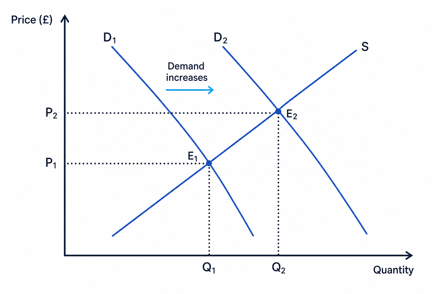
If demand increases, the demand curve shifts right. Equilibrium price rises and equilibrium quantity rises.
If demand decreases, the demand curve shifts left. Equilibrium price falls and equilibrium quantity falls.
If supply increases, the supply curve shifts right. Equilibrium price falls and equilibrium quantity rises.
If supply decreases, the supply curve shifts left. Equilibrium price rises and equilibrium quantity falls.
Here is an increase in demand. The new equilibrium moves from E1 to E2, with a higher price and a higher quantity.
Explaining an increase in demand
During the early COVID-19 period, demand for supermarket delivery slots increased because more households wanted groceries delivered rather than shopping in store.
-
Identify the curve that changes. Consumers want more delivery slots at each possible price, so the demand curve shifts right from D1 to D2.
-
Compare the old and new equilibrium. With supply initially limited by vans, drivers and warehouse capacity, the new intersection is at a higher price and a higher quantity.
-
Explain the market pressure. At the old price, there would be excess demand for delivery slots, so supermarkets could increase delivery charges, minimum spends, or expand capacity over time.
Applying the model to real markets
You can use the same diagram for many markets, as long as you label the price and quantity clearly.
For example:
- In the UK rental housing market, strong demand in some cities and limited supply can push rents upwards.
- In food markets during 2022–23, higher energy, transport and fertiliser costs reduced supply or increased production costs, contributing to higher supermarket prices.
- In the used car market after COVID-19, shortages of new cars encouraged more buyers to look for used cars, increasing demand and prices.
- In a labour market, the price is the wage rate and the quantity is the number of workers or hours of labour.
Real-world application
A strong answer names the market, identifies which curve shifts, explains why it shifts, and then states the effect on equilibrium price and quantity.
Markets are not always perfectly free
Some prices are affected by government rules, contracts, taxes, subsidies or price caps. For example, UK household energy bills in 2022–23 were affected by wholesale energy costs and government intervention, not just a simple free-market equilibrium.
Prices also raise moral and ethical questions. If demand for essentials such as food, medicine or energy rises sharply, producers may have the ability to charge higher prices. This can improve profits and encourage more supply, but it can also worsen the cost-of-living squeeze for low-income households.
3.1.3.3 Demonstrating revenue on a demand and supply diagram
Revenue is the money a producer receives from selling goods or services before costs are subtracted.
Total revenue is calculated as:
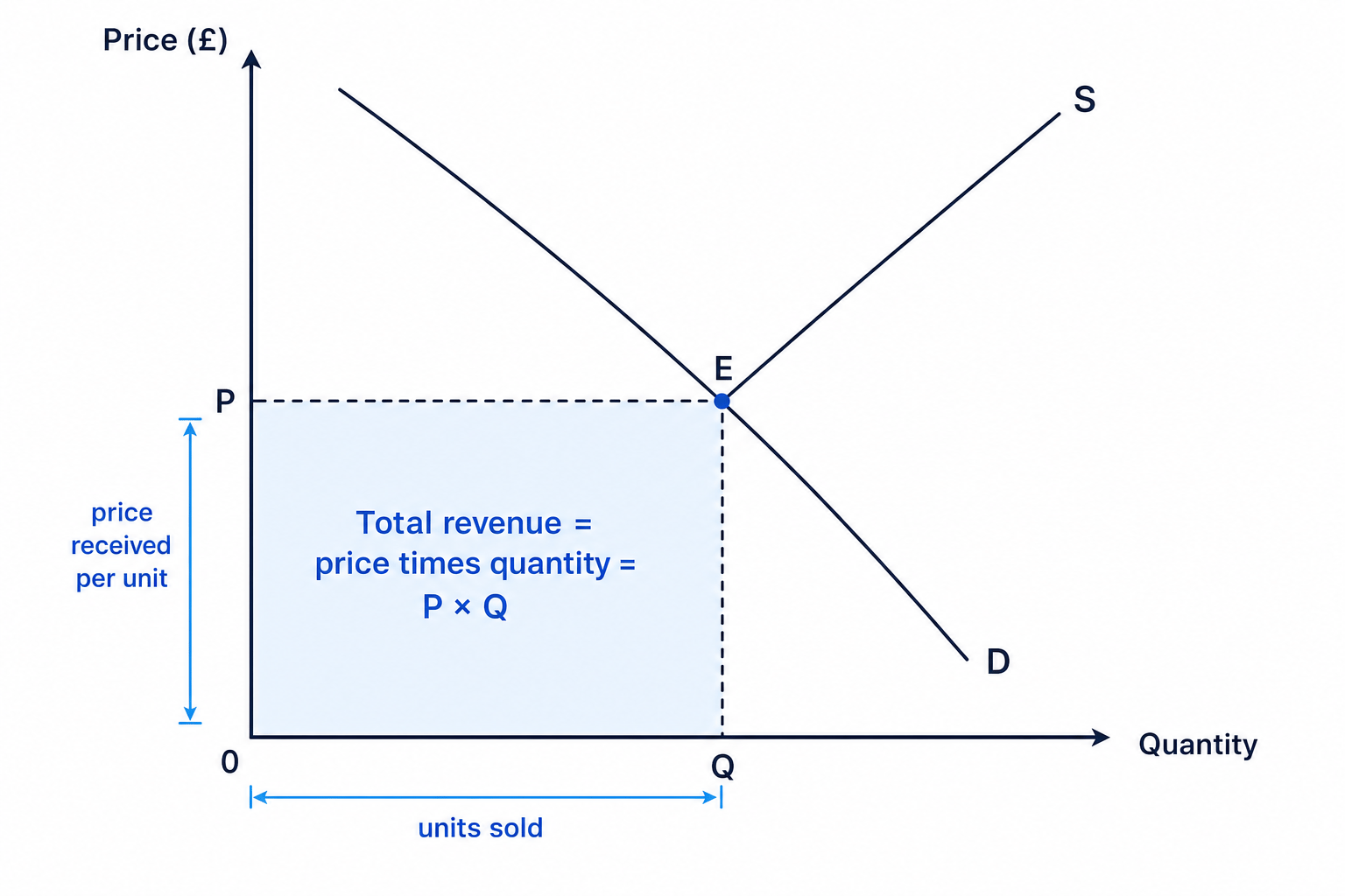
TR=P×QTR = P \times QTR=P×Qwhere TRTRTR is total revenue, PPP is price, and QQQ is quantity sold.
On a supply and demand diagram, total revenue is shown as a rectangle. The height of the rectangle is the price, and the width is the quantity sold. The area of the rectangle represents price times quantity.
Calculating revenue from the rectangle
A bakery sells 800 pastries per day at the equilibrium price of £2.50.
-
Identify the two values from the diagram or information. Price is £2.50 per pastry and quantity is 800 pastries per day.
-
Substitute into the revenue formula.
- Interpret the answer. The bakery’s total revenue is £2,000 per day before costs such as ingredients, wages, rent and electricity are deducted.
Revenue is not profit
Revenue is money received from sales. Profit is what remains after costs are subtracted: total revenue minus total costs.
If the equilibrium price or quantity changes, the revenue rectangle may get larger or smaller. For example, if demand for a product rises and both price and quantity increase, total revenue is likely to rise. But if price rises and quantity falls, you need to calculate carefully before deciding what happens to revenue.
In the exam
-
Draw diagrams carefully: price on the vertical axis, quantity on the horizontal axis, demand sloping down and supply sloping up.
-
For a change in the market, decide whether it is a movement along a curve or a shift of the whole curve.
-
Label the old and new equilibrium clearly, then explain the effect on price and quantity.
-
If asked about revenue, use price times quantity and show it as the rectangle under the equilibrium price across to the equilibrium quantity.
Check yourself
- What happens to price when there is excess demand in a market?
- How would a fall in production costs affect the supply curve and equilibrium price?
- How do you show total revenue on a supply and demand diagram?

