What you'll learn
- How to organise raw psychological data into frequency tables.
- How to choose and construct bar charts, histograms, line graphs, pie charts and scatter diagrams.
- How to interpret normal, positively skewed and negatively skewed distributions.
- How to avoid common exam mistakes when describing graphs in Component 2.
Why graphs matter in psychology
In psychology, you often collect lots of data: reaction times, questionnaire scores, memory test scores, observations of behaviour, or category choices. Graphs help you summarise patterns so that findings can be understood quickly.
Graphs are part of descriptive statistics: they describe what the data look like. They do not prove whether a result is statistically significant. For significance, you would need an inferential test, such as Spearman’s rho for a correlation or Mann-Whitney U for an unrelated-groups difference.
Graphs describe patterns
A graph can show a trend, difference, relationship or distribution, but it does not by itself prove that the finding is significant at a level such as p≤0.05p \le 0.05p≤0.05.
Starting point: raw data and frequency
Raw data
Raw data are the original scores or observations collected in a study before they have been organised, summarised or analysed.
For example, if you ran a practical investigation into memory, your raw data might be each participant’s recall score out of 20.
Frequency
Frequency means how often something occurs. In a dataset, it is the number of times a score, category or interval appears.
A frequency table organises data by showing each score or category alongside its frequency.
Frequency tables
Frequency tables are useful when you need to tidy data before drawing a graph. They are especially helpful for:
- questionnaire response categories, such as “agree”, “neutral”, “disagree”
- observation categories, such as “verbal aggression” or “physical aggression”
- test scores, such as memory scores from 0 to 10
- grouped score intervals, such as 0–4, 5–9, 10–14
Constructing a frequency table
A researcher records the number of words recalled by 12 participants: 4, 7, 5, 4, 8, 7, 6, 4, 5, 7, 9, 6.
- Identify each distinct score: 4, 5, 6, 7, 8 and 9.
- Count how often each score occurs: 4 appears three times, 5 appears twice, 6 appears twice, 7 appears three times, 8 appears once and 9 appears once.
- Check the total frequency: 3 + 2 + 2 + 3 + 1 + 1 = 12, which matches the number of participants.
- Present the table clearly with two columns: “Words recalled” and “Frequency”.
Forgetting to check the total
Always add the frequencies at the end. If the total does not match the number of participants or observations, your table is wrong.
Choosing the right graph
Different graphs are used for different types of data. The choice depends on what you want to show.
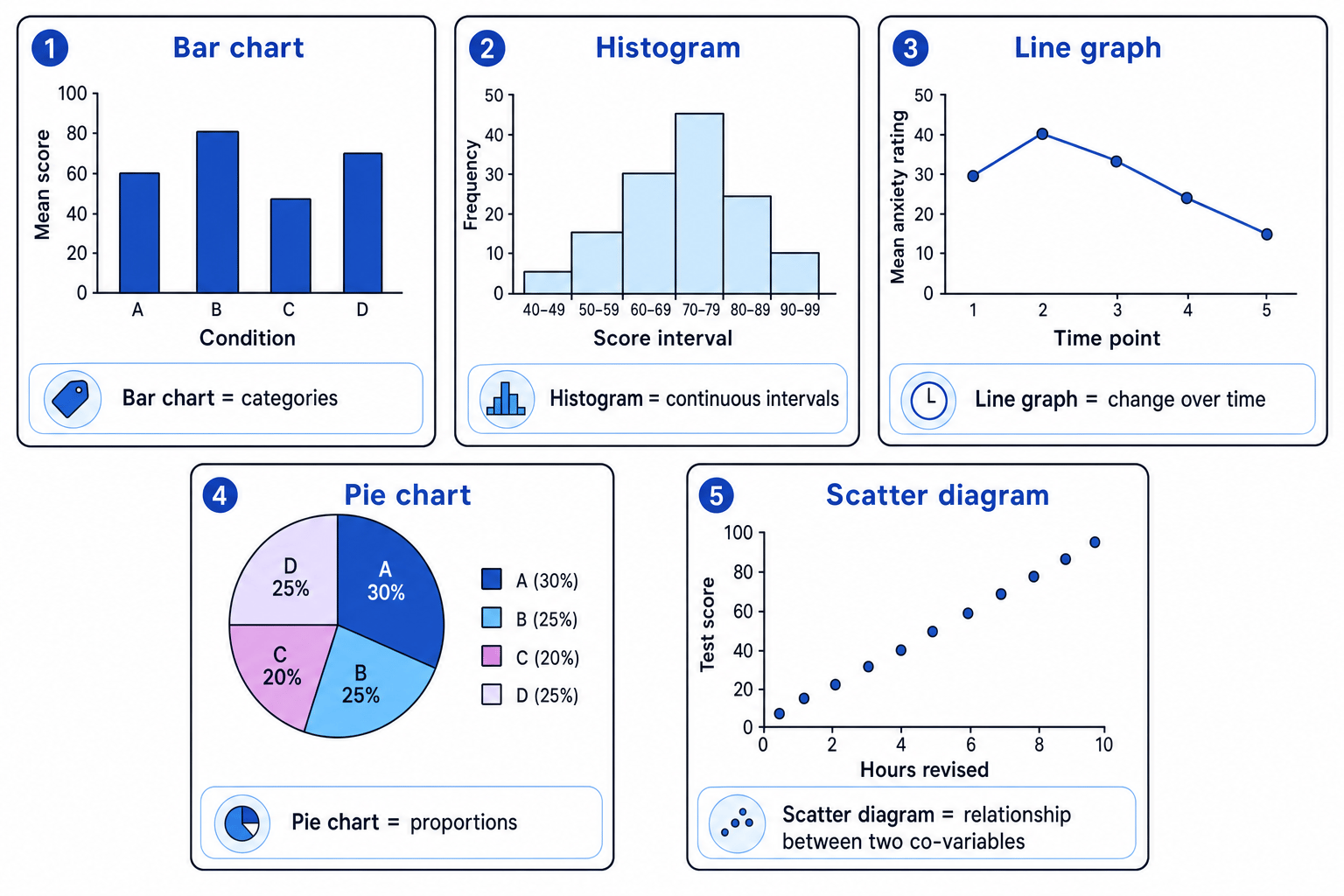
Bar charts
Bar chart
A bar chart displays data in separate bars. It is used for categories or separate conditions, such as different experimental groups.
In psychology, a bar chart is useful when comparing the mean score for different conditions. For example, in a memory experiment, you might compare mean recall in a “quiet room” condition and a “noisy room” condition.
Bar charts have:
- a clear title
- the independent variable or categories on the x-axis
- the dependent variable or frequency on the y-axis
- separate bars with gaps between them
Independent variable and dependent variable
The independent variable is the factor manipulated or compared by the researcher. The dependent variable is the measured outcome.
Choosing a bar chart
A student investigates whether background music affects concentration. One group works in silence, one hears calm music and one hears loud music. The mean concentration scores are compared.
- Identify the x-axis variable: the conditions are separate categories — silence, calm music and loud music.
- Identify the y-axis variable: the measured outcome is mean concentration score.
- Choose a bar chart because the x-axis contains separate categories, not a continuous scale.
- Draw separate bars with gaps to show that the categories are distinct.
Joining bars in a bar chart
Do not join the bars in a bar chart. Gaps show that the categories or conditions are separate.
Histograms
Histogram
A histogram displays frequencies for continuous data grouped into intervals. The bars touch because the intervals form a continuous scale.
A histogram is suitable for data such as:
- age intervals
- reaction time intervals
- questionnaire score intervals
- memory test score bands
The x-axis shows score intervals, and the y-axis shows frequency.
Bar charts and histograms can look similar, but their meaning is different. A bar chart is for categories; a histogram is for continuous grouped scores.
Choosing a histogram
A researcher groups 40 anxiety questionnaire scores into intervals: 0–9, 10–19, 20–29, 30–39 and 40–49.
- Decide whether the x-axis is categorical or continuous: anxiety score is numerical and runs along a continuous scale.
- Check whether the data are grouped into intervals: each bar represents a score band, such as 10–19.
- Choose a histogram because the intervals are continuous.
- Draw the bars touching to show that the score intervals connect with no category gaps.
Line graphs
Line graph
A line graph shows change across a continuous variable, most often time. Points are plotted and joined to show a trend.
Line graphs are useful for repeated measurements, such as stress ratings taken across several weeks, or sleep quality measured before and after an intervention.
A line graph should not usually be used just because there are several conditions. It is best when the x-axis has a meaningful order.
When to use a line graph
Use a line graph when “movement” across the x-axis matters, such as time, age, trial number or session number.
Pie charts
Pie chart
A pie chart shows how a whole is divided into proportions or percentages. Each slice represents part of the total.
Pie charts are good for simple category data, such as the percentage of participants choosing each response option.
To construct a pie chart, convert each frequency into a slice angle:
slice angle=category frequencytotal frequency×360\text{slice angle} = \frac{\text{category frequency}}{\text{total frequency}} \times 360slice angle=total frequencycategory frequency×360Calculating pie chart angles
A questionnaire asks 20 participants which coping strategy they use most: exercise = 8, talking to friends = 6, music = 4, other = 2.
- Use the formula for each category: divide the category frequency by the total frequency, then multiply by 360.
- Calculate exercise: 820×360=144∘\frac{8}{20} \times 360 = 144^\circ208×360=144∘.
- Calculate talking to friends: 620×360=108∘\frac{6}{20} \times 360 = 108^\circ206×360=108∘.
- Calculate music and other: 420×360=72∘\frac{4}{20} \times 360 = 72^\circ204×360=72∘ and 220×360=36∘\frac{2}{20} \times 360 = 36^\circ202×360=36∘.
- Check the angles total 360 degrees: 144 + 108 + 72 + 36 = 360.
Scatter diagrams
Scatter diagram
A scatter diagram shows the relationship between two co-variables. Each dot represents one participant’s pair of scores.
Co-variable
A co-variable is one of the two measured variables in a correlation. Neither variable is manipulated by the researcher.
Scatter diagrams are used in correlational research. For example, you might plot hours of sleep against concentration score.
Patterns can show:
- positive correlation: as one variable increases, the other tends to increase
- negative correlation: as one variable increases, the other tends to decrease
- no correlation: there is no clear pattern
A scatter diagram links naturally to Spearman’s rho, the inferential test used for a correlation with ordinal data or when assumptions for Pearson’s are not met.
Interpreting a scatter diagram
A scatter diagram shows that participants who report more hours of revision tend to achieve higher test scores.
- Identify the two co-variables: hours of revision and test score.
- Look at the direction of the pattern: the points generally rise from left to right.
- Interpret this as a positive correlation because higher revision hours are associated with higher test scores.
- Avoid claiming causation because the researcher has not manipulated revision hours and other variables may be involved.
Correlation is not causation
A scatter diagram can show an association, but it cannot prove that one variable caused the other.
Distribution curves
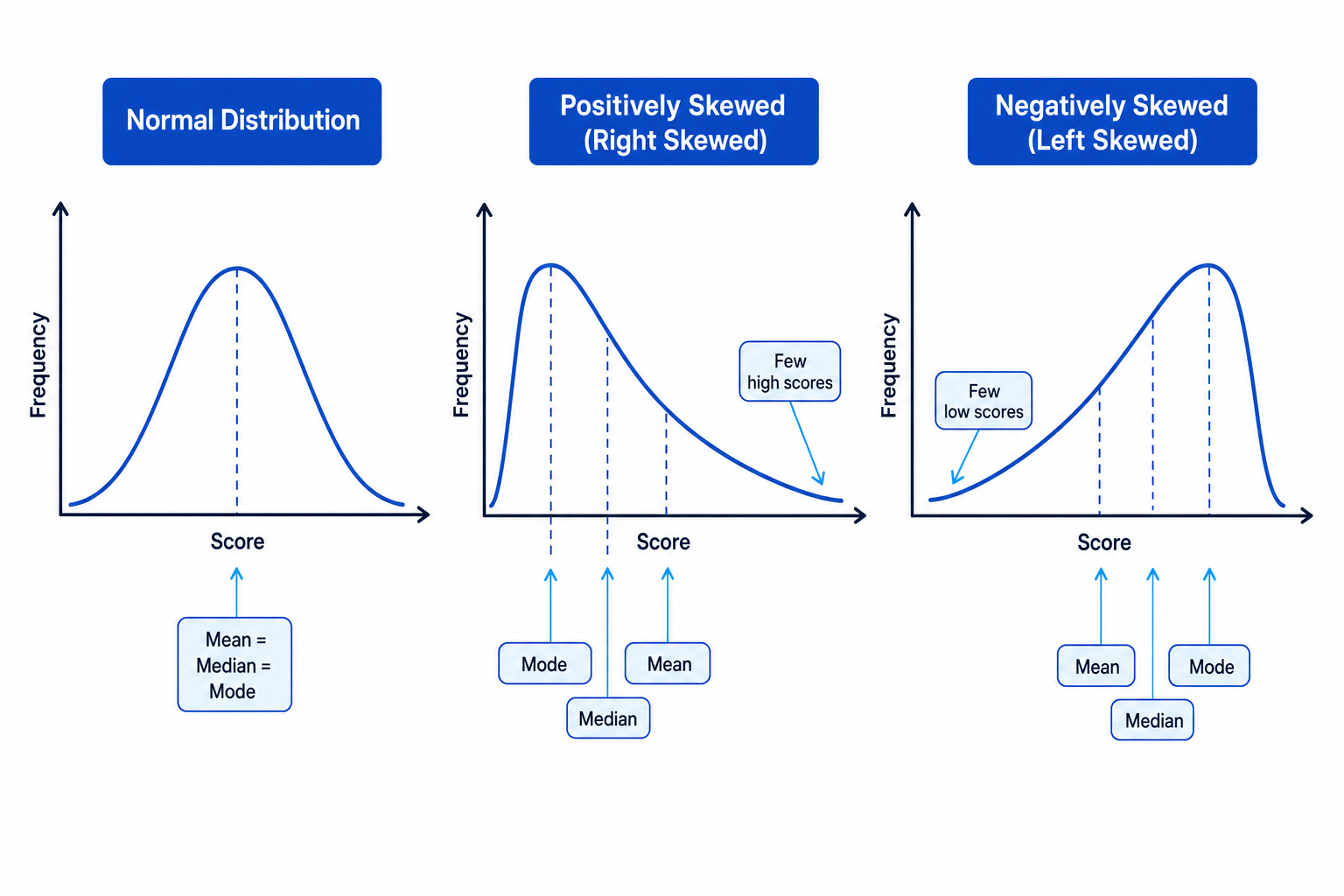
A distribution is the pattern of scores in a dataset. Distribution curves help you see whether scores are balanced, clustered, or affected by extreme values.
Normal distribution
Normal distribution
A normal distribution is a symmetrical bell-shaped distribution where most scores cluster around the centre and fewer scores appear at the extremes.
In a normal distribution:
- the mean, median and mode are in the same central position
- the left and right sides are roughly mirror images
- many psychological characteristics, such as some test scores, are often treated as approximately normal
A normal distribution matters because some statistical tests, such as related and unrelated t-tests, assume interval-level data that are approximately normally distributed.
Positive skew
Positive skew
A positively skewed distribution has a long tail to the right, meaning there are a few unusually high scores.
In a positive skew, the typical order is:
mode, then median, then mean.
The mean is pulled in the direction of the extreme high scores.
For example, if most participants score low on an anxiety scale but a few score very highly, the distribution may be positively skewed.
Negative skew
Negative skew
A negatively skewed distribution has a long tail to the left, meaning there are a few unusually low scores.
In a negative skew, the typical order is:
mean, then median, then mode.
The mean is pulled towards the extreme low scores.
For example, if most participants score very highly on an easy memory test but a few score much lower, the distribution may be negatively skewed.
Remembering skew direction
The skew is named after the tail, not the tallest part. A positive skew has its tail on the positive/right side; a negative skew has its tail on the negative/left side.
Interpreting graphs well
When you interpret a graph, do not just describe what you can see. Link the pattern back to the research question.
For example, if a bar chart shows higher mean recall in the silent condition than the noisy condition, you could say this suggests noise may reduce recall. However, you should also consider sample size, spread of scores, outliers and whether an inferential test supports the difference.
Good interpretation
A strong interpretation describes the pattern, uses data from the graph, and makes a cautious conclusion linked to the aim or hypothesis.
Application to psychology studies and practical work
In Component 2, you may be asked to construct or interpret graphs from a novel scenario or your own practical investigation. You can also apply graphing to named research. For example, data from Loftus and Palmer (1974) could be shown in a bar chart comparing mean speed estimates for different verb conditions.
Graphs are also useful in AO3 evaluation. A clear graph improves communication of findings and makes patterns easier to inspect. However, graphs can mislead if axes are distorted, categories are unclear, or the wrong graph type is chosen.
Ethics when collecting data for graphs
If you collect data for a practical investigation, you must follow the BPS Code of Ethics and Conduct. This includes informed consent, protection from harm, confidentiality, right to withdraw, and debriefing. If deception is used, it must be justified and followed by a full debrief.
Graphs can hide ethical issues
A tidy graph does not make a study ethical. Always consider how the data were collected, especially if sensitive topics, deception or vulnerable participants were involved.
Quick graph-choice guide
- Use a frequency table to organise raw counts.
- Use a bar chart for separate categories or conditions.
- Use a histogram for continuous scores grouped into intervals.
- Use a line graph for change over time or another ordered continuous variable.
- Use a pie chart for proportions of a whole.
- Use a scatter diagram for relationships between two co-variables.
- Use a distribution curve to show the overall shape of scores.
In the exam
- Choose the graph based on the data type: categories need a bar chart, continuous intervals need a histogram, and two co-variables need a scatter diagram.
- Label both axes fully and give the graph a clear title; include units or score scales where relevant.
- When interpreting, describe the pattern using evidence from the graph, then make a cautious psychological conclusion.
Check yourself
- Why do the bars touch in a histogram but not in a bar chart?
- What graph would you choose to show the relationship between stress score and hours of sleep?
- In a positively skewed distribution, where is the tail and what happens to the mean?
