Question 1
The partially completed box plot shows the distribution of average temperatures at Heathrow in 2015.
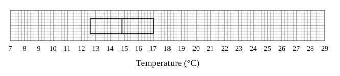
An outlier is defined as a value more than 1.5×IQR1.5 \times \text{IQR}1.5×IQR below Q1 Q_1\,Q1 or more than 1.5×IQR1.5 \times \text{IQR}1.5×IQR above Q3Q_3Q3. The lowest temperature was 8.4∘C8.4^\circ\text{C}8.4∘C and the highest two temperatures were 22.2∘C22.2^\circ\text{C}22.2∘C and 27.8∘C27.8^\circ\text{C}27.8∘C.
Complete the box plot showing clearly any outliers.
Representations of Data Questions
160 exam-style questions on Edexcel A Level Maths Representations of Data, covering 3.1 Outliers, 3.2 Box Plots, 3.3 Cumulative Frequency, 3.4 Histograms, and 3.5 Comparing Data. Each one has a worked solution and a mark scheme showing where the marks go.