Question 5
The scatter diagram below shows the fuel economy, in miles per gallon, and the CO2 _2\,2 emission, in g/km, of 22 petrol cars.
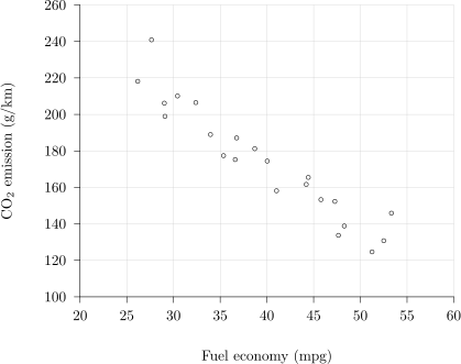
Identify the correlation shown by the diagram.
Tick one box.
Strong positive correlation
Strong negative correlation
Weak positive correlation
No correlation
2.2.2 Scatter diagrams and correlation Questions
157 exam-style questions on AQA A Level Maths 2.2.2 Scatter diagrams and correlation. Each one has a worked solution and a mark scheme showing where the marks go.