Question 11
The scatter diagram below shows the fuel economy, in miles per gallon, and the CO2 _2\,2 emission, in g/km, of 22 petrol cars.
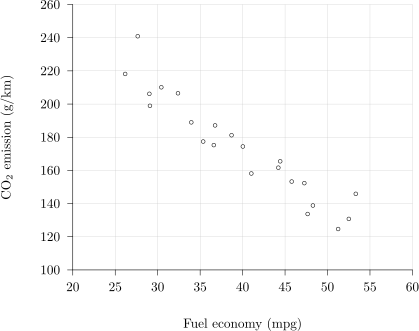
Identify the correlation shown by the diagram.
Tick one box.
Strong positive correlation
Strong negative correlation
Weak positive correlation
No correlation
2.2 L: Data presentation and interpretation Questions
244 exam-style questions on AQA A Level Maths 2.2 L: Data presentation and interpretation, covering 2.2.1 Single-variable data diagrams, 2.2.2 Scatter diagrams and correlation, 2.2.3 Central tendency, variation and standard deviation, 2.2.4 Outliers and cleaning data, and 2.2 L: Data presentation and interpretation. Each one has a worked solution and a mark scheme showing where the marks go.