Question 36
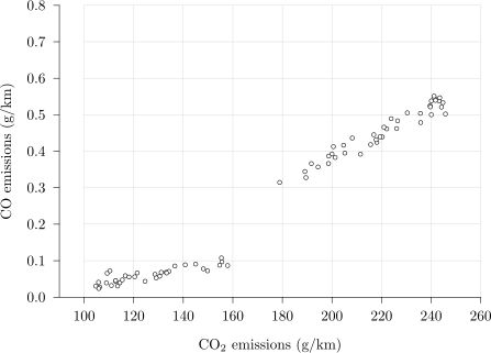
The scatter diagram below shows the CO emissions and the CO2 _2\,2 emissions, both in g/km, of 74 cars taken from the Large Data Set.
a.[1]
Describe the correlation between CO emissions and CO2 _2\,2 emissions for the cars in the lower left group.
b.[2]
The 74 cars form two clearly separate groups. State which variable in the Large Data Set these two groups correspond to, and state which group is which.
c.[1]
Kofi says that the diagram shows that a higher CO2 _2\,2 emission causes a higher CO emission. Comment on Kofi's statement.
2.2 L: Data presentation and interpretation Questions
244 exam-style questions on AQA A Level Maths 2.2 L: Data presentation and interpretation, covering 2.2.1 Single-variable data diagrams, 2.2.2 Scatter diagrams and correlation, 2.2.3 Central tendency, variation and standard deviation, 2.2.4 Outliers and cleaning data, and 2.2 L: Data presentation and interpretation. Each one has a worked solution and a mark scheme showing where the marks go.