Revision notes for CIE IGCSE Maths Cumulative Frequency. Open the guide for explanations and worked examples. Written against the CIE IGCSE Maths (0580) specification, so the content matches what's examinable rather than general Maths background.
Cumulative Frequency
What you'll learn
- How to build a cumulative frequency table from grouped data.
- How to draw a cumulative frequency graph using upper bounds.
- How to estimate the median, quartiles and interquartile range.
- How cumulative frequency connects to box plots.
1. The starting point: grouped frequency tables
Before cumulative frequency, you need to be comfortable with grouped data.
Grouped data is data collected into intervals, such as times, lengths, heights or scores.
For example, the class 10<t≤2010 < t \le 2010<t≤20 means:
- the value is greater than 10
- the value is less than or equal to 20
So a time of exactly 20 seconds belongs in this group, but a time of exactly 10 seconds does not.
Definition
Class interval and upper bound
- A class interval is a group such as 10<t≤2010 < t \le 2010<t≤20.
- The upper bound is the top end of the interval. For 10<t≤2010 < t \le 2010<t≤20, the upper bound is 20.
- On a cumulative frequency graph, you plot the upper bound against the cumulative frequency.
Example
Identifying the upper bounds
A grouped table records the time, ttt seconds, taken to solve a puzzle:
- 0<t≤100 < t \le 100<t≤10
- 10<t≤2010 < t \le 2010<t≤20
- 20<t≤3020 < t \le 3020<t≤30
- 30<t≤4030 < t \le 4030<t≤40
Find the upper bound for each group.
-
Look at the right-hand end of the first interval, 0<t≤100 < t \le 100<t≤10. The upper bound is 10.
-
For 10<t≤2010 < t \le 2010<t≤20, the upper bound is 20.
-
Continue in the same way: the upper bounds are 10, 20, 30 and 40.
Common Mistake
Plotting the wrong x-values
Do not plot the middle of each group unless the question specifically asks for midpoints. For cumulative frequency graphs, use the upper bounds.
2. What cumulative frequency means
Cumulative frequency means a running total of the frequencies.
Instead of saying how many values are in each group separately, cumulative frequency tells you how many values are up to and including a certain point.
Definition
Cumulative frequency
The cumulative frequency is the total frequency so far as you move down a grouped frequency table.
Key Idea
Running total
Cumulative frequency means “add as you go”. Each new cumulative frequency is the previous cumulative frequency plus the next frequency.
Example
Making a cumulative frequency table
The times taken to finish a task are grouped as follows:
- 0<t≤100 < t \le 100<t≤10: frequency 8
- 10<t≤2010 < t \le 2010<t≤20: frequency 16
- 20<t≤3020 < t \le 3020<t≤30: frequency 23
- 30<t≤4030 < t \le 4030<t≤40: frequency 18
- 40<t≤5040 < t \le 5040<t≤50: frequency 7
Find the cumulative frequencies.
-
Start with the first frequency. The first cumulative frequency is 8.
-
Add the second frequency to the running total:
8+16=248 + 16 = 248+16=24 -
Add the third frequency:
24+23=4724 + 23 = 4724+23=47 -
Add the fourth frequency:
47+18=6547 + 18 = 6547+18=65 -
Add the final frequency:
65+7=7265 + 7 = 7265+7=72 -
So the cumulative frequencies are 8, 24, 47, 65 and 72. The total number of people is 72.
Tip
Final cumulative frequency
The last cumulative frequency should equal the total frequency. If it does not, check your addition.
3. Drawing a cumulative frequency graph
A cumulative frequency graph shows the running total visually.
The horizontal axis usually shows the data values, such as time or height. The vertical axis shows cumulative frequency.
To draw the graph:
- Work out the cumulative frequencies.
- Plot each upper bound against its cumulative frequency.
- Add a starting point at the lowest boundary with cumulative frequency 0.
- Join the points with a smooth increasing curve.
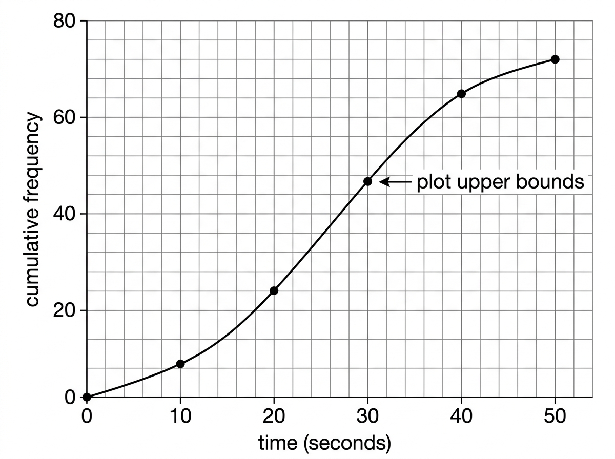
Here is the shape you are aiming for: the graph should always go upwards or stay flat, because cumulative frequency cannot decrease.
Example
Plotting a cumulative frequency graph
Use the cumulative frequencies from the previous example.
-
The first group is 0<t≤100 < t \le 100<t≤10, so plot the point with x-coordinate 10 and cumulative frequency 8.
-
The second group is 10<t≤2010 < t \le 2010<t≤20, so plot the point with x-coordinate 20 and cumulative frequency 24.
-
Continue plotting the points:
(30,47), (40,65), (50,72)(30,47),\ (40,65),\ (50,72)(30,47), (40,65), (50,72) -
Add the starting point at 0 seconds with cumulative frequency 0.
-
Draw a smooth increasing curve through the points, not a jagged bar chart.
Common Mistake
Grouped whole-number data
If classes are written like 10–19, 20–29 for rounded whole-number data, the class boundaries may be 9.5, 19.5, 29.5, and so on. In many IGCSE cumulative frequency questions, the intervals are written clearly using inequalities, so the upper bound is easier to spot.
4. Reading from a cumulative frequency graph
Once you have a cumulative frequency graph, you can estimate values from it.
The key skill is moving across and down:
- Start on the cumulative frequency axis.
- Draw a horizontal line to the curve.
- Draw a vertical line down to the data axis.
You can also estimate how many values are below or above a certain value.
Median and quartiles
The median is the middle value.
The lower quartile, written Q1Q_1Q1, is one quarter of the way through the data.
The upper quartile, written Q3Q_3Q3, is three quarters of the way through the data.
Definition
Quartiles from cumulative frequency
For a total frequency of nnn:
- lower quartile is read at cumulative frequency n4\frac{n}{4}4n
- median is read at cumulative frequency n2\frac{n}{2}2n
- upper quartile is read at cumulative frequency 3n4\frac{3n}{4}43n
Example
Estimating the median and quartiles
A cumulative frequency graph has total frequency 72. Estimate where to read the quartiles.
-
Find the lower quartile position:
724=18\frac{72}{4}=18472=18 -
Find the median position:
722=36\frac{72}{2}=36272=36 -
Find the upper quartile position:
3×724=54\frac{3 \times 72}{4}=5443×72=54 -
On the graph, read the data value at cumulative frequency 18 to estimate Q1Q_1Q1.
-
Read the data value at cumulative frequency 36 to estimate the median.
-
Read the data value at cumulative frequency 54 to estimate Q3Q_3Q3.
Tip
Graph readings are estimates
When reading from a cumulative frequency graph, small differences are normal. Use a ruler, draw clear guide lines, and give sensible estimates.
Estimating frequencies above or below a value
Cumulative frequency tells you how many values are less than or equal to a certain value.
So if a graph shows cumulative frequency 65 at 40 seconds, that means about 65 people took 40 seconds or less.
To find how many took more than 40 seconds, subtract from the total.
Example
Estimating how many values are above a value
A cumulative frequency graph has total frequency 72. At 40 seconds, the cumulative frequency is 65. Estimate how many people took more than 40 seconds.
-
Cumulative frequency 65 means 65 people took 40 seconds or less.
-
Subtract this from the total:
72−65=772 - 65 = 772−65=7 -
So about 7 people took more than 40 seconds.
Common Mistake
Forgetting to subtract
If the question asks for “more than” a value, cumulative frequency does not give the answer directly. It gives “up to that value”, so subtract from the total.
5. Interquartile range
The interquartile range, often called the IQR, measures the spread of the middle half of the data.
It ignores the lowest quarter and highest quarter, so it is less affected by extreme values than the range.
Definition
Interquartile range
The interquartile range is:
IQR=Q3−Q1\text{IQR}=Q_3-Q_1IQR=Q3−Q1Example
Finding the interquartile range
From a cumulative frequency graph, a student estimates:
- lower quartile Q1=16Q_1 = 16Q1=16
- upper quartile Q3=34Q_3 = 34Q3=34
Find the interquartile range.
-
Use the formula IQR=Q3−Q1\text{IQR}=Q_3-Q_1IQR=Q3−Q1.
-
Substitute the two quartiles:
34−16=1834 - 16 = 1834−16=18 -
The interquartile range is 18.
6. Box plots from cumulative frequency
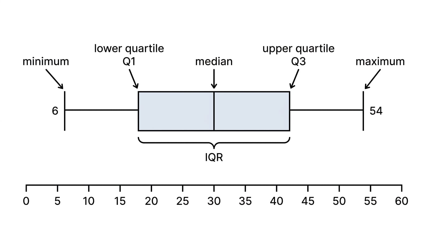
A box plot is a diagram that summarises a set of data using five important values:
- minimum
- lower quartile
- median
- upper quartile
- maximum
The box goes from Q1Q_1Q1 to Q3Q_3Q3, and the line inside the box shows the median. The whiskers go out to the minimum and maximum.
Example
Drawing a box plot from summary values
A data set has:
- minimum 5
- lower quartile 16
- median 25
- upper quartile 34
- maximum 50
Describe how to draw the box plot.
-
Draw a horizontal scale that comfortably includes 5 to 50.
-
Draw a box from 16 to 34.
-
Draw a vertical line inside the box at 25 for the median.
-
Draw a whisker from 16 down to 5.
-
Draw another whisker from 34 up to 50.
7. Comparing box plots
When comparing two box plots, focus on two things:
- Average: compare the medians.
- Spread: compare the ranges or interquartile ranges.
A higher median means the typical value is higher. A smaller IQR means the middle half of the data is more consistent.
Example
Comparing two distributions
Two classes take the same test.
Class A has median 62 and IQR 18.
Class B has median 70 and IQR 10.
Compare the two classes.
-
Compare the medians. Class B has the higher median, so Class B generally scored higher.
-
Compare the IQRs. Class B has the smaller IQR, so Class B’s scores were more consistent in the middle half.
-
A good comparison is: Class B generally scored higher and had less variation in the middle 50% of scores.
Exam technique
In the exam
-
Always plot cumulative frequency against the upper bound of each class interval.
-
Check the final cumulative frequency equals the total frequency before drawing the graph.
-
For quartiles, use n4\frac{n}{4}4n, n2\frac{n}{2}2n and 3n4\frac{3n}{4}43n on the cumulative frequency axis, then read across to the curve and down.
-
When comparing box plots, mention both median and spread.
Self review
Check yourself
- If the class interval is 20<x≤3020 < x \le 3020<x≤30, what x-value do you plot on a cumulative frequency graph?
- Why must a cumulative frequency graph never go downwards?
- If a data set has 80 values, at which cumulative frequencies would you read Q1Q_1Q1, the median and Q3Q_3Q3?

Recap questions
Test yourself with 5 quick questions on this guide. Answer them all correctly to complete it.
You've reached the end
Test yourself on this topic, or move on to the next guide.
How was this guide?