Question 12
Emily drove to the beach. She stayed at the beach and then she drove back home.
Here is Emily's travel graph.
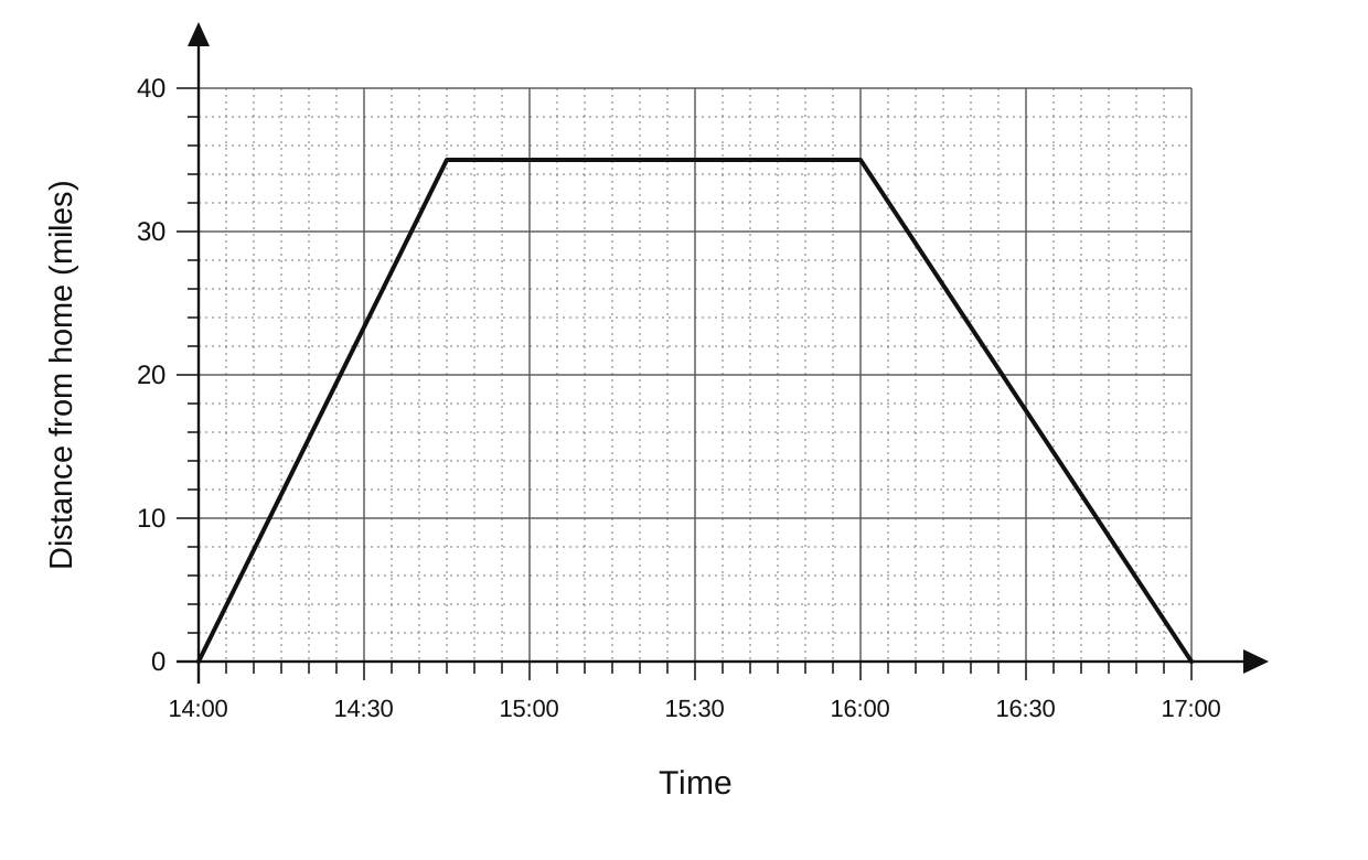
| Time | Distance from home (miles) |
|---|---|
| 14 00 | 0 |
| 14 45 | 35 |
| 16 00 | 35 |
| 17 00 | 0 |
A travel graph showing distance from home (miles) on the y-axis (0 to 40) against time on the x-axis (14 00 to 17 00). The graph consists of three straight line segments: from (14 00, 0) to (14 45, 35), from (14 45, 35) to (16 00, 35), and from (16 00, 35) to (17 00, 0). The y-axis has major grid lines every 10 units and minor grid lines every 2 units. The x-axis has major grid lines every 30 minutes and minor grid lines every 5 minutes.
a.[1]
For how many minutes did Emily stay at the beach?
b.[2]
What was Emily's average speed on her journey to the beach?
Real Life and Distance Time Graphs Questions
17 exam-style questions on Edexcel GCSE Maths Real Life and Distance Time Graphs. Each one has a worked solution and a mark scheme showing where the marks go.