Bar Charts
x

Revision notes for Edexcel GCSE Maths Bar Charts. Open the guide for explanations and worked examples. Written against the Edexcel GCSE Maths (1MA1) specification, so the content matches what's examinable rather than general Maths background.

Bar Charts

What you'll learn

  • How to read values from a bar chart accurately.
  • How to compare bars and find the range.
  • How to use frequency, tally charts, and the mode.
  • How to draw simple and grouped bar charts.

What is a bar chart?

A bar chart is used to show information for categories. Categories are things like months, colours, days of the week, or favourite sports.

Each category has a bar. The height of the bar shows the value.

Definition

Bar chart

A bar chart is a graph with separate bars used to compare amounts in different categories.

The two main parts are:

  • The horizontal axis: usually shows the categories.
  • The vertical axis: usually shows the numbers.
Key Idea

Main idea

The taller the bar, the bigger the value.

Worked example: reading a simple bar chart

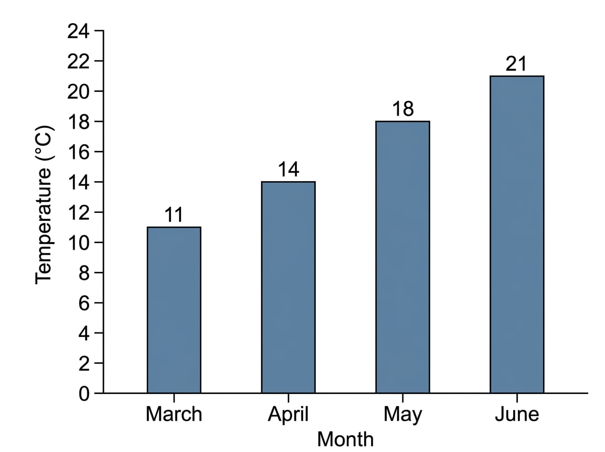
A bar chart shows the average temperatures for four months:

  • March: 11°C
  • April: 14°C
  • May: 18°C
  • June: 21°C

Which month has the highest temperature?

A simple bar chart of monthly temperatures, where June has the tallest bar.

Example

Finding the highest bar

  1. Look at the height of each bar.

  2. Compare the values: 11°C, 14°C, 18°C and 21°C.

  3. The highest value is 21°C.

  4. So the month with the highest temperature is June.

Common Mistake

Reading the wrong axis

Do not read the category names as numbers. The categories are usually along the bottom; the values are usually up the side.

Reading scales carefully

The vertical axis may not go up in ones. It might go up in 2s, 4s, 5s, or 10s.

Before reading a bar, check the scale.

For example, if the labels are 0, 2, 4, 6, 8, then each labelled line goes up by 2.

Tip

Scale check

Always ask: “What does each square or line stand for?” before reading or drawing any bars.

Worked example: completing missing bars

A bar chart shows temperatures from January to September. The missing values are:

  • October: 15°C
  • November: 10°C
  • December: 7°C

The vertical axis goes up in 1s.

A bar chart with the October, November and December bars added to the correct heights using a scale of 1°C per unit.

Example

Adding missing bars

  1. Find October on the horizontal axis.

  2. Draw a bar up to 15°C.

  3. Find November on the horizontal axis.

  4. Draw a bar up to 10°C.

  5. Find December on the horizontal axis.

  6. Draw a bar up to 7°C.

  7. Check that all three bars are the same width as the others.

Finding the range

The range tells you how spread out the data is.

Definition

Range

The range is the biggest value minus the smallest value.

So you need to find:

  • the highest bar
  • the lowest bar
  • the difference between them

Worked example: finding the range from a bar chart

A bar chart shows these temperatures:

  • January: 6°C
  • February: 8°C
  • March: 12°C
  • April: 17°C
  • May: 20°C

Find the range.

A bar chart of temperatures showing the highest value, 20°C, and the lowest value, 6°C, needed for the range.

Example

Range of temperatures

  1. Find the biggest value: 20°C.

  2. Find the smallest value: 6°C.

  3. Subtract the smallest from the biggest:

    20−6=1420 - 6 = 1420−6=14
  4. The range is 14°C.

Common Mistake

Using the first and last bars

The range is not always the last value minus the first value. You must use the biggest and smallest values.

Comparing two bars

Some bar charts show two sets of information for each category. For example, Paula and Rose might both have bars for each day.

This is called a grouped bar chart or a dual bar chart.

Definition

Grouped bar chart

A grouped bar chart shows two or more bars next to each other for each category, so you can compare groups.

There is usually a key to show which bar belongs to which person or group.

Definition

Key

A key explains what the colours, shading, or patterns on the bars mean.

Worked example: comparing distances

A grouped bar chart shows miles run on Monday:

  • Aisha ran 4 miles.
  • Ben ran 7 miles.

How much further did Ben run?

A grouped bar chart comparing Aisha’s and Ben’s miles on Monday, with Ben’s bar higher.

Example

Finding the difference between two bars

  1. Read Aisha’s bar: 4 miles.

  2. Read Ben’s bar: 7 miles.

  3. Subtract the smaller value from the larger value:

    7−4=37 - 4 = 37−4=3
  4. Ben ran 3 miles further.

Worked example: making totals equal

From Monday to Friday, Maya ran 22 miles in total. Liam ran 27 miles in total. Liam will not run on Saturday.

How many miles must Maya run on Saturday so that their totals are the same?

Example

Using totals from a bar chart

  1. Write down Maya’s total so far: 22 miles.

  2. Write down Liam’s total: 27 miles.

  3. Find the difference:

    27−22=527 - 22 = 527−22=5
  4. Maya must run 5 miles on Saturday.

Frequency and mode

Sometimes a bar chart shows how often something happens. This is called the frequency.

Definition

Frequency

The frequency is how many times something happens.

The mode is the most common result. On a frequency bar chart, it is the category with the tallest bar.

Definition

Mode

The mode is the value or category that happens most often.

Worked example: finding the modal number

A football team’s goals per match are shown in a frequency bar chart:

  • 0 goals: 5 matches
  • 1 goal: 9 matches
  • 2 goals: 7 matches
  • 3 goals: 4 matches

What is the modal number of goals?

A frequency bar chart where the tallest bar is at 1 goal, so the modal number of goals is 1.

Example

Finding the mode

  1. Look for the highest frequency.

  2. The highest frequency is 9 matches.

  3. This frequency belongs to 1 goal.

  4. The modal number of goals is 1.

Finding a total from a frequency bar chart

If a bar chart shows frequencies, be careful: the frequency is not always the total amount.

For example, if a team scored 3 goals in 4 matches, that is 12 goals in total from those matches.

Worked example: total goals scored

A football team scored:

  • 0 goals in 3 matches
  • 1 goal in 5 matches
  • 2 goals in 4 matches
  • 3 goals in 2 matches

Work out the total number of goals scored.

A frequency bar chart showing how many matches had 0, 1, 2 or 3 goals, for use in calculating total goals.

Example

Using value times frequency

  1. Multiply each number of goals by its frequency.

  2. For 0 goals:

    0×3=00 \times 3 = 00×3=0
  3. For 1 goal:

    1×5=51 \times 5 = 51×5=5
  4. For 2 goals:

    2×4=82 \times 4 = 82×4=8
  5. For 3 goals:

    3×2=63 \times 2 = 63×2=6
  6. Add the totals:

    0+5+8+6=190 + 5 + 8 + 6 = 190+5+8+6=19
  7. The team scored 19 goals in total.

Common Mistake

Adding only the frequencies

If the question asks for total goals, do not just add the frequencies. The frequencies tell you how many matches, not how many goals.

Tally charts and drawing a bar chart

A tally is a quick way to count items. Tallies are usually grouped in fives.

Definition

Tally

A tally is a counting mark used to record how many times each category appears.

To draw a bar chart from a table:

  1. Put the categories along the horizontal axis.
  2. Put frequency on the vertical axis.
  3. Choose a sensible scale.
  4. Draw bars with equal width.
  5. Leave gaps between the bars.
  6. Label the axes.

Worked example: colours of bikes

A group of students recorded bike colours:

Blue, Red, Blue, Black, Blue, Red, White, Black, Blue, White

Draw a bar chart.

A completed bar chart from the bike colour list, with equal-width bars, gaps and labelled axes.

Example

From list to bar chart

  1. Count each colour.

  2. The frequencies are:

    • Black: 2
    • Blue: 4
    • Red: 2
    • White: 2
  3. Put the colours along the horizontal axis.

  4. Put frequency on the vertical axis, starting at 0.

  5. Draw a bar of height 2 for Black.

  6. Draw a bar of height 4 for Blue.

  7. Draw a bar of height 2 for Red.

  8. Draw a bar of height 2 for White.

  9. Add labels: “Colour” on the horizontal axis and “Frequency” on the vertical axis.

Tip

Bar chart checklist

Bars in a bar chart should have equal widths, clear gaps, labelled axes, and a sensible scale.

Spotting mistakes in bar charts

Sometimes you may be asked to say what is wrong with a graph.

Common problems include:

  • no title
  • missing axis labels
  • no key for grouped bars
  • uneven bar widths
  • missing gaps between bars
  • vertical scale not going up evenly
  • bars drawn to the wrong height

Worked example: finding errors

A grouped bar chart shows Maths and English scores for five students. The chart has no key, the vertical scale goes 0, 5, 12, 20, 30, and some bars touch each other.

Write down three things wrong with the graph.

An intentionally faulty grouped bar chart showing the common errors: no key, uneven vertical scale and some bars touching.

Example

Identifying graph mistakes

  1. Check whether the graph explains which bar is which. There is no key, so that is one mistake.

  2. Check the vertical scale. It does not go up evenly, so that is another mistake.

  3. Check the bars. Some bars touch each other, but bar charts should have gaps between categories.

  4. Three possible answers are: no key, uneven scale, and bars touching.

Exam technique

In the exam

  1. Read the scale before reading any bars.

  2. Use the key carefully when there are two bars for each category.

  3. For range, use biggest minus smallest.

  4. For total from frequency, multiply each value by its frequency first.

  5. When drawing, label both axes and keep bar widths equal.

Self review

Check yourself

  • Can you find the highest and lowest bars on a chart?

  • Can you explain the difference between frequency and total?

  • Can you draw a grouped bar chart with a clear key?

Recap questions

Test yourself with 5 quick questions on this guide. Answer them all correctly to complete it.

You've reached the end

Test yourself on this topic, or move on to the next guide.

Practice questionsTake a quick quiz on this topicFlashcardsSelf-test with active recall
Stem and LeafUp next

How was this guide?

Bar Charts Revision Guide

  1. GCSE
  2. /Maths
  3. /Bar Charts