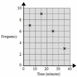
- How to read grouped data from a frequency table.
- How to find the midpoint of each group.
- How to plot points for a frequency polygon.
- How to choose a sensible scale when the axes are blank.
In this topic, the data is usually already sorted into groups. For example, a table might show how many people took between 10 and 20 minutes, between 20 and 30 minutes, and so on.
A letter such as ttt, www or hhh is a variable. It stands for the measurement in the question, such as time, weight or height.
Frequency and class intervals
- Frequency means how many values are in a group.
- A class interval is one range of values, such as 20<t≤3020 < t \leq 3020<t≤30. This means “more than 20, up to and including 30”.
Reading a grouped table
A table about 20 runners gives these groups:

- 15<t≤2015 < t \leq 2015<t≤20: frequency 4
- 20<t≤2520 < t \leq 2520<t≤25: frequency 5
- 25<t≤3025 < t \leq 3025<t≤30: frequency 8
- 30<t≤3530 < t \leq 3530<t≤35: frequency 3
-
The variable ttt stands for time in minutes.
-
The interval 15<t≤2015 < t \leq 2015<t≤20 means times greater than 15 minutes and up to 20 minutes.
-
The frequency 4 means 4 runners were in that first time group.
-
Check the total number of runners by adding the frequencies: 4 + 5 + 8 + 3 = 20.
A frequency polygon uses one point for each class interval. The horizontal position of that point is the middle of the interval.
The two numbers at the ends of a class interval are called the ends or boundaries.
Midpoint
The midpoint is the value halfway between the two ends of a class interval. Find it by adding the two ends and dividing by 2: midpoint=lower end+upper end2\text{midpoint}=\frac{\text{lower end}+\text{upper end}}{2}midpoint=2lower end+upper end.

Finding midpoints for weights
A table about cat weights has these groups:

- 0<w≤10 < w \leq 10<w≤1: frequency 6
- 1<w≤21 < w \leq 21<w≤2: frequency 9
- 2<w≤32 < w \leq 32<w≤3: frequency 18
- 3<w≤43 < w \leq 43<w≤4: frequency 15
- 4<w≤54 < w \leq 54<w≤5: frequency 10
- 5<w≤65 < w \leq 65<w≤6: frequency 7
-
For 0<w≤10 < w \leq 10<w≤1, the midpoint is 0+12=0.5\frac{0+1}{2}=0.520+1=0.5.
-
For 1<w≤21 < w \leq 21<w≤2, the midpoint is 1+22=1.5\frac{1+2}{2}=1.521+2=1.5.
-
Keep going in the same way to get the midpoints: 0.5, 1.5, 2.5, 3.5, 4.5 and 5.5.
-
The frequencies stay the same. You only change each interval into its midpoint.
Plotting the class ends
For the interval 20<t≤3020 < t \leq 3020<t≤30, the midpoint is 25. Do not plot at 20 or 30.
A frequency polygon is drawn on a pair of axes.
Axes and coordinates
- The x-axis is the horizontal axis.
- The y-axis is the vertical axis.
- A coordinate tells you where to plot a point. For a frequency polygon, use: midpoint first, frequency second.
So if a group has midpoint 25 and frequency 18, you plot the point (25, 18).

Plotting travel-time points
A table shows how long people took to travel to an event:

- 0<t≤100 < t \leq 100<t≤10: frequency 12
- 10<t≤2010 < t \leq 2010<t≤20: frequency 16
- 20<t≤3020 < t \leq 3020<t≤30: frequency 23
- 30<t≤4030 < t \leq 4030<t≤40: frequency 28
- 40<t≤5040 < t \leq 5040<t≤50: frequency 13
- 50<t≤6050 < t \leq 6050<t≤60: frequency 8
-
Find the midpoints: 5, 15, 25, 35, 45 and 55.
-
Pair each midpoint with its frequency: (5, 12), (15, 16), (25, 23), (35, 28), (45, 13), (55, 8).
-
The x-axis should show time from 0 to 60 minutes.
-
The y-axis should show frequency from 0 to at least 28.
-
Plot each point carefully on the grid.
Use the grid lines
Check the small grid squares before plotting. For example, if the y-axis goes up in 2s, then frequency 14 is two small squares above 10.
A polygon is a shape made from straight line pieces. A line segment is one straight piece of line between two points.
Frequency polygon
A frequency polygon is a graph made by plotting the midpoint-frequency points, then joining neighbouring points with straight line segments.
The whole method
Find the midpoint, plot the frequency, then join the points with straight lines.
Drawing a frequency polygon for speeds
A table gives these car speed groups:

- 0<s≤200 < s \leq 200<s≤20: frequency 5
- 20<s≤4020 < s \leq 4020<s≤40: frequency 16
- 40<s≤6040 < s \leq 6040<s≤60: frequency 30
- 60<s≤8060 < s \leq 8060<s≤80: frequency 24
- 80<s≤10080 < s \leq 10080<s≤100: frequency 18
- 100<s≤120100 < s \leq 120100<s≤120: frequency 7
-
Find the midpoints: 10, 30, 50, 70, 90 and 110.
-
Make the coordinates: (10, 5), (30, 16), (50, 30), (70, 24), (90, 18), (110, 7).
-
Plot all six points on the grid.
-
Use a ruler to join the points from left to right.
-
Do not draw bars. The straight joined lines are the frequency polygon.
Joining to the origin
Do not draw separate lines from each point to (0, 0). Join each plotted point to the next plotted point.

Sometimes the grid is given, but the numbers are not written on the axes. You must choose a sensible scale.
Scale
A scale is the way numbers increase along an axis, such as going up in 5s, 10s or 20s.
The vertical axis for frequency should usually start at 0. The horizontal axis does not always need to start at 0 if all the data is much larger, such as heights from 140 cm to 190 cm.
Choosing axes for heights
A table gives heights of plants:

- 140<h≤150140 < h \leq 150140<h≤150: frequency 6
- 150<h≤160150 < h \leq 160150<h≤160: frequency 21
- 160<h≤170160 < h \leq 170160<h≤170: frequency 32
- 170<h≤180170 < h \leq 180170<h≤180: frequency 27
- 180<h≤190180 < h \leq 190180<h≤190: frequency 14
-
Label the x-axis Height (cm).
-
Label the y-axis Frequency.
-
Choose an x-axis scale from 140 to 190, going up in 10s.
-
Choose a y-axis scale from 0 to 35, going up in 5s, because the largest frequency is 32.
-
Find the midpoints: 145, 155, 165, 175 and 185.
-
Plot the points: (145, 6), (155, 21), (165, 32), (175, 27), (185, 14).
-
Join the points with straight line segments using a ruler.
Scale sanity check
Before plotting, check that your biggest midpoint and your biggest frequency both fit on the grid.
In the exam
-
Find every midpoint before you start plotting.
-
Check the axes: label the variable and units, and make sure the frequency axis starts at 0.
-
Plot small, accurate points, then join neighbouring points with straight ruler lines.
Check yourself
- What midpoint would you plot for 30<t≤4030 < t \leq 4030<t≤40?
- In a frequency polygon, what goes on the x-axis and what goes on the y-axis?
- If the largest frequency is 29, would a y-axis ending at 20 be suitable?