What you'll learn
- How to understand the five key values used in a box plot.
- How to sketch and label a box plot from a table or from raw data.
- How to compare two box plots using medians and spread.
- How to create a box plot from a cumulative frequency graph.
What a box plot shows
A distribution means the way a set of data values is spread out. A box plot is a compact diagram that shows the main features of a distribution on a number line.
The five-number summary
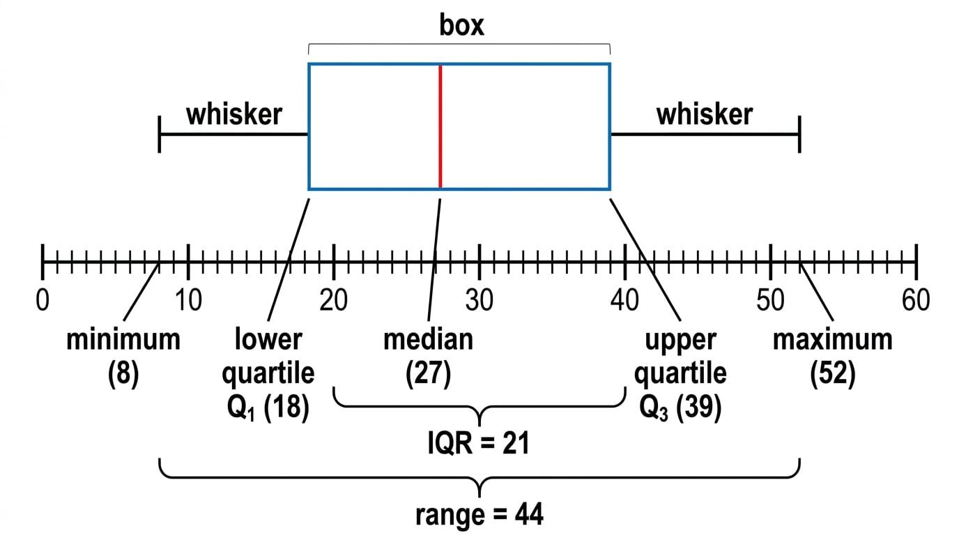
A box plot uses five values:
- Minimum: the smallest value.
- Lower quartile, written Q1Q_1Q1: about 25% of the data is below this value.
- Median, written Q2Q_2Q2: the middle value.
- Upper quartile, written Q3Q_3Q3: about 75% of the data is below this value.
- Maximum: the largest value.
The whiskers are the lines from the box to the minimum and maximum.

Box plots summarise, not detail
A box plot does not show every data value. It shows the centre and spread of the data using the five-number summary.
Reading values from a box plot
A box plot has whiskers at 8 and 52, a box from 18 to 39, and a vertical line inside the box at 27.

-
The whisker ends give the minimum and maximum, so the minimum is 8 and the maximum is 52.
-
The left edge of the box is the lower quartile, so Q1Q_1Q1 is 18.
-
The vertical line inside the box is the median, so the median is 27.
-
The right edge of the box is the upper quartile, so Q3Q_3Q3 is 39.
-
The range is 52 - 8 = 44, and the interquartile range is 39 - 18 = 21.
Range and interquartile range
The range measures the full spread of the data.
The interquartile range, often called the IQR, measures the spread of the middle 50% of the data.
Spread formulas
- The range is found using range=maximum−minimum\text{range}=\text{maximum}-\text{minimum}range=maximum−minimum.
- The interquartile range is found using IQR=Q3−Q1\text{IQR}=Q_3-Q_1IQR=Q3−Q1.
The IQR is often more useful than the range because it ignores the most extreme values.
Sketching a box plot from a table
When the five-number summary is given, your job is to place the five values accurately on a scale.
To draw a box plot:
- Draw a horizontal number line with a sensible scale.
- Mark the minimum, Q1Q_1Q1, median, Q3Q_3Q3, and maximum.
- Draw a box from Q1Q_1Q1 to Q3Q_3Q3.
- Draw a vertical line inside the box at the median.
- Draw whiskers from the box to the minimum and maximum.
Sketching from five values
A set of plant heights has minimum 10 cm, Q1Q_1Q1 26 cm, median 34 cm, Q3Q_3Q3 41 cm, and maximum 54 cm.

-
Draw a horizontal scale from 0 cm to 60 cm.
-
Mark the five values on the scale: 10, 26, 34, 41, and 54.
-
Draw the box from 26 cm to 41 cm.
-
Draw a vertical line inside the box at 34 cm.
-
Draw whiskers from 26 cm back to 10 cm, and from 41 cm up to 54 cm.
Keep the order sensible
The five values must go in order: minimum, Q1Q_1Q1, median, Q3Q_3Q3, maximum. If your values are not in that order, check your calculations.
When one value is missing
Sometimes a table gives the range or IQR instead of one of the five values.
Use the formula backwards.
Finding missing values before drawing
A table for potato weights gives range 96 g, Q1Q_1Q1 109 g, median 132 g, Q3Q_3Q3 160 g, and maximum 183 g.

-
Use the range to find the missing minimum: 183 - 96 = 87.
-
The five values are now minimum 87 g, Q1Q_1Q1 109 g, median 132 g, Q3Q_3Q3 160 g, and maximum 183 g.
-
Draw the box from 109 g to 160 g.
-
Draw the median line at 132 g.
-
Draw whiskers to 87 g and 183 g.
Using the IQR to find a quartile
For some puzzle times, the IQR is 8 minutes, the minimum is 12 minutes, the median is 18 minutes, Q3Q_3Q3 is 23 minutes, and the maximum is 29 minutes.

-
Use IQR=Q3−Q1\text{IQR}=Q_3-Q_1IQR=Q3−Q1.
-
Since 23 - 15 = 8, the lower quartile is 15 minutes.
-
The five values are 12, 15, 18, 23, and 29 minutes.
-
Draw the box from 15 to 23, put the median line at 18, and draw whiskers to 12 and 29.
Forgetting to find the missing value
Do not start drawing if the table gives range or IQR instead of one of the five values. Work out the missing value first.
Finding a box plot from raw data
Sometimes you are given a list of data values.
First, make sure the data is in order from smallest to largest. Then find the median and quartiles.
For an odd number of values:
- The median is the middle value.
- Q1Q_1Q1 is the median of the lower half.
- Q3Q_3Q3 is the median of the upper half.
- Do not include the main median in either half.
Sketching from race times
The race times, in seconds, are already in order:
51, 53, 55, 55, 57, 58, 59, 61, 62, 63, 65, 66, 69, 71, 74

-
There are 15 values, so the median is the 8th value.
-
The 8th value is 61, so the median is 61 seconds.
-
The lower half is the first 7 values: 51, 53, 55, 55, 57, 58, 59. The middle of these is 55, so Q1Q_1Q1 is 55 seconds.
-
The upper half is the last 7 values: 62, 63, 65, 66, 69, 71, 74. The middle of these is 66, so Q3Q_3Q3 is 66 seconds.
-
The minimum is 51 seconds and the maximum is 74 seconds.
-
Draw the box plot using 51, 55, 61, 66, and 74.
Including the median twice
When there is an odd number of data values, do not include the median when finding Q1Q_1Q1 and Q3Q_3Q3.
Comparing two box plots
Comparison questions usually want two things:
- A comparison of the medians, which tells you about the typical value.
- A comparison of the spread, usually using the IQR or range.
Use the context. For test scores, a higher median is better. For race times or puzzle times, a lower median means faster.
Comparing two classes
Class A has minimum 8, Q1Q_1Q1 16, median 21, Q3Q_3Q3 32, maximum 45.
Class B has minimum 12, Q1Q_1Q1 18, median 24, Q3Q_3Q3 30, maximum 43.

-
Compare the medians: Class B has median 24, while Class A has median 21. So Class B generally scored higher.
-
Find the IQR for Class A: 32 - 16 = 16.
-
Find the IQR for Class B: 30 - 18 = 12.
-
Class B has the smaller IQR, so Class B’s scores were more consistent.
-
A good comparison is: Class B generally scored higher and had less spread in the middle 50% of scores.
Use the word ‘median’
Instead of saying “Class B did better”, say “Class B had a higher median score”. That is more precise and earns marks.
From a cumulative frequency graph to a box plot
A cumulative frequency graph shows the running total of values up to a certain point.
To make a box plot from one:
- Find the total frequency, NNN.
- Use N/4N/4N/4 for Q1Q_1Q1.
- Use N/2N/2N/2 for the median.
- Use 3N/43N/43N/4 for Q3Q_3Q3.
- Read across to the curve, then down to the horizontal axis.
Using a cumulative frequency graph
A cumulative frequency graph shows the weights of 60 oranges. The minimum weight is 114 g and the maximum weight is 150 g. From the graph, the readings are about 123 g at cumulative frequency 15, 130 g at cumulative frequency 30, and 137 g at cumulative frequency 45.

-
Let N=60N=60N=60. The quartile positions are:
N4=15,N2=30,3N4=45\frac{N}{4}=15,\quad \frac{N}{2}=30,\quad \frac{3N}{4}=454N=15,2N=30,43N=45 -
Read from cumulative frequency 15 to the curve, then down to the weight axis. This gives Q1Q_1Q1 as about 123 g.
-
Read from cumulative frequency 30. This gives the median as about 130 g.
-
Read from cumulative frequency 45. This gives Q3Q_3Q3 as about 137 g.
-
Use the five values 114, 123, 130, 137, and 150 to sketch the box plot.
Using the wrong axis
For quartiles on a cumulative frequency graph, start on the cumulative frequency axis, not the weight or time axis.
In the exam
-
Write the five values above your scale before drawing the box plot.
-
In comparison questions, make one point about the median and one point about spread.
-
For cumulative frequency graphs, use N/4N/4N/4, N/2N/2N/2, and 3N/43N/43N/4, then read across to the curve and down.
Check yourself
- Can you find the five-number summary from an ordered list of 11 values?
- If the IQR is 8 and Q3Q_3Q3 is 23, can you find Q1Q_1Q1?
- When comparing two box plots, which two features should you mention?