Start with the trend, then the figures
- Say first whether unemployment is rising, falling or steady across the whole period given, before picking out any single month.
- Then quote the figures with their periods, because an unemployment claim with no date attached cannot be checked against anything.
- Name the measure as well, since a Claimant Count level and a survey unemployment rate are not comparable numbers.
- Finish the description with the turning point, because the month the direction changed is usually the one worth explaining.
Read an unemployment chart month by month
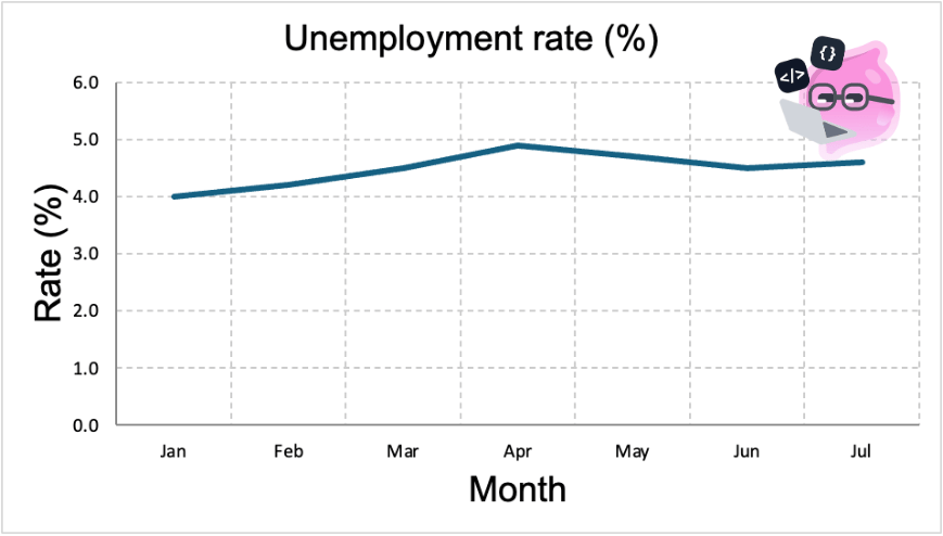
- The vertical axis starts at zero and the whole series sits between 4.0% and 4.9%, so the line looks flat because the movement genuinely is small.
- The rate climbs from 4.0% in January to a peak of 4.9% in April, which is a rise of 0.9 percentage points, not a rise of 0.9%.
- April is the turning point, and after it the rate falls to 4.5% in June before edging back up to 4.6% in July.
- A rate falling after April does not mean unemployment is low, only that it is lower than it was at the peak, and it says nothing about how many people that is.
Note
- A rate and a level answer different questions, so a rise in one alongside a fall in the other is not a contradiction.
Recent UK unemployment has drifted up
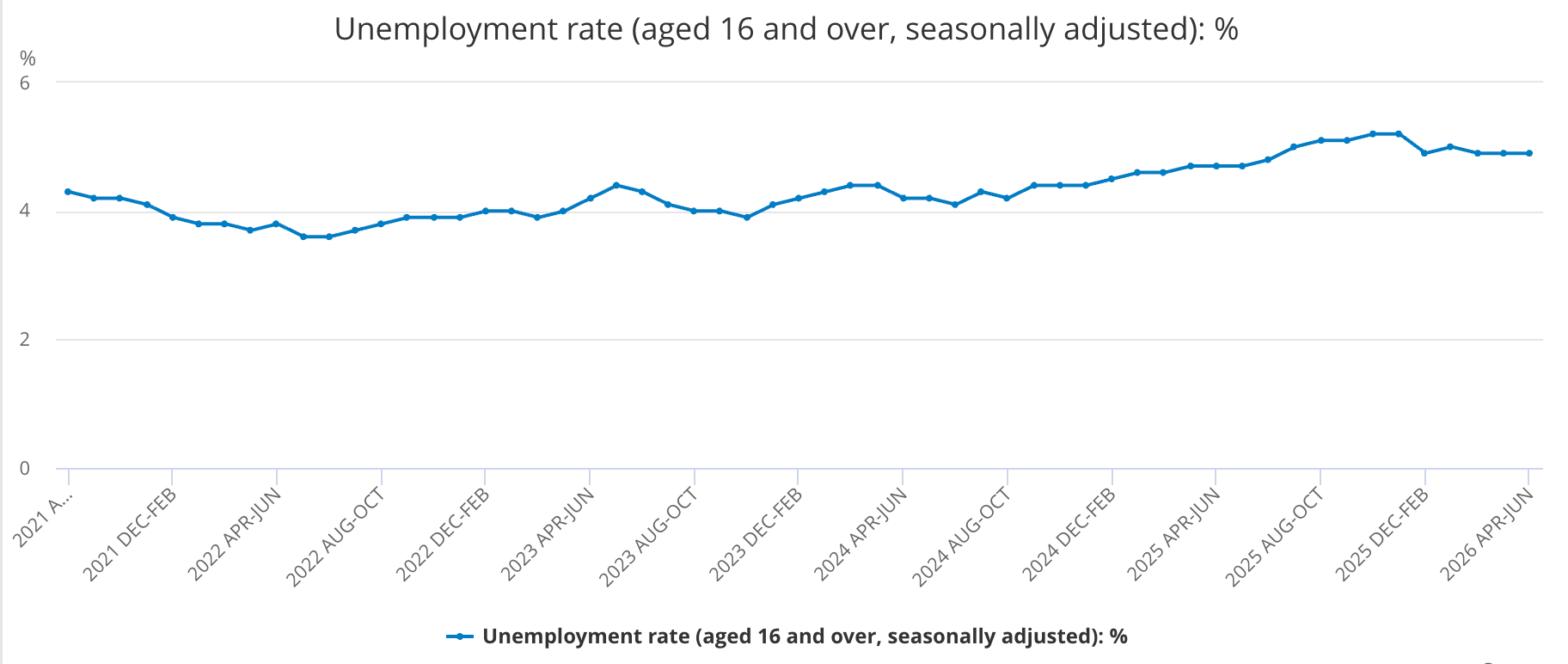
- Each point on this chart covers a rolling three-month period rather than a single month, so neighbouring points share two months of data and the line moves more smoothly than monthly figures would (Source: ONS).
- Read across it and the rate falls to about 3.6% in late 2022, climbs to about 5.2% by the winter of 2025 and eases to about 4.9% by mid-2026, so the recent direction is upward from a low point rather than a sudden jump.
- The rate was 4.9% in April to June 2026, up from 4.7% a year earlier, with 1.772 million people aged 16 and over out of work, a rise of 88,000 over the year (Source: ONS).
- The employment rate slipped to 75.1% over the same period, down 0.2 percentage points on the year, while economic inactivity held at 20.9%.
- The Claimant Count moved the other way, falling on the year to 1.665 million in July 2026, which is why the measure has to be named before any conclusion.
Example
- Put together, those figures say the labour market weakened slightly: a few fewer people in work, and a few more looking and failing to find it.
- The change is small and inactivity barely moved, so this is a drift rather than a collapse.
- One quarter is weak evidence on its own, which is why the year-earlier comparison is quoted next to it.
Historical figures show the scale
- A rate only means something next to earlier ones, so any judgement about 4.9% depends on what the figure used to be.
- In the recession of the early 1980s the UK employment rate fell to around 66%, against 75.1% in April to June 2026, which shows how much deeper that downturn cut into work (Source: ONS).
- Unemployment also rose sharply after the financial crisis of 2008 and again during the coronavirus pandemic in 2020, then fell back each time as the economy recovered.
- The pattern a long series shows is that unemployment climbs in downturns and falls in recoveries, around a level set by longer-term factors.
Common Mistake
- Do not describe a change of a few tenths of a percentage point as a collapse or a boom, because normal quarter-to-quarter movement is that size.
Headline figures hide as much as they show
Definition
Hidden unemployment: people who want work but are not counted as unemployed, such as discouraged workers who have stopped looking.
Underemployment: people who are in work but want more hours, or who are in jobs well below their skill level.
- Both groups make the official rate look better than the labour market really is, because neither of them counts as unemployed.
- Averages hide differences too, since youth unemployment and unemployment in some regions run well above the national rate.
- So a falling rate is not proof of more good jobs, because it can mean people gave up looking or took fewer hours than they wanted.
- A strong reading therefore quotes the figure, names the measure and the period, describes the trend, and then says what the number leaves out.
Self review
- What is the difference between hidden unemployment and underemployment?
- Why must you name the measure before comparing two unemployment figures?
- A rate rises from 4.0% to 4.9%. By how many percentage points has it risen?
- Why might a falling headline rate still hide a weak labour market?
- Why does a chart of rolling three-month periods look smoother than one of single months?
