Start with the direction of the rate
- Say first whether inflation is rising, falling or steady across the whole period shown, before picking out any single month.
- Then keep the rate apart from the price level, because a falling rate still means prices are climbing.
- Quote the figures with their months attached, since an inflation figure always belongs to a stated twelve-month period.
- Name the measure as well, because CPI and CPIH give different numbers for the very same month.
Read an inflation chart against the target
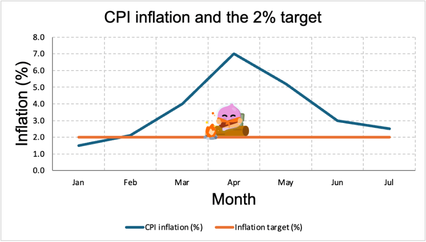
- The rising line is the inflation rate and the flat line is the 2% target, so the vertical gap between them is how far inflation sits from where the Bank of England is aiming (the figures are illustrative).
- The rate climbs from 1.5% in January to a peak of 7.0% in April, which is the turning point, and then falls back to 2.5% by July.
- From April onwards the line drops steeply but stays well above zero, so prices went on rising every month and only rose more slowly, and deflation would need the line to fall below zero, which it never does.
- January is the only month below target, and by April the rate is 5 percentage points above it, which is the figure a question about missing the target is asking for.
Note
- A rise in the rate from 2.6% to 2.9% is an acceleration in price rises, not a jump in the price level itself.
- Contributions tell you which parts of the basket moved, which is what turns a number into an explanation.
Historical figures show the extremes
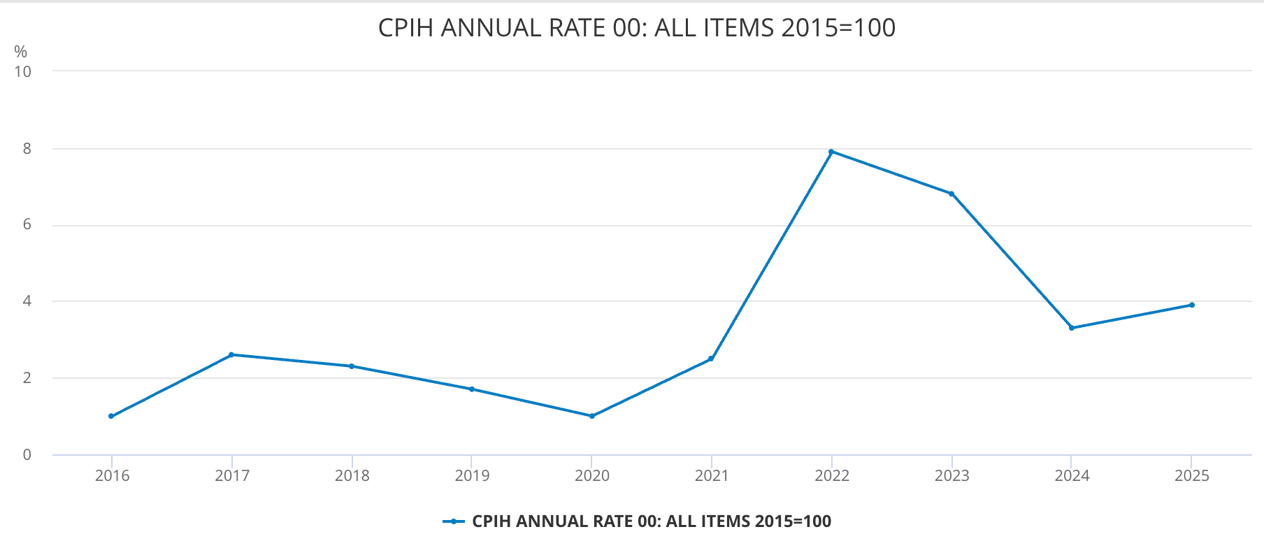
- This chart plots the annual CPIH rate rather than CPI, and OCR asks only about CPI, so it is here to show what a real inflation series looks like over a decade (Source: ONS).
- It runs from 1.0% in 2020 up to 7.9% in 2022 and back down to 3.3% in 2024, so the whole spike and its unwinding fit in one picture, with 3.9% in 2025 showing the rate settling above target rather than at it.
- That 7.9% is an annual average, which is why it sits below the 11.1% monthly peak quoted below, because averaging a year together smooths the highest and lowest months into each other.
- The episodes behind those peaks, in the 1970s and again in 2022, came from cost pressures, energy prices above all, feeding through into the rest of the basket.
- Rates close to zero appeared in the middle of the 2010s, and the price level itself dipped slightly in 2015, which is deflation rather than low inflation.
- Reading history properly means asking what drove each episode, because the cause decides which policy would have worked.
Case study
- UK CPI inflation reached 11.1% in October 2022, its highest for 41 years (Source: ONS).
- The trigger was a sharp rise in gas and electricity prices, which lifted firms' costs right across the economy.
- The rate then fell back over the following two years as energy prices eased, and by July 2026 it was 2.9%.
- That is the lesson for reading inflation data: a falling rate undoes none of the earlier rise in prices, it only slows the next one.
Say what the figures do not show
- A published rate is an average across all households, so one spending heavily on the fastest-rising items faces more than the headline.
- The rate says nothing about whether pay kept up, which is what decides whether people are actually worse off.
- One month is weak evidence on its own, so quote the year-earlier comparison alongside it.
Self review
- What is the difference between the inflation rate and the price level?
- Inflation falls from 7.0% to 2.5%. What has happened to prices?
- Why can CPI and CPIH give different figures for the same month?
- Inflation is 7.0% and the target is 2%. By how many percentage points is the target missed?
- Why does a falling inflation rate not mean prices are coming back down?
