

What you'll learn
- How to turn grouped data into correct class widths.
- How histograms use area, not just height, to represent frequency.
- How to find quartiles, outliers and draw box plots.
- How to compare distributions using centre, spread and outliers.
1. Grouped data and class widths
In statistics, data are often collected in groups called classes or class intervals, such as 10–14 miles or 20–24 minutes.
The frequency is the number of observations in a class.
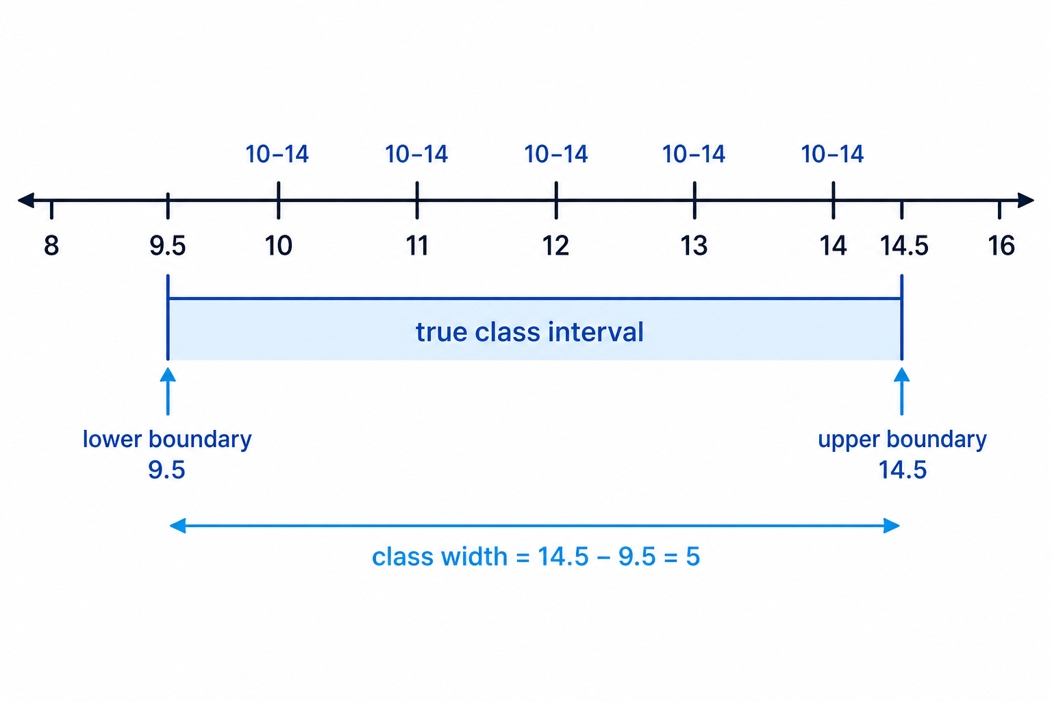
For histograms, the width of a class matters. If data are measured to the nearest whole number, the true class boundaries go halfway between the whole numbers.
For example, a class written as 10–14 actually covers values from 9.5 up to 14.5, so its class width is 5.
Class width
The class width is the size of the interval covered by a class, using the true class boundaries if the data have been rounded.
Finding true class widths
A variable is measured to the nearest whole number. Two classes are 6–10 and 11–18. Find their true class widths.
-
The class 6–10 includes values that round to 6, 7, 8, 9 or 10, so its true boundaries are 5.5 and 10.5.
-
Find the width of the first class:
10.5−5.5=510.5 - 5.5 = 510.5−5.5=5 -
The class 11–18 has true boundaries 10.5 and 18.5.
-
Find the width of the second class:
18.5−10.5=818.5 - 10.5 = 818.5−10.5=8
Counting the labels instead of the interval
For a class like 14–20 measured to the nearest whole number, the class width is 7, not 6. Use boundaries 13.5 and 20.5.
2. Histograms: area represents frequency
A histogram is used for grouped continuous data. Unlike a bar chart, the bars can have different widths, and the key idea is:
frequency=class width×frequency density\text{frequency} = \text{class width} \times \text{frequency density}frequency=class width×frequency densitySo:
frequency density=frequencyclass width\text{frequency density} = \frac{\text{frequency}}{\text{class width}}frequency density=class widthfrequencyThis is why the area of each bar represents the frequency.
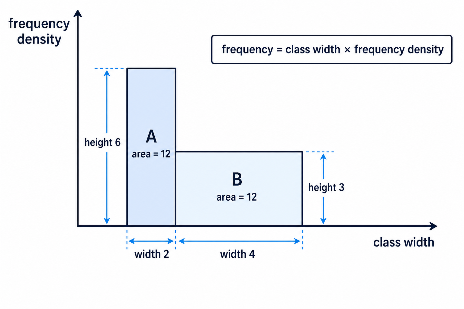
Here is the main idea visually: wider bars need a smaller height if they are to represent the same frequency.
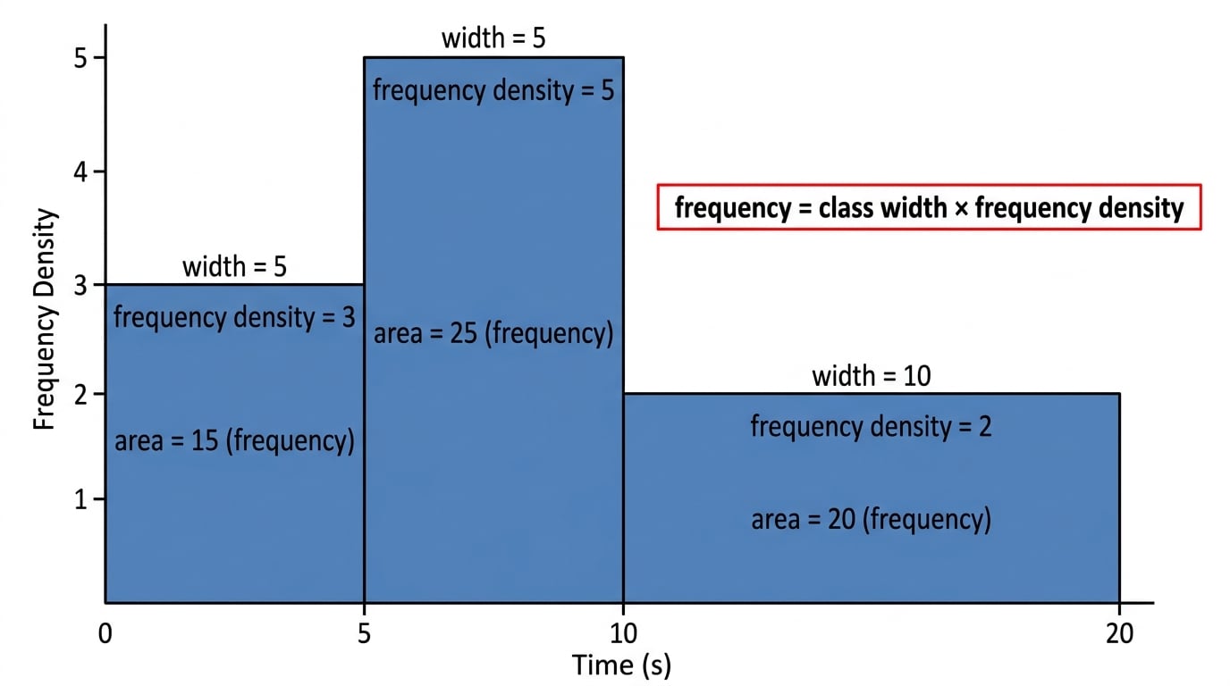
Histogram rule
In a histogram, compare areas, not just heights. A tall narrow bar and a short wide bar can represent the same frequency.
Completing a missing frequency from a histogram
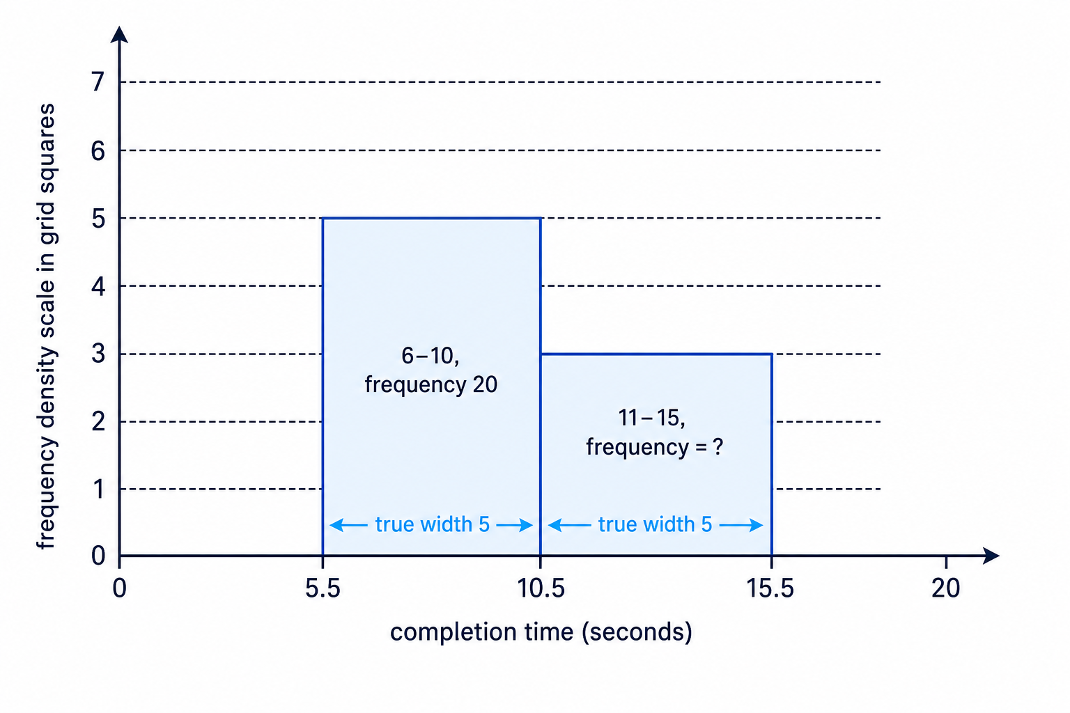
A histogram shows completion times, measured to the nearest second. The class 6–10 has frequency 20 and its bar is 5 grid squares high. The class 11–15 has a bar 3 grid squares high. Find the frequency for 11–15.
-
The class 6–10 has true width 5. Its frequency density is:
205=4\frac{20}{5} = 4520=4 -
A height of 5 grid squares represents a frequency density of 4, so one grid square represents:
45=0.8\frac{4}{5} = 0.854=0.8 -
The bar for 11–15 is 3 grid squares high, so its frequency density is:
3×0.8=2.43 \times 0.8 = 2.43×0.8=2.4 -
The class 11–15 also has width 5, so its frequency is:
2.4×5=122.4 \times 5 = 122.4×5=12
3. Finding bar widths and heights from one given bar
Sometimes you are told the actual width and height of one bar on a drawn histogram. Use it to find the horizontal and vertical scales.
- The horizontal scale links class width to centimetres.
- The vertical scale links frequency density to centimetres.
Finding the width and height of another histogram bar
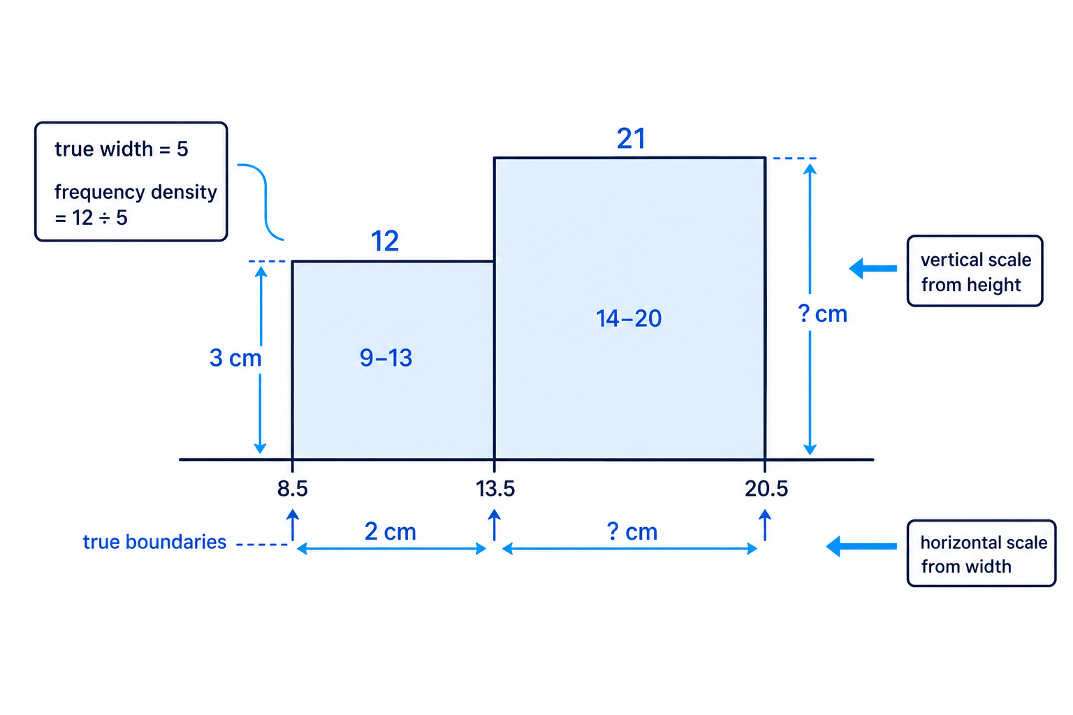
A variable is measured to the nearest whole number. The class 9–13 has frequency 12 and is drawn with width 2 cm and height 3 cm. Find the width and height of the bar for class 14–20, which has frequency 21.
-
Find the true width of 9–13. Its boundaries are 8.5 and 13.5:
13.5−8.5=513.5 - 8.5 = 513.5−8.5=5 -
Since width 5 is drawn as 2 cm, the horizontal scale is:
25=0.4 cm per unit\frac{2}{5} = 0.4 \text{ cm per unit}52=0.4 cm per unit -
The class 14–20 has boundaries 13.5 and 20.5, so its true width is:
20.5−13.5=720.5 - 13.5 = 720.5−13.5=7 -
Therefore its drawn width is:
7×0.4=2.8 cm7 \times 0.4 = 2.8 \text{ cm}7×0.4=2.8 cm -
Now find the frequency density of 9–13:
125=2.4\frac{12}{5} = 2.4512=2.4 -
A frequency density of 2.4 is drawn as height 3 cm, so the vertical scale is:
32.4=1.25 cm per frequency-density unit\frac{3}{2.4} = 1.25 \text{ cm per frequency-density unit}2.43=1.25 cm per frequency-density unit -
The frequency density of 14–20 is:
217=3\frac{21}{7} = 3721=3 -
So its drawn height is:
3×1.25=3.75 cm3 \times 1.25 = 3.75 \text{ cm}3×1.25=3.75 cm
Two separate scales
Histogram width and height scales are independent. Do not use the horizontal scale to find a height.
4. Estimating probabilities and percentages from a histogram
If one person is selected at random, a probability can be estimated using frequency:
probability=frequency wantedtotal frequency\text{probability} = \frac{\text{frequency wanted}}{\text{total frequency}}probability=total frequencyfrequency wantedFrom a histogram, frequencies come from areas. If the vertical scale is not fully labelled, use proportional areas.
Estimating a percentage from histogram areas
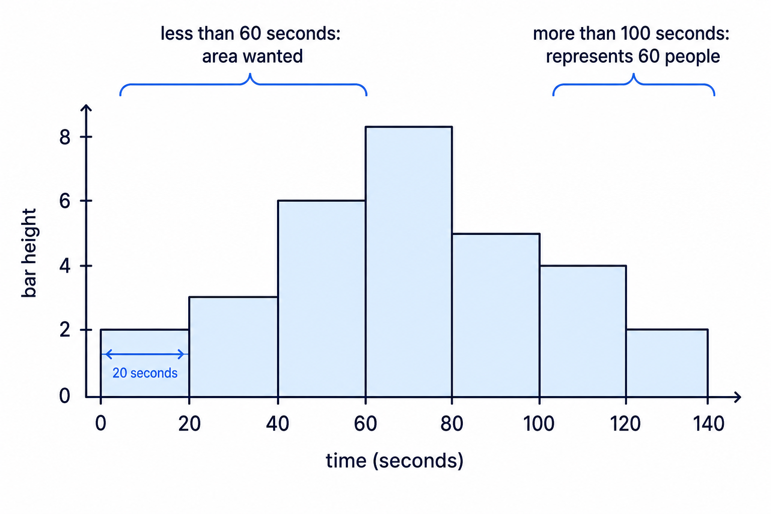
A scaled histogram has intervals of width 20 seconds. The bar heights for 0–20, 20–40, 40–60, 60–80, 80–100, 100–120 and 120–140 seconds are 2, 3, 6, 8, 5, 4 and 2. The number of people taking more than 100 seconds is 60. Estimate the percentage taking less than 60 seconds.
-
Find the area for more than 100 seconds:
20×4+20×2=12020 \times 4 + 20 \times 2 = 12020×4+20×2=120 -
Since 120 area units represents 60 people, each area unit represents:
60120=0.5\frac{60}{120} = 0.512060=0.5 -
Find the area for less than 60 seconds:
20(2+3+6)=22020(2 + 3 + 6) = 22020(2+3+6)=220 -
Estimate the number of people taking less than 60 seconds:
220×0.5=110220 \times 0.5 = 110220×0.5=110 -
Find the total area:
20(2+3+6+8+5+4+2)=60020(2 + 3 + 6 + 8 + 5 + 4 + 2) = 60020(2+3+6+8+5+4+2)=600 -
Estimate the total number of people:
600×0.5=300600 \times 0.5 = 300600×0.5=300 -
Find the percentage:
110300×100≈36.7%\frac{110}{300} \times 100 \approx 36.7\%300110×100≈36.7%
5. Box plots and quartiles
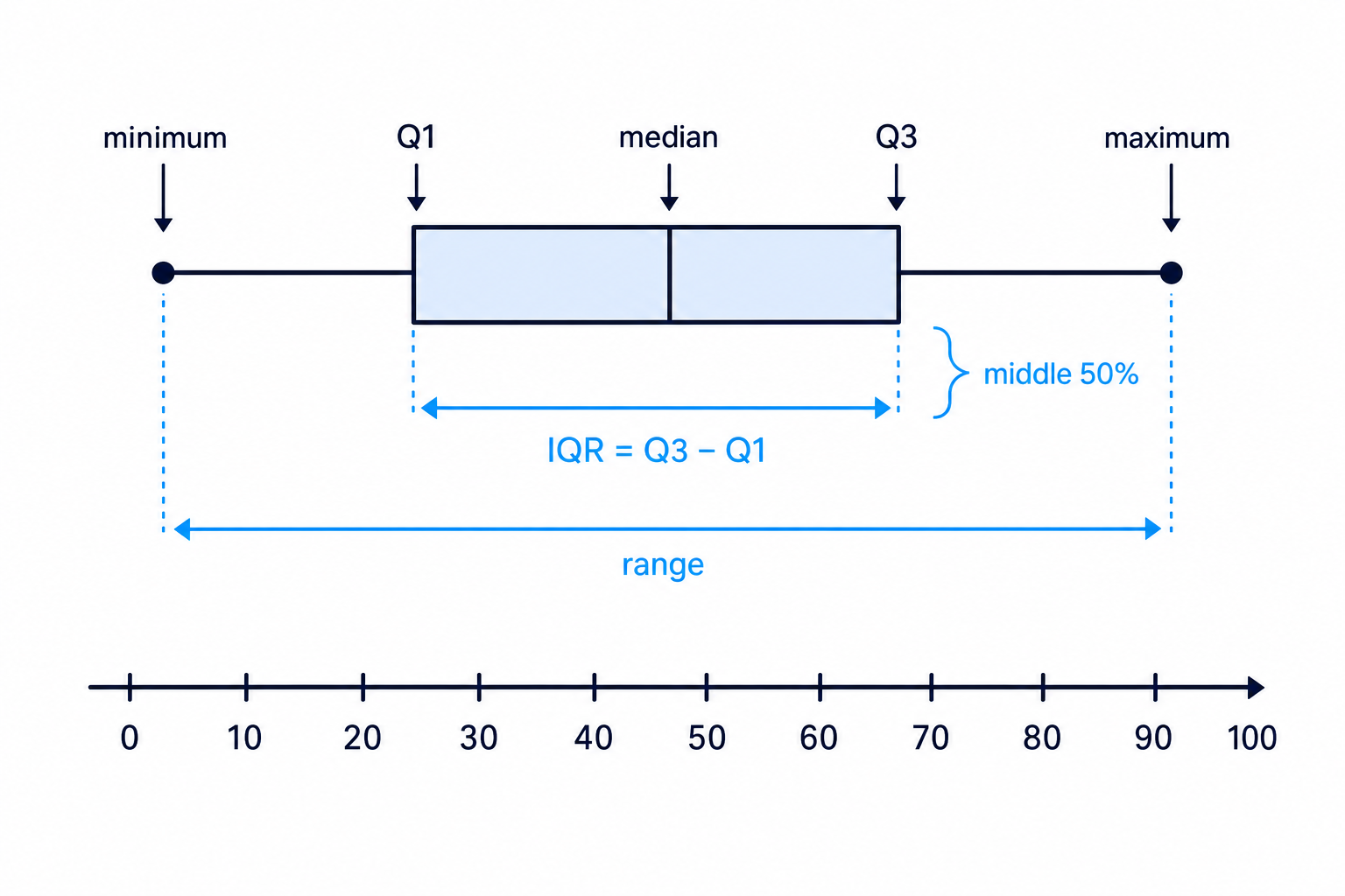
A box plot summarises data using five key values:
- minimum
- lower quartile, written Q1Q_1Q1
- median
- upper quartile, written Q3Q_3Q3
- maximum
The median is the middle value when the data are in order. The quartiles split the data into quarters. The interquartile range, or IQR, measures the spread of the middle 50% of the data:
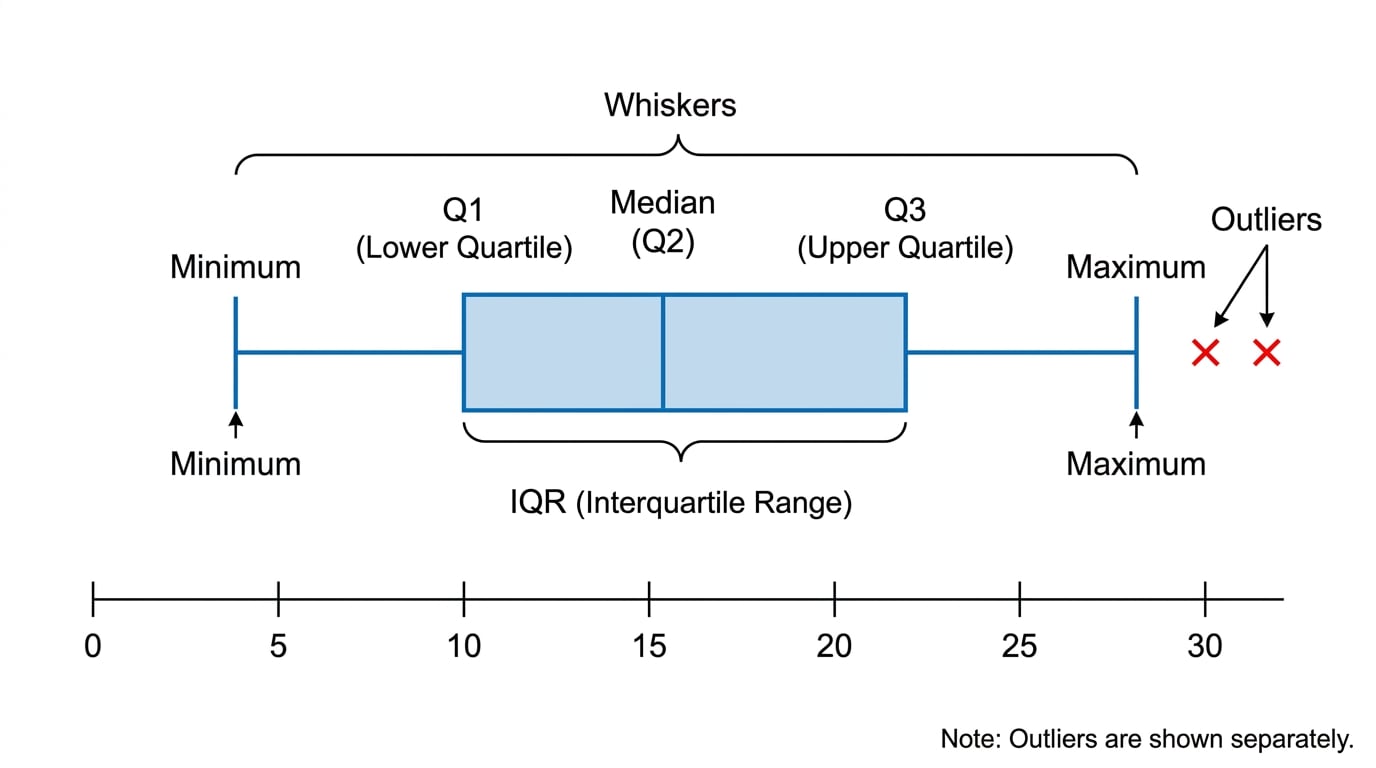
IQR=Q3−Q1\text{IQR} = Q_3 - Q_1IQR=Q3−Q1A box plot shows the middle 50% of the data as the box, with the median marked inside.
Finding quartiles from a list
The ordered data are:
8, 12, 15, 18, 20, 22, 24, 25, 29, 33, 56
Find the median, quartiles and IQR.
-
There are 11 values, so the median is the 6th value: 22.
-
The lower half is 8, 12, 15, 18, 20, so Q1Q_1Q1 is 15.
-
The upper half is 24, 25, 29, 33, 56, so Q3Q_3Q3 is 29.
-
Find the IQR:
29−15=1429 - 15 = 1429−15=14
Including the median twice
When there is an odd number of data values, do not include the median in both halves when finding Q1Q_1Q1 and Q3Q_3Q3.
6. Outliers and drawing box plots
An outlier is a value that is unusually far from the rest of the data. At AS Level, you are usually given this rule:
lower fence=Q1−1.5×IQR\text{lower fence} = Q_1 - 1.5 \times \text{IQR}lower fence=Q1−1.5×IQR upper fence=Q3+1.5×IQR\text{upper fence} = Q_3 + 1.5 \times \text{IQR}upper fence=Q3+1.5×IQRValues below the lower fence or above the upper fence are outliers.
Identifying an outlier and describing the box plot
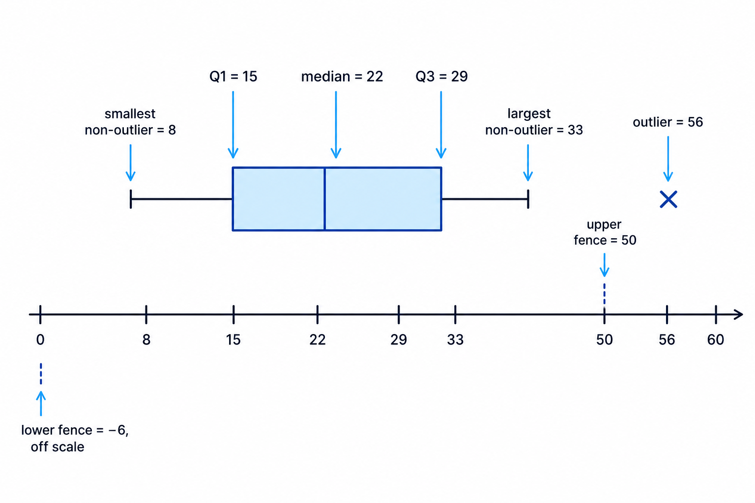
Use the data from the previous example, where Q1=15Q_1 = 15Q1=15, Q3=29Q_3 = 29Q3=29 and IQR is 14.
-
Find the lower and upper fences:
lower fence=15−1.5×14=−6upper fence=29+1.5×14=50\begin{aligned} \text{lower fence} &= 15 - 1.5 \times 14 = -6 \\ \text{upper fence} &= 29 + 1.5 \times 14 = 50 \end{aligned}lower fenceupper fence=15−1.5×14=−6=29+1.5×14=50 -
Compare the data values with the fences. The value 56 is greater than 50, so 56 is an outlier.
-
The smallest non-outlier is 8 and the largest non-outlier is 33.
-
The box plot would have a box from 15 to 29, a median line at 22, whiskers to 8 and 33, and a cross at 56.
Whiskers do not go to outliers
If there are outliers, the whiskers stop at the smallest and largest values that are not outliers. The outliers are plotted separately, usually with crosses.
7. Comparing distributions
When comparing two box plots, write about:
- location: usually compare medians
- spread: compare IQRs and ranges
- outliers: mention any unusual values in context
Comparing two sets of completion times
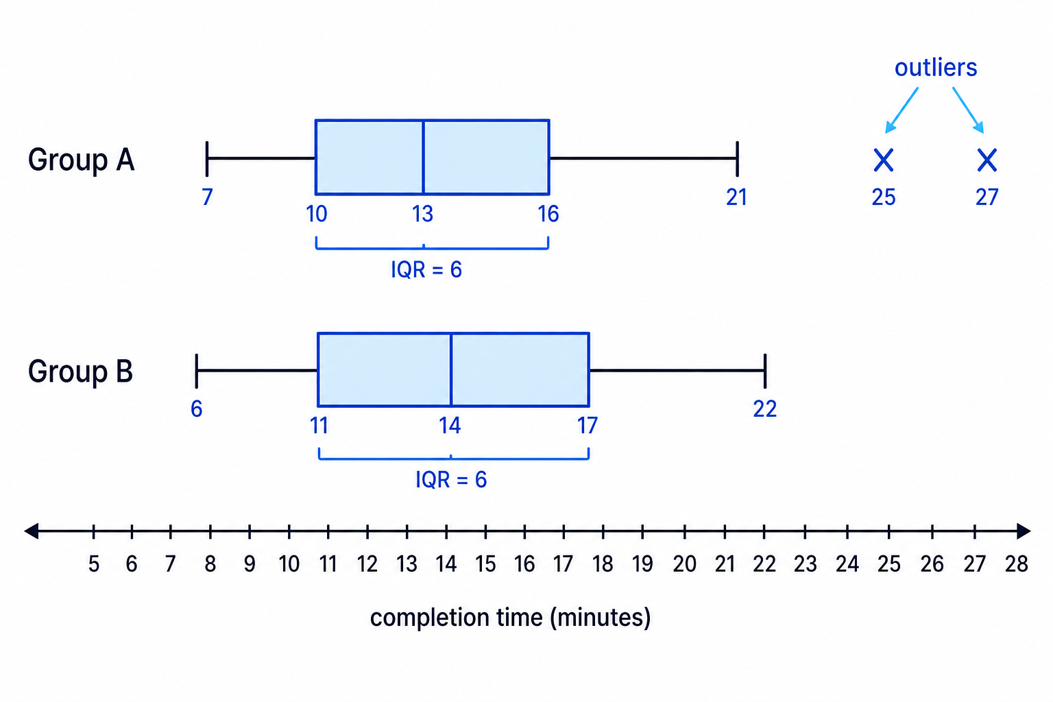
Group A has minimum 7, Q1=10Q_1 = 10Q1=10, median 13, Q3=16Q_3 = 16Q3=16, largest non-outlier 21, with outliers at 25 and 27 minutes. Group B has minimum 6, Q1=11Q_1 = 11Q1=11, median 14, Q3=17Q_3 = 17Q3=17 and maximum 22. Determine whether Group B has outliers, then compare the groups.
-
For Group A, 75% of people completed the task by Q3Q_3Q3, so by 16 minutes.
-
Find the IQR for Group B:
17−11=617 - 11 = 617−11=6 -
Find the outlier fences for Group B:
lower fence=11−1.5×6=2upper fence=17+1.5×6=26\begin{aligned} \text{lower fence} &= 11 - 1.5 \times 6 = 2 \\ \text{upper fence} &= 17 + 1.5 \times 6 = 26 \end{aligned}lower fenceupper fence=11−1.5×6=2=17+1.5×6=26 -
Group B has no outliers because 6 and 22 are both within the fences.
-
Group A has the lower median, so a typical person in Group A was faster. The IQRs are both 6, so the middle 50% of times have similar spread. However, Group A has two high outliers, meaning a few people in Group A took unusually long.
8. Mean and standard deviation, or median and IQR?
The mean and standard deviation are useful when data are fairly symmetrical with no major outliers.
The median and IQR are better when the data are skewed or contain outliers, because they are less affected by extreme values.
For summary data:
xˉ=∑xn\bar{x} = \frac{\sum x}{n}xˉ=n∑xand
standard deviation=∑x2n−xˉ2\text{standard deviation} = \sqrt{\frac{\sum x^2}{n} - \bar{x}^2}standard deviation=n∑x2−xˉ2Choosing suitable summary statistics
For 50 journey times, ∑x=425\sum x = 425∑x=425 and ∑x2=4312.5\sum x^2 = 4312.5∑x2=4312.5. A box plot shows two large high outliers. Calculate the mean and standard deviation, then choose suitable summary statistics.
-
Calculate the mean:
xˉ=42550=8.5\bar{x} = \frac{425}{50} = 8.5xˉ=50425=8.5 -
Calculate the standard deviation:
4312.550−8.52=14≈3.74\sqrt{\frac{4312.5}{50} - 8.5^2} = \sqrt{14} \approx 3.74504312.5−8.52=14≈3.74 -
Since the box plot shows high outliers, the median and IQR would usually be more suitable for describing these data.
In the exam
- For histograms, write down class widths first, then use frequency density or area.
- For rounded data, use true class boundaries such as 9.5 to 14.5.
- For box plots, calculate IQR and outlier fences before deciding where the whiskers go.
- When comparing distributions, mention median, IQR or range, and outliers in context.
Check yourself
- Why can two histogram bars with different heights represent the same frequency?
- How do you decide whether a value is an outlier using Q1Q_1Q1, Q3Q_3Q3 and the IQR?
- In what situation would median and IQR be better than mean and standard deviation?
