Revision notes for Edexcel AS Level Maths Box Plots. Open the guide for explanations and worked examples. Written against the Edexcel AS Level Maths (8MA0) specification, so the content matches what's examinable rather than general Maths background.
Box Plots
What you'll learn
- How to find the median and quartiles from an ordered list of data.
- How to calculate the interquartile range and use it to test for outliers.
- How to draw a box plot, including separate outlier crosses.
- How to compare two distributions using medians, spreads and context.
Why box plots are useful
A box plot is a compact diagram for showing the spread of a data set. It does not show every individual value, but it quickly shows the “middle” of the data, the spread of the central values, and any unusual values.
Definition
Box plot
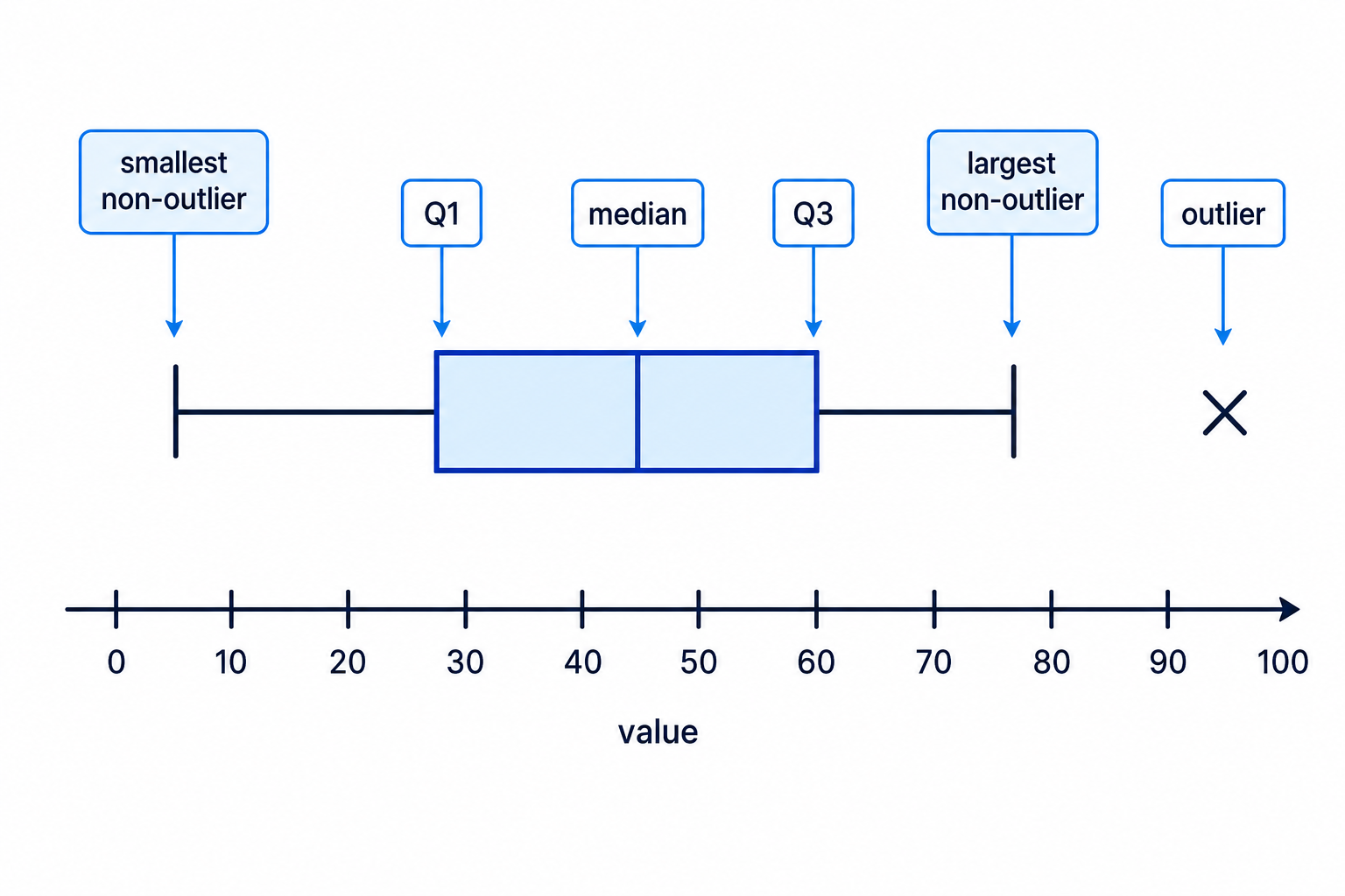
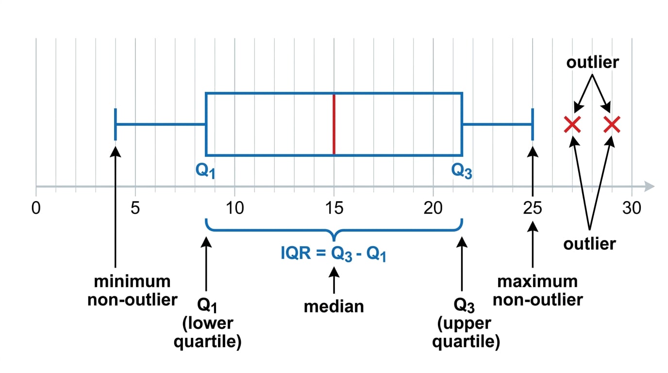
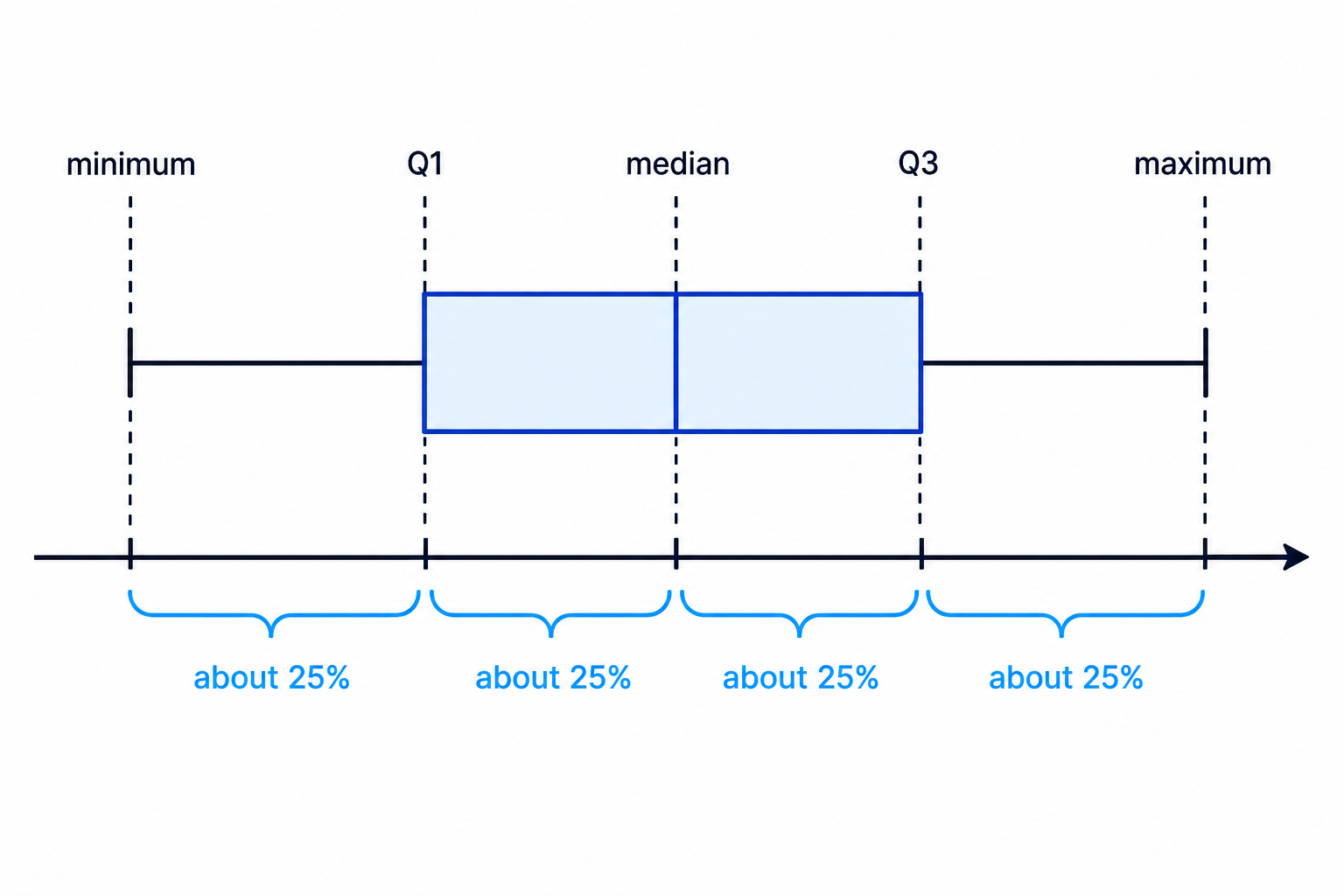
A box plot represents a data set using its minimum, lower quartile, median, upper quartile and maximum. If there are outliers, the whiskers stop at the smallest and largest non-outlier values, and the outliers are shown separately, usually using crosses.
This labelled diagram shows the main parts of a box plot.
Key Idea
The big picture
A box plot is built from five important positions on a number line: the smallest value, Q1Q_1Q1, the median, Q3Q_3Q3, and the largest value — adjusted if there are outliers.
Ordering data, medians and quartiles
Before drawing a box plot, the data must be in ascending order, meaning smallest to largest.
Definition
Median and quartiles
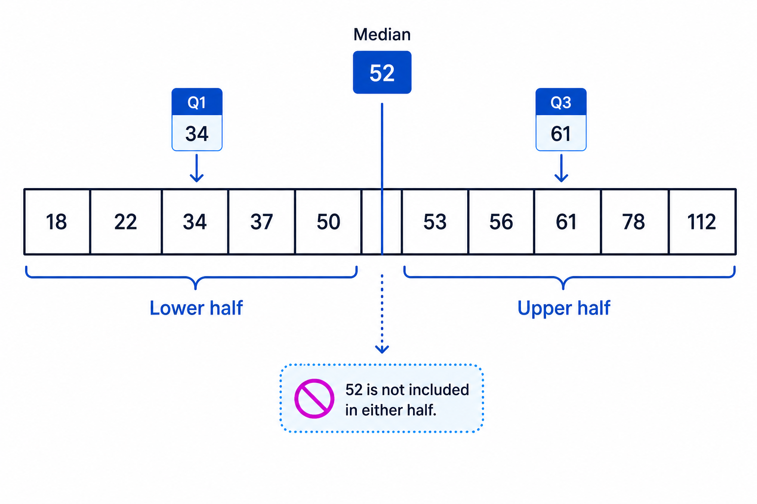
The median is the middle value of an ordered data set. The lower quartile, written Q1Q_1Q1, is the median of the lower half of the data. The upper quartile, written Q3Q_3Q3, is the median of the upper half of the data.
For an odd number of data values, the median is the middle value and is not included in either half when finding Q1Q_1Q1 and Q3Q_3Q3.
Example
Finding the median and quartiles
The weekly call times, in minutes, for 11 students are:
18, 22, 34, 37, 50, 52, 53, 56, 61, 78, 112
Find the median and quartiles.
-
Check the data are already in ascending order.
-
There are 11 values, so the median is the 6th value.
median=52\text{median}=52median=52 -
The lower half is the five values below the median:
18, 22, 34, 37, 5018,\ 22,\ 34,\ 37,\ 5018, 22, 34, 37, 50 -
The median of the lower half is the 3rd value, so:
Q1=34Q_1=34Q1=34 -
The upper half is the five values above the median:
53, 56, 61, 78, 11253,\ 56,\ 61,\ 78,\ 11253, 56, 61, 78, 112 -
The median of the upper half is the 3rd value, so:
Q3=61Q_3=61Q3=61
Common Mistake
Including the median twice
When there is an odd number of values, do not include the overall median when finding the lower and upper quartiles.
Interquartile range
The full range uses the smallest and largest values, so it can be affected a lot by one extreme value. Box plots often focus on the middle half of the data instead.
Definition
Interquartile range
The interquartile range, or IQR, measures the spread of the middle 50% of the data.
IQR=Q3−Q1\text{IQR}=Q_3-Q_1IQR=Q3−Q1Example
Finding the IQR
For the data from the previous example, Q1=34Q_1=34Q1=34 and Q3=61Q_3=61Q3=61. Find the interquartile range.
-
Write down the formula.
IQR=Q3−Q1\text{IQR}=Q_3-Q_1IQR=Q3−Q1 -
Substitute the quartiles.
IQR=61−34\text{IQR}=61-34IQR=61−34 -
Calculate the answer.
IQR=27\text{IQR}=27IQR=27
Tip
What the IQR tells you
A smaller IQR means the middle 50% of the data are more tightly clustered. A larger IQR means the middle 50% are more spread out.
Outliers
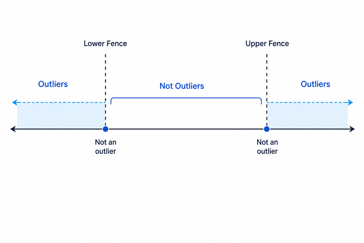
An outlier is a value that is unusually small or unusually large compared with the rest of the data.
Definition
Outlier rule
At AS Level, a common rule is:
lower fence=Q1−1.5×IQR\text{lower fence}=Q_1-1.5\times \text{IQR}lower fence=Q1−1.5×IQR upper fence=Q3+1.5×IQR\text{upper fence}=Q_3+1.5\times \text{IQR}upper fence=Q3+1.5×IQRA value is an outlier if it is smaller than the lower fence or greater than the upper fence.
Notice the words “smaller than” and “greater than”. A value exactly on a fence is not counted as an outlier using this rule.
Example
Showing that a value is an outlier
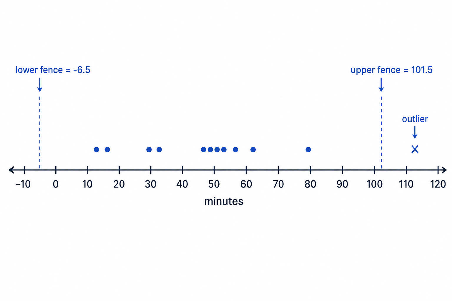
Using the call-time data:
18, 22, 34, 37, 50, 52, 53, 56, 61, 78, 112
Show whether there are any outliers.
-
From earlier, the quartiles are Q1=34Q_1=34Q1=34 and Q3=61Q_3=61Q3=61.
-
Calculate the interquartile range.
IQR=61−34=27\text{IQR}=61-34=27IQR=61−34=27 -
Find 1.5 times the IQR.
1.5×27=40.51.5\times 27=40.51.5×27=40.5 -
Find the lower fence.
Q1−1.5×IQR=34−40.5=−6.5Q_1-1.5\times \text{IQR}=34-40.5=-6.5Q1−1.5×IQR=34−40.5=−6.5 -
Find the upper fence.
Q3+1.5×IQR=61+40.5=101.5Q_3+1.5\times \text{IQR}=61+40.5=101.5Q3+1.5×IQR=61+40.5=101.5 -
Compare the data values with the fences: no value is below -6.5, but 112 is greater than 101.5.
-
Therefore, 112 is the only outlier.
Common Mistake
Using the overall range instead of the IQR
The outlier test uses Q3−Q1Q_3-Q_1Q3−Q1, not maximum minus minimum. Always find the IQR first.
Drawing a box plot
To draw a box plot, you need:
- the lower quartile, Q1Q_1Q1
- the median
- the upper quartile, Q3Q_3Q3
- the smallest non-outlier
- the largest non-outlier
- any outliers, marked separately
The box goes from Q1Q_1Q1 to Q3Q_3Q3. The median is drawn as a vertical line inside the box. The whiskers go to the smallest and largest non-outliers.
Example
Drawing a box plot with an outlier
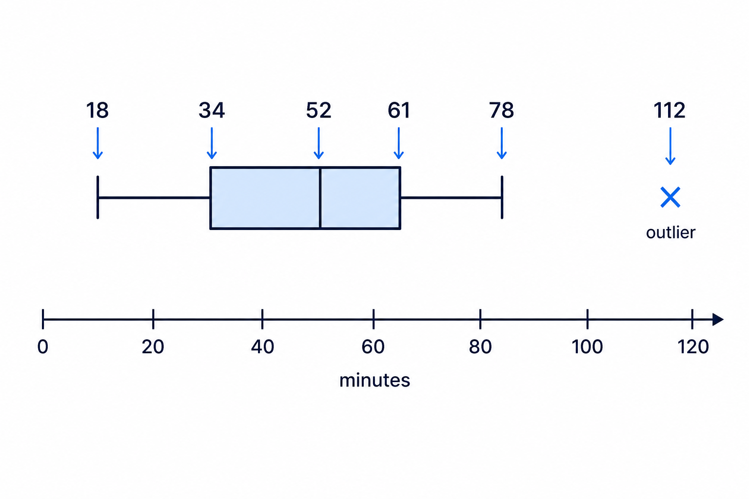
Draw a box plot for the data:
18, 22, 34, 37, 50, 52, 53, 56, 61, 78, 112
-
Use the quartiles already found.
Q1=34,median=52,Q3=61Q_1=34,\quad \text{median}=52,\quad Q_3=61Q1=34,median=52,Q3=61 -
Use the outlier test already completed. The value 112 is an outlier.
-
The smallest value is 18, and it is not an outlier, so the lower whisker starts at 18.
-
The largest non-outlier is 78, so the upper whisker ends at 78.
-
Draw a horizontal number line with a suitable scale, for example from 0 to 120.
-
Draw the box from 34 to 61, and put a vertical median line at 52.
-
Draw whiskers from 34 down to 18 and from 61 up to 78.
-
Mark the outlier 112 with a cross, not as the end of the whisker.
Tip
Choosing a scale
Pick a scale that includes all important values, including outliers. Make sure the spacing is consistent: if one square represents 10 minutes, every square must represent 10 minutes.
Common Mistake
Whiskering to an outlier
If a value is an outlier, do not use it as the end of the whisker. Mark it separately with a cross.
Reading a box plot
You may be asked to read values directly from a box plot.
The phrase “the time by which 75% had finished” means the upper quartile, Q3Q_3Q3. This is because 75% of the data are at or below Q3Q_3Q3.
Example
Interpreting a box plot in context
A box plot shows times taken to complete a puzzle. The lower quartile is 10 minutes, the median is 13 minutes, the upper quartile is 18 minutes, and crosses are plotted at 28 and 29 minutes.
-
To find the time by which 75% of children had completed the puzzle, identify Q3Q_3Q3.
-
The upper quartile is 18 minutes.
-
Therefore, 75% of the children had completed the puzzle by 18 minutes.
-
The crosses at 28 and 29 minutes represent outliers.
-
In context, these are children who took unusually long times to complete the puzzle.
Key Idea
Percentages in a box plot
Roughly 25% of the data lie in each section: below Q1Q_1Q1, between Q1Q_1Q1 and the median, between the median and Q3Q_3Q3, and above Q3Q_3Q3.
Comparing two box plots
When comparing distributions, do not just list values. You should compare them in context.
Useful comparisons include:
- Average location: compare the medians.
- Spread of the middle 50%: compare the IQRs.
- Overall spread: compare the ranges, but be careful with outliers.
- Outliers: mention unusually high or low values and what they mean in context.
Example
Comparing two distributions
Two groups of students completed the same puzzle.
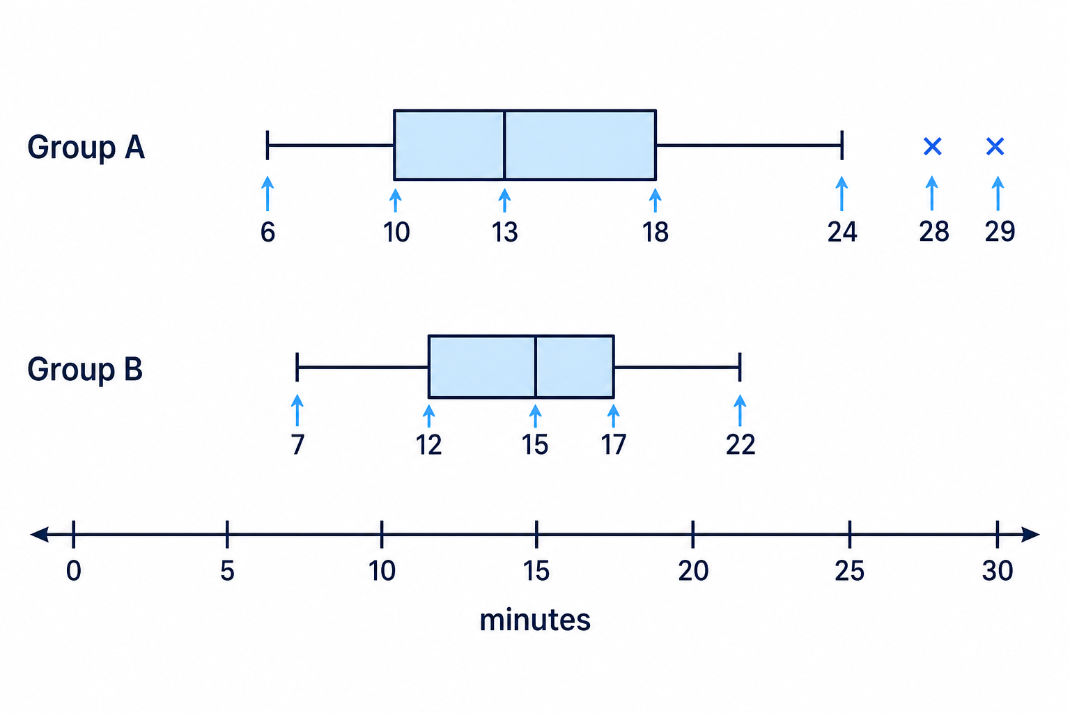
Group A has median 13 minutes, Q1=10Q_1=10Q1=10, Q3=18Q_3=18Q3=18, smallest non-outlier 6, largest non-outlier 24, and outliers at 28 and 29 minutes.
Group B has median 15 minutes, Q1=12Q_1=12Q1=12, Q3=17Q_3=17Q3=17, minimum 7 and maximum 22, with no outliers.
Compare the two distributions.
-
Compare the medians. Group A has the lower median, 13 minutes compared with 15 minutes, so a typical student in Group A completed the puzzle faster.
-
Compare the IQRs.
IQR for Group A=18−10=8\text{IQR for Group A}=18-10=8IQR for Group A=18−10=8 IQR for Group B=17−12=5\text{IQR for Group B}=17-12=5IQR for Group B=17−12=5 -
Group B has the smaller IQR, so the middle 50% of Group B’s times were more consistent.
-
Compare the overall spread. Ignoring outliers, Group A’s non-outlier range is from 6 to 24, while Group B’s range is from 7 to 22.
-
Mention the outliers in context. Group A had two unusually slow times, 28 and 29 minutes, while Group B had no outliers.
Exam technique
In the exam
-
Put raw data in order first, then find the median, Q1Q_1Q1 and Q3Q_3Q3 carefully.
-
For outliers, write the IQR and both fences clearly before making your conclusion.
-
When comparing box plots, write sentences in context: compare medians for typical value, IQRs for consistency, and mention outliers.
Self review
Check yourself
-
If a data set has 15 values, which position is the median, and which values form the lower half?
-
What are the two outlier fences when Q1=20Q_1=20Q1=20 and Q3=44Q_3=44Q3=44?
-
In a box plot, why might the largest data value not be the end of the upper whisker?

Recap questions
Test yourself with 5 quick questions on this guide. Answer them all correctly to complete it.
You've reached the end
Test yourself on this topic, or move on to the next guide.
How was this guide?