Correlation
What you'll learn
- How to draw and read a scatter graph for paired data.
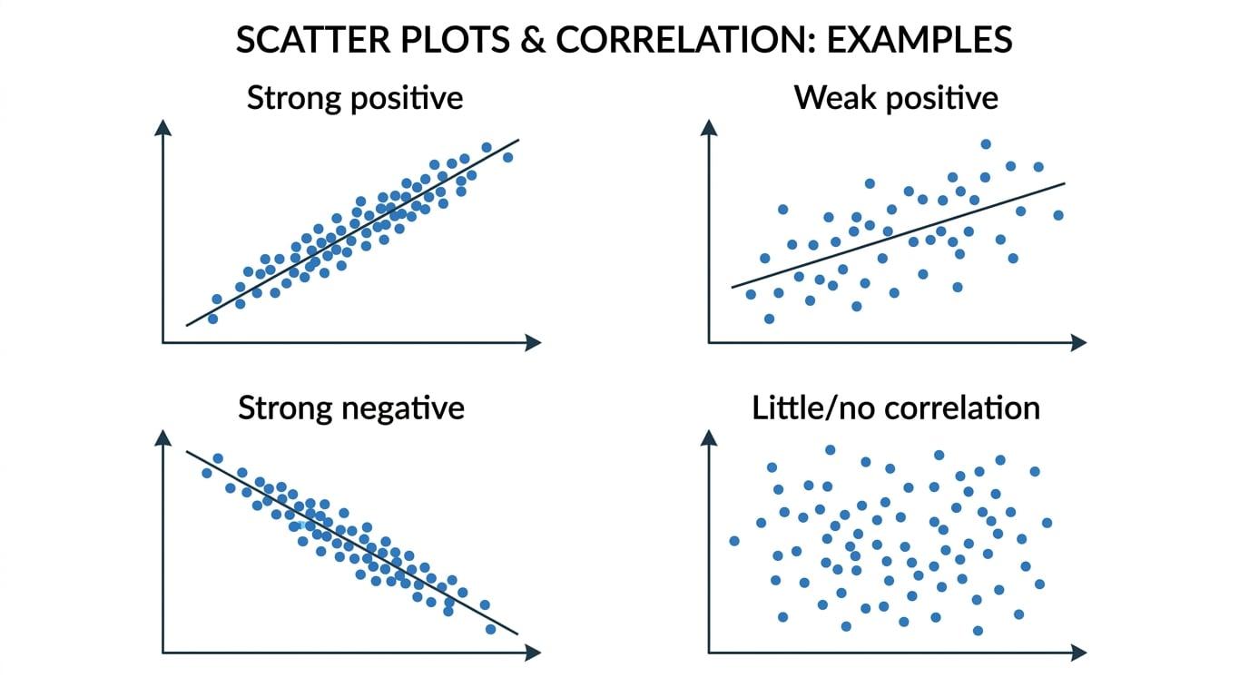
- How to describe positive, negative, strong, weak, or no correlation.
- How outliers can affect your conclusion about a relationship.
- How to interpret and use a simple regression line carefully.
1. Paired data and scatter graphs
In correlation questions, you usually have two measurements for each item or person. For example, each footballer might have a height and a weight.
Bivariate data
- Bivariate data means data involving two variables measured in pairs.
- A scatter graph shows each pair as one plotted point.
- The variable you use to make predictions is usually placed on the horizontal axis and is called the explanatory variable.
- The variable being predicted is usually placed on the vertical axis and is called the response variable.
A scatter graph helps you see whether larger values of one variable tend to go with larger or smaller values of the other variable.
Setting up a scatter graph
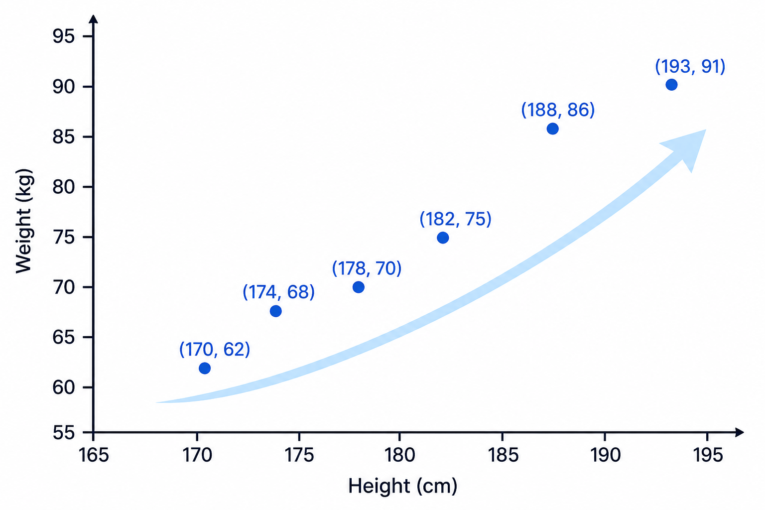
A coach records the heights and weights of six players:
- Height in cm: 170, 174, 178, 182, 188, 193
- Weight in kg: 62, 68, 70, 75, 86, 91
Draw and interpret a scatter graph.
-
Put height on the horizontal axis because it is the variable you might use to estimate weight.
-
Put weight on the vertical axis because it is the variable being compared with height.
-
Choose scales that cover the data without wasting lots of space. For example, the height axis could run from 165 to 195 cm, and the weight axis from 55 to 95 kg.
-
Plot each ordered pair, such as 170 cm with 62 kg, then 174 cm with 68 kg.
-
Look at the overall pattern. The points tend to rise from left to right, so taller players generally tend to have higher weights.
Axis labels matter
Always label both axes with the variable and unit, for example “Height (cm)” and “Weight (kg)”. A correct-looking graph can still lose marks if the variables or units are unclear.
2. Describing correlation
Correlation describes the relationship between two variables.
Correlation
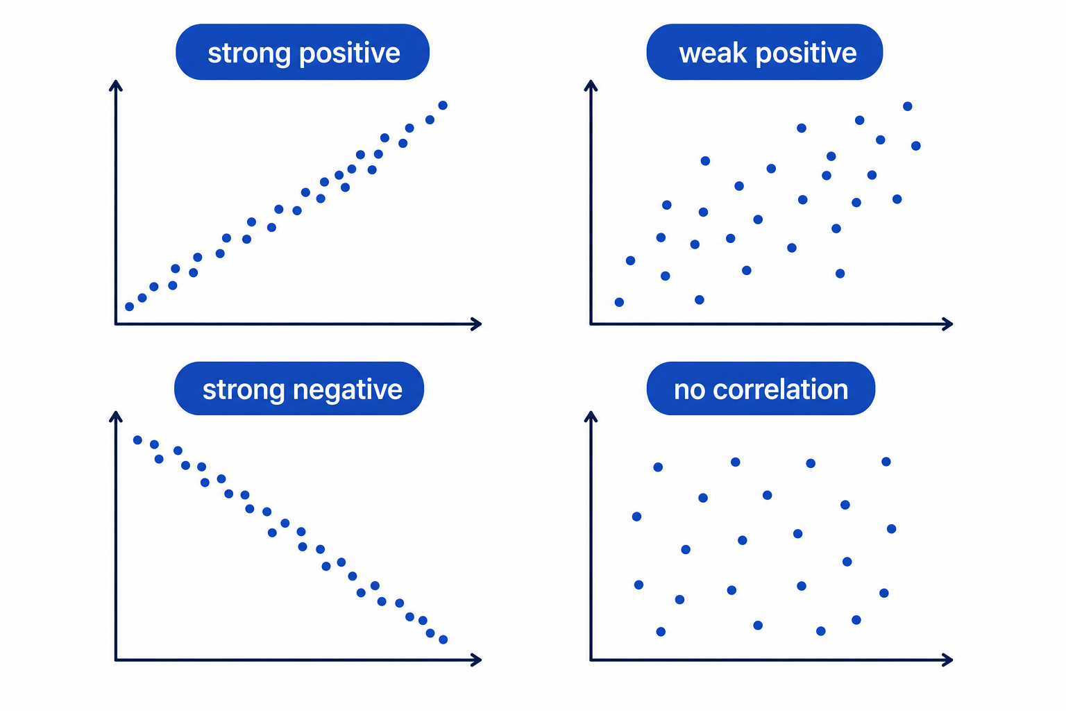
Correlation is a measure of how two variables are associated. In AS Statistics, you mainly describe the direction and strength of the relationship shown by a scatter graph.
Direction
- Positive correlation: as one variable increases, the other tends to increase.
- Negative correlation: as one variable increases, the other tends to decrease.
- No correlation: there is no obvious pattern.
Strength
- Strong correlation: points lie close to an imaginary straight line.
- Weak correlation: there is a trend, but the points are widely scattered.
- No correlation: the points form a random-looking cloud.
The main sentence to remember
For correlation questions, say both the direction and the strength, and link them back to the context.
Interpreting correlation in context
A teacher plots revision time against test score for a group of students. The points rise from left to right and are fairly close to a straight line. Describe the correlation.
-
The points rise from left to right, so the correlation is positive.
-
The points are fairly close to a straight line, so the correlation is strong.
-
Put the answer in context: students who spend more time revising tend to get higher test scores.
Forgetting the context
Do not just write “positive correlation”. A better answer is “there is positive correlation between revision time and test score, so students who revise for longer tend to score higher”.
3. Correlation does not prove causation
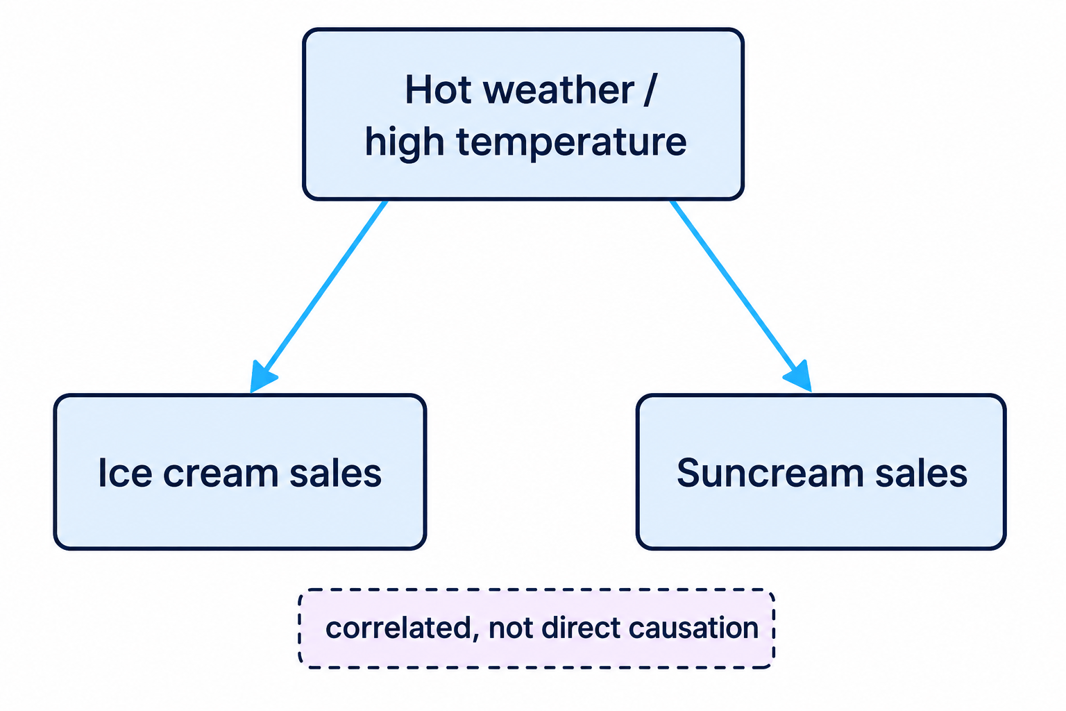
Two variables can be correlated without one directly causing the other.
For example, ice cream sales and suncream sales might both increase in hot weather. Buying ice cream does not cause people to buy suncream; both are affected by temperature.
Causation
Causation means that a change in one variable directly causes a change in another. Correlation alone is not enough to prove causation.
Avoiding a causation trap
A researcher finds positive correlation between hours of sunshine and the number of drinks sold at a beach café. Can they conclude that sunshine directly causes every extra drink sale?
-
The scatter graph suggests that higher sunshine hours are associated with more drinks sold.
-
However, there may be other factors, such as school holidays, tourist numbers, weekends, or temperature.
-
So it is reasonable to say there is positive correlation, but not enough evidence to prove direct causation.
4. Outliers and their effect
An outlier is a value that is unusually far away from the rest of the data. In correlation, a single outlier can change the apparent trend or make a regression line unreliable.
Outlier using the interquartile range
The interquartile range is
IQR=Q3−Q1\text{IQR} = Q_3 - Q_1IQR=Q3−Q1A common rule is that outliers are values below
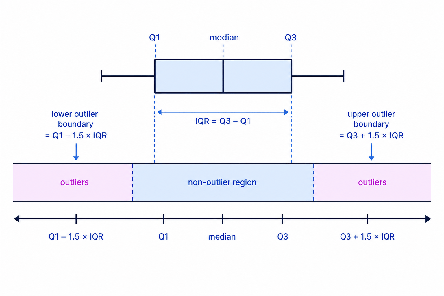
or above
Q3+1.5×IQRQ_3 + 1.5 \times \text{IQR}Q3+1.5×IQRChecking for rainfall outliers
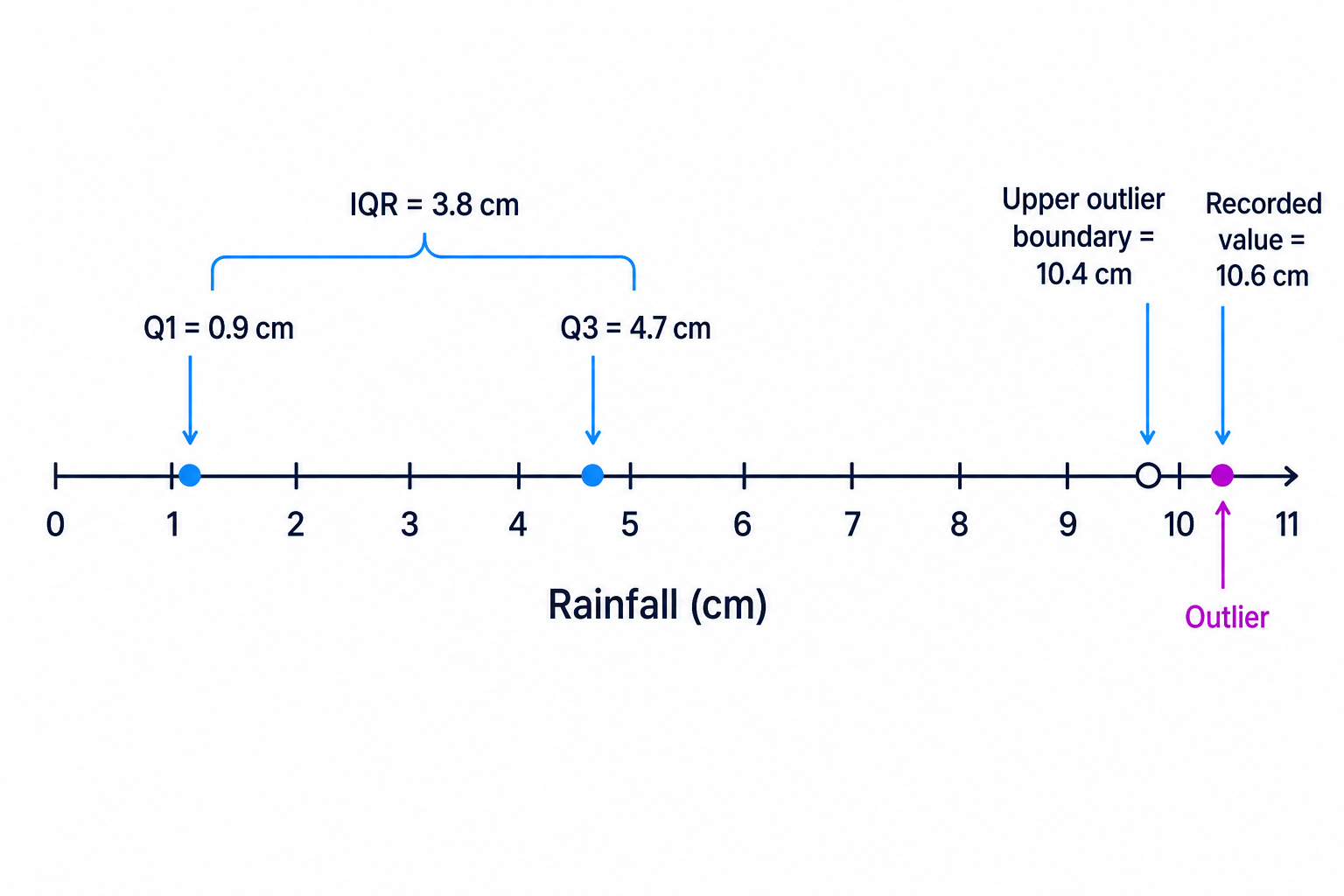
A student records daily rainfall values. For the rainfall data, the lower quartile is 0.9 cm and the upper quartile is 4.7 cm. The largest recorded rainfall is 10.6 cm. Decide whether 10.6 cm is an outlier.
-
Find the interquartile range:
IQR=4.7−0.9=3.8\text{IQR} = 4.7 - 0.9 = 3.8IQR=4.7−0.9=3.8 -
Find the upper outlier boundary:
4.7+1.5×3.8=10.44.7 + 1.5 \times 3.8 = 10.44.7+1.5×3.8=10.4 -
Compare the value with the boundary. Since 10.6 cm is greater than 10.4 cm, it is an outlier.
-
In a correlation question, mention that this value could affect the apparent relationship shown on the scatter graph.
Outliers are not automatically wrong
An outlier might be a genuine extreme value, not a mistake. In context, heavy rainfall on one day could be real, so do not delete it unless the question tells you to.
5. The correlation coefficient
Sometimes you are given a number measuring correlation.
Product moment correlation coefficient
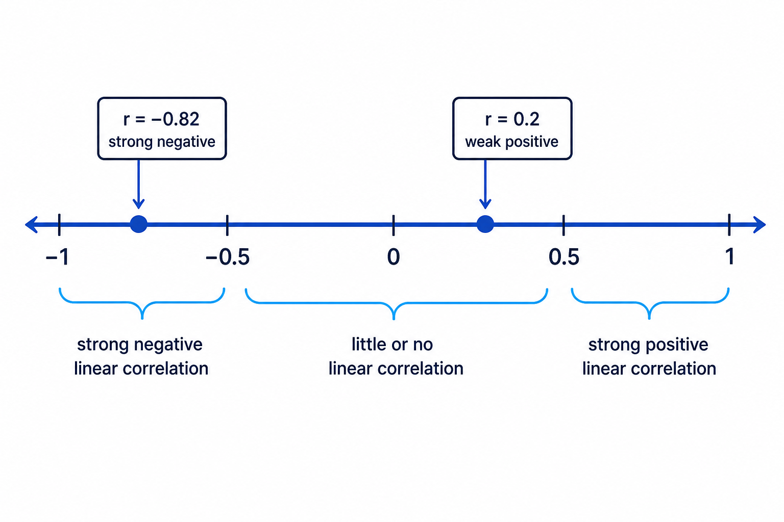
The product moment correlation coefficient, usually written as rrr, measures the strength and direction of a linear relationship between two variables.
- rrr is always between -1 and 1.
- If rrr is close to 1, there is strong positive linear correlation.
- If rrr is close to -1, there is strong negative linear correlation.
- If rrr is close to 0, there is little or no linear correlation.
Interpreting a correlation coefficient
For a sample of towns, a calculator gives r=−0.82r = -0.82r=−0.82 for distance from the coast and average annual rainfall. Interpret this value.
-
The value is negative, so the relationship is negative: as distance from the coast increases, rainfall tends to decrease.
-
The value is close to -1, so the relationship is strong.
-
A suitable interpretation is: there is strong negative linear correlation between distance from the coast and average annual rainfall.
Thinking means no relationship at all
A value close to zero means there is little or no linear correlation. There could still be a curved relationship.
6. Linear regression and prediction
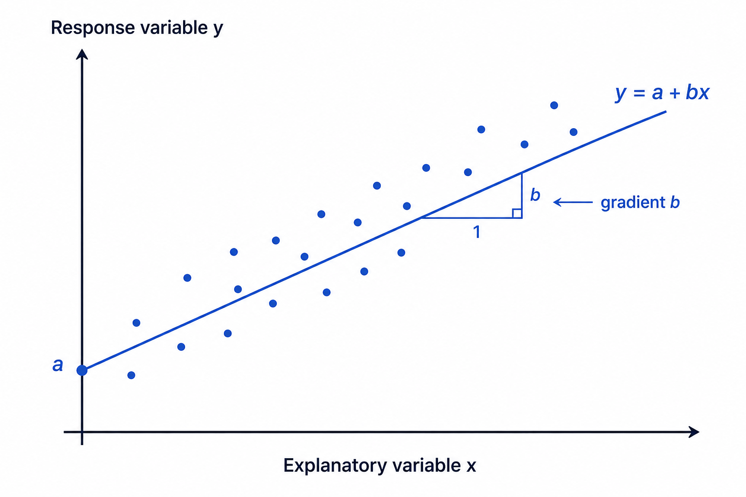
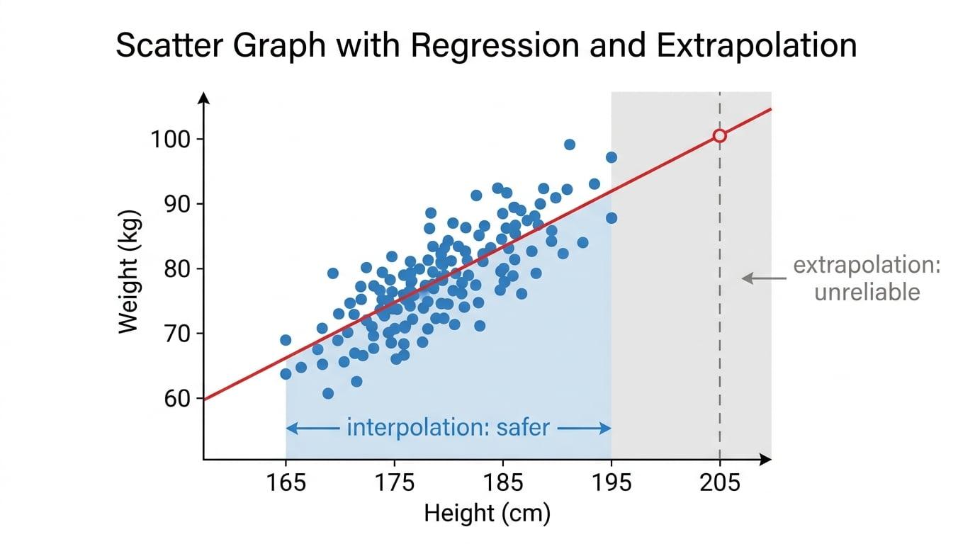
If a scatter graph shows a roughly straight-line pattern, you may be given a regression line to make predictions.
Regression line
A regression line is a straight-line model used to estimate one variable from another. It is often written in the form
y=a+bxy = a + bxy=a+bxwhere bbb is the gradient and aaa is the intercept.
The gradient tells you how much the predicted response changes when the explanatory variable increases by one unit.
For example, if the regression line for weight www in kg on height hhh in cm is
w=1.28h−148w = 1.28h - 148w=1.28h−148then the gradient is 1.28. This means that for each extra 1 cm of height, the predicted weight increases by 1.28 kg.
Using and interpreting a regression line
For a group of athletes, the regression line for weight www in kg on height hhh in cm is
w=1.31h−157w = 1.31h - 157w=1.31h−157Estimate the weight of an athlete who is 176 cm tall, and interpret the gradient.
-
Substitute h=176h = 176h=176 into the regression equation:
w=1.31×176−157w = 1.31 \times 176 - 157w=1.31×176−157 -
Calculate the estimate:
w=230.56−157=73.56w = 230.56 - 157 = 73.56w=230.56−157=73.56 -
Give a sensible rounded answer: the estimated weight is about 73.6 kg.
-
The gradient is 1.31, so for each extra 1 cm in height, the predicted weight increases by 1.31 kg.
Use the equation the right way round
If the equation predicts weight from height, substitute a height to estimate a weight. Do not rearrange it to predict height unless you are specifically told the regression line is suitable for that direction.
7. Reliability of estimates
Predictions are more reliable when:
- the scatter graph shows strong linear correlation;
- the value used is within the range of the original data;
- there are no serious outliers affecting the trend;
- the context has not changed.
Interpolation and extrapolation
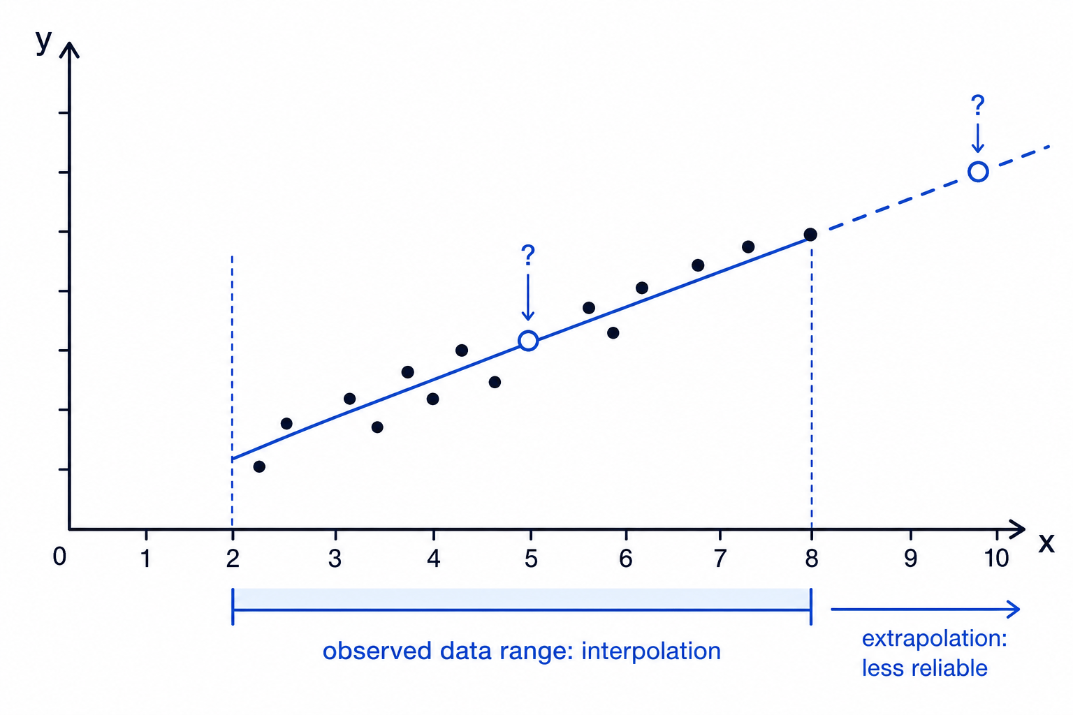
- Interpolation means predicting within the range of the original data.
- Extrapolation means predicting outside the range of the original data.
Extrapolation is risky because the relationship may not continue in the same way beyond the data you observed.
Commenting on reliability
A regression line was found using players with heights from 168 cm to 194 cm. It is used to estimate the weight of a player who is 170 cm tall. Comment on the reliability.
-
The height 170 cm lies within the range 168 cm to 194 cm.
-
This is interpolation, so it is more reliable than predicting for a much taller or shorter player outside the range.
-
The estimate would be more reliable if the scatter graph also showed strong positive linear correlation.
-
A good final comment is: the estimate is reasonably reliable because 170 cm is within the data range, provided the original scatter graph showed a clear linear trend.
When a linear model may not be suitable
A student plots temperature against rainfall for 12 days. The points are widely scattered with no clear straight-line pattern, and one day has unusually high rainfall. Explain why a linear regression model may not be suitable.
-
A linear model assumes a roughly straight-line relationship between the two variables.
-
The points are widely scattered, so the correlation appears weak.
-
The unusually high rainfall value may be an outlier and could distort any fitted line.
-
Therefore a linear regression model may not be suitable for making reliable predictions from this data.
In the exam
-
On scatter graphs, label axes clearly and use sensible scales; then describe the trend using direction, strength, and context.
-
If asked about a regression gradient, say “for each increase of 1 unit in the explanatory variable, the predicted response changes by the gradient units”.
-
For reliability, mention whether the prediction is interpolation or extrapolation, and whether the scatter graph shows a strong linear relationship.
Check yourself
- Can you explain the difference between positive correlation and negative correlation using a real context?
- If a regression line predicts weight from height, what does its gradient mean?
- Why might an estimate outside the range of the original data be unreliable?