Measuring Inequality
Definition
Lorenz curve: a graph showing how income (or wealth) is distributed across a population, revealing how far the distribution departs from perfect equality.
Gini coefficient: a single number derived from the Lorenz curve that summarises inequality, ranging from 0 for perfect equality to 1 for perfect inequality.
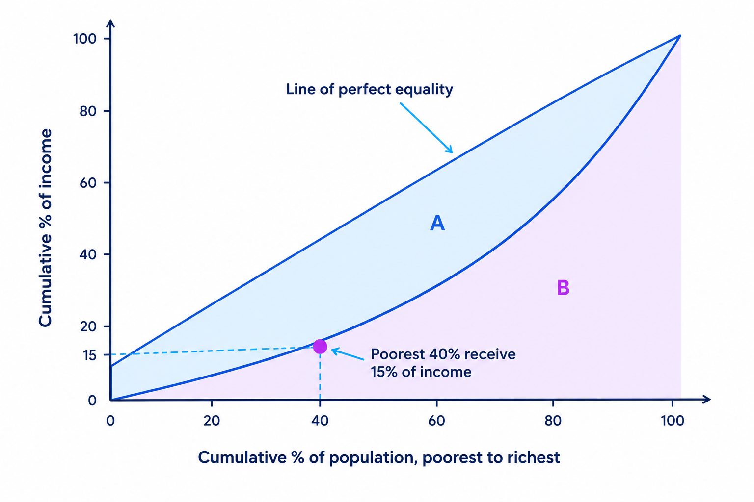
- The horizontal axis shows the cumulative percentage of the population, ranked from poorest to richest.
- The vertical axis shows the cumulative percentage of total income received by that group.
- The straight 45° line shows perfect equality, where any given share of the population earns exactly that share of income.
- The actual distribution is drawn as a curve that sags below this line of equality.
- The further the curve bows away from the 45° line, the more unequal the distribution.
Key Idea
- On the line of equality the poorest 20% of people earn exactly 20% of income.
- The more the Lorenz curve sags below that line, the greater the inequality.
Reading The Curve
- Rank the population from poorest to richest and add up income shares as you go.
- Each point on the curve answers the question: what share of income does the poorest x% receive?
- The gap between the curve and the diagonal at any point shows how far that group falls short of an equal share.
Example
- Suppose the poorest 40% of the population earn £15bn of a total £100bn of income.
- Plot the point (40, 15) below the diagonal; on the line of equality that 40% would earn 40%, a shortfall of 40 − 15 = 25 percentage points.
- Joining such points from (0, 0) to (100, 100) traces the bowed Lorenz curve.
From Curve To Gini
Gini coefficient formula
Gini coefficient=AA+B \text{Gini coefficient}=\dfrac{A}{A+B} Gini coefficient=A+BA- The Gini is read straight from the Lorenz-curve diagram by comparing two areas.
- Area A is the gap between the line of equality and the Lorenz curve.
- Area B lies beneath the Lorenz curve, so A + B is the whole triangle below the line of equality.
- If the curve lies on the diagonal there is no gap, so area A = 0 and the Gini = 0.
- If one person holds all the income the curve hugs the axes, area B disappears and the Gini approaches 1.
Note
- At 9708 you explain what the Gini coefficient shows, and you are not required to calculate it.
- A value closer to 0 means greater equality and a value closer to 1 means greater inequality.
Comparing Distributions
- Two Lorenz curves on one diagram let you rank countries or years by inequality.
- The curve nearer the diagonal represents the more equal distribution and the lower Gini.
- A country whose curve shifts towards the diagonal over time has become more equal.
- Wealth is usually more unequally distributed than income, so its Lorenz curve bows out further.
- A lower Gini looks more equitable, but reducing it can blunt work and investment incentives, so it trades some efficiency for equity — and whether that is worthwhile depends on how the fall is achieved.
Example
- Country A has a Gini of 0.25 and Country B a Gini of 0.45, a difference of 0.45 − 0.25 = 0.20.
- Country B is more unequal, so its Lorenz curve lies further from the line of equality.
Exam technique
- Always label the axes as cumulative percentage of population and cumulative percentage of income.
- State that a larger gap between the curve and the 45° line means greater inequality.
Common Mistake
- Do not read a curve closer to the diagonal as more unequal, because closer means more equal.
- Do not try to calculate the Gini coefficient, since 9708 only requires you to interpret it.
Self review
- What is plotted on each axis of the Lorenz curve?
- What does the 45° line represent?
- What do Gini values of 0 and 1 mean?
- In words, which two areas does the Gini coefficient compare?