Revision notes for Edexcel IGCSE Maths Pie Charts. Open the guide for explanations and worked examples. Written against the Edexcel IGCSE Maths (4MA1) specification, so the content matches what's examinable rather than general Maths background.
Pie Charts
Welcome to Pie Charts! You have probably seen these circular graphs in newspapers or science classes, but in IGCSE Maths, we need to be very precise about how we draw and interpret them.
What you'll learn in this topic:
- How to calculate the exact angle needed for each slice when given a frequency table.
- How to work backwards from a single slice to find the total amount.
- The "Proportion Trap" — why you must be careful when comparing two different pie charts.
1. What is a Pie Chart?
Definition
Pie Chart
A pie chart is a circular graph divided into sectors (slices). The angle of each sector is directly proportional to the quantity or frequency it represents. Because a full circle is 360°, all the frequencies combined must share this 360° total.
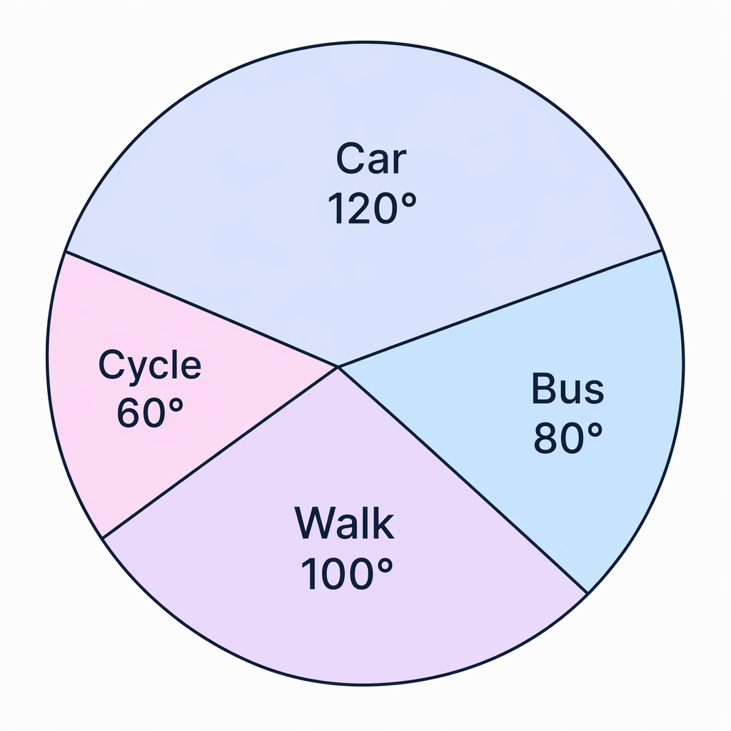
2. Drawing a Pie Chart from a Table
To draw an accurate pie chart from a frequency table, you need to convert each frequency into an angle. Since the whole pie chart represents the total frequency, and the whole circle is 360°, we need to find out how many degrees represent one unit of frequency. We call this the multiplier.
Example
Drawing a Pie Chart
Imagine a table shows the favourite fruit of 90 people:
- Apple: 30 people
- Banana: 25 people
- Orange: 20 people
- Kiwi: 15 people
-
Check or calculate the total frequency. Here, we are told it is 90 people, but if you aren't told, simply add up the frequencies: 30+25+20+15=9030 + 25 + 20 + 15 = 9030+25+20+15=90.
-
Find your multiplier by dividing the total degrees in a circle (360) by the total frequency. This tells you how many degrees you need for each person.
Multiplier=36090=4\text{Multiplier} = \frac{360}{90} = 4Multiplier=90360=4This means every 1 person is represented by 4° on the pie chart.
-
Multiply each individual frequency by the multiplier to find the angle for that sector.
- Apple: 30×4=120∘30 \times 4 = 120^\circ30×4=120∘
- Banana: 25×4=100∘25 \times 4 = 100^\circ25×4=100∘
- Orange: 20×4=80∘20 \times 4 = 80^\circ20×4=80∘
- Kiwi: 15×4=60∘15 \times 4 = 60^\circ15×4=60∘
-
Draw a circle, mark the centre, draw a starting line to the top, and use a protractor to measure and draw each angle in turn. Label each sector with the category name (e.g., "Apple").
Tip
Check your angles
Before you pick up your protractor, add up your calculated angles. They should always sum to exactly 360°. For the example above: 120+100+80+60=360120 + 100 + 80 + 60 = 360120+100+80+60=360. If they don't, you have made a calculation error!
3. Interpreting a Pie Chart (Finding Totals)
Often, exam questions will give you a drawn pie chart and tell you what one specific slice represents. From this one piece of information, you can unlock the rest of the chart.
Example
Working backwards from a sector
A pie chart shows how David spends his monthly salary. The sector for "Rent" has an angle of 150°. You are told that David spends £750 on Rent. Find out how much he spends in total.
-
Set up an equation showing what you know. You know that 150° represents £750.
150∘=£750150^\circ = £750150∘=£750 -
Find out what 1° represents by dividing the amount by the angle.
1∘=750150=£51^\circ = \frac{750}{150} = £51∘=150750=£5 -
Multiply this value by 360 to find the total amount (the whole circle).
360∘=360×5=£1800360^\circ = 360 \times 5 = £1800360∘=360×5=£1800David's total monthly salary is £1800.
Fractions and Probabilities
Sometimes you will be asked what fraction of the total a certain slice represents, or what the probability is of picking someone from that category. This is very straightforward: just put the angle of that sector over 360 and simplify the fraction.
For example, if the "Walk to school" sector is 90°, the fraction of students who walk is 90360\frac{90}{360}36090, which simplifies nicely to 14\frac{1}{4}41. If a student is picked at random, the probability they walk is 14\frac{1}{4}41.
4. Comparing Two Pie Charts
This is where many students lose marks in their IGCSE!
Imagine you have two pie charts showing the sports played at School A and School B. In School A's pie chart, the sector for Football has an angle of 90°. In School B's pie chart, the sector for Football has an angle of 120°.
A classic exam question will ask: "Does this mean more students play Football at School B? Explain your answer."
Common Mistake
The Proportion Trap
Many students answer "Yes, because 120° is bigger than 90°." This is incorrect.
A pie chart only shows proportion, not the actual total number.
- If School A has 1000 students, the 90° slice represents 14\frac{1}{4}41 of 1000, which is 250 students.
- If School B only has 120 students, the 120° slice represents 13\frac{1}{3}31 of 120, which is only 40 students.
Key Idea
Comparing Pie Charts
You cannot compare the actual quantities in two different pie charts unless you are told the total frequency for both charts. If you aren't given the totals, the only correct answer is: "No, we do not know the total number of people in each group, so we cannot compare the actual amounts."
Exam technique
In the exam
- Find the total first: Whether you are drawing or interpreting, always try to find the total frequency or the total amount if you aren't given it.
- Calculate the multiplier: Get into the habit of doing 360÷Total Frequency360 \div \text{Total Frequency}360÷Total Frequency. It is the fastest way to turn numbers into angles.
- Bring a protractor: You cannot draw a pie chart without one. Make sure you know how to read the inner and outer scales correctly.
- Spot the trap: If a question asks you to compare amounts between two pie charts, immediately check if you know the totals. If you don't, write down that you can't compare them.
Self review
Check yourself
- Can you calculate the angle needed for a frequency of 12 if the total frequency is 72?
- If a 60° sector represents 15 people, can you find the total number of people in the whole pie chart?
- If two pie charts both have a 180° sector for "Dogs", does that mean they have the exact same number of dogs? Why or why not?

Recap questions
Test yourself with 5 quick questions on this guide. Answer them all correctly to complete it.
You've reached the end
Test yourself on this topic, or move on to the next guide.
How was this guide?