Study Figure 9, a world map showing estimated annual net migration rates per 1,000 population for selected countries between 2018 and 2022.
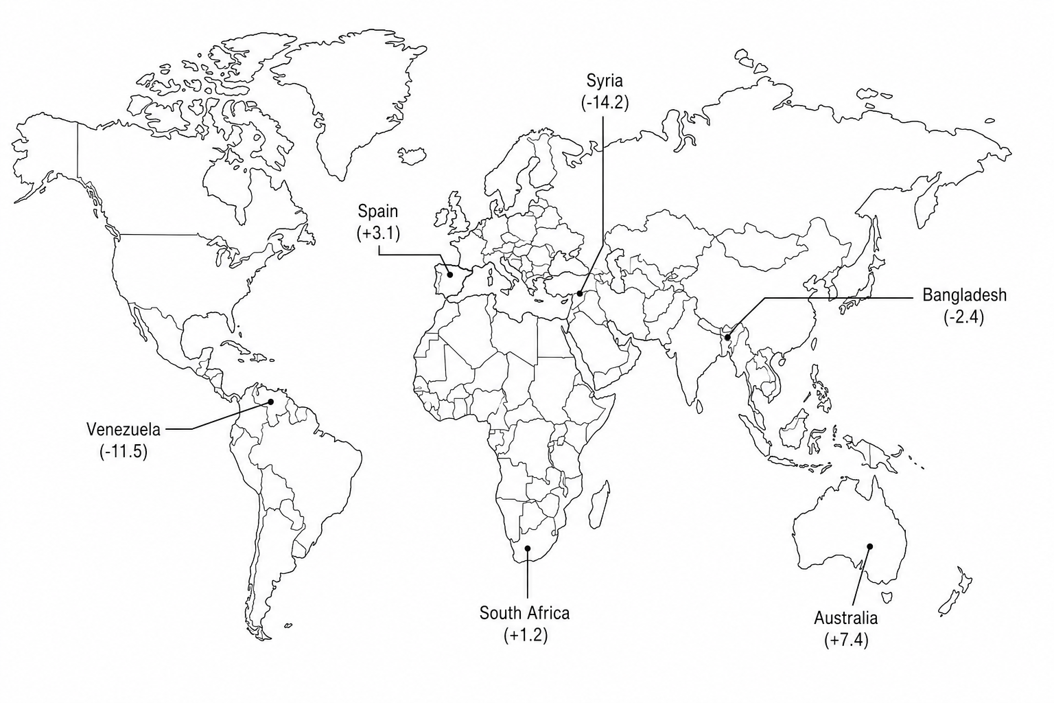
Using Figure 9, identify the labeled country with the:
Highest positive net migration rate.
Highest negative net migration rate.