x

Pie Charts

What you'll learn

  • How a pie chart shows parts of a whole group.
  • How to read sectors, fractions and totals from a pie chart.
  • How to calculate angles and draw an accurate pie chart.
  • How pie charts link to simple fractions and probabilities.

Key words

A category is one group in the data, such as “Food” or “Transport”.

Definition

Pie chart basics

  • A pie chart is a circle split into parts to show data.

A pie chart is one whole circle split into sectors for different categories.

  • A sector is one part of the circle.

  • The frequency is how many people or items are in a category.

  • An angle measures a turn, in degrees. A full circle is 360°.

Key Idea

One whole circle

Every pie chart represents the whole group. The whole circle is always 360°.

The whole circle in any pie chart represents 360° and the full group.

Reading a pie chart

The largest sector represents the largest frequency or amount.

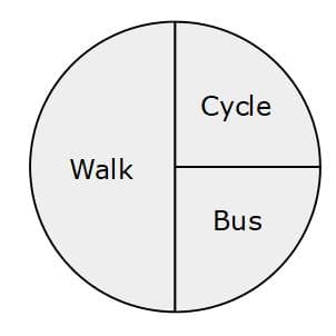
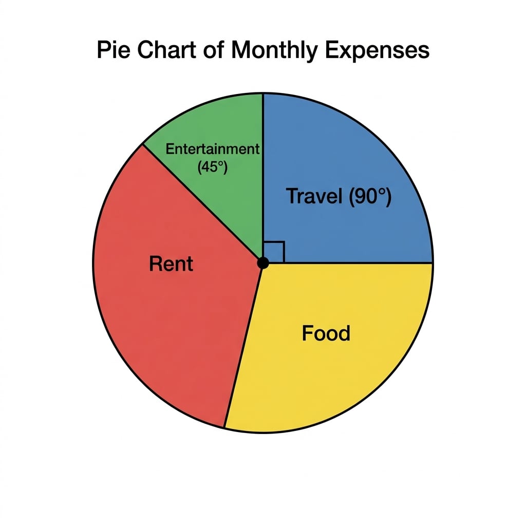
A right angle is 90°. It is often shown using a small square at the centre of the pie chart.

A right-angle sector in a pie chart is one quarter of the circle, or 90° out of 360°.

To find a fraction from a sector, compare its angle with 360°.

Example

Reading a spending pie chart

Leah has a pie chart showing her spending on rent, food, travel and entertainment. The travel sector is a right angle. Leah spent £180 on travel.

Leah’s travel sector is a 90° right angle, so it is one quarter of her spending pie chart.

  1. The biggest sector is for rent, so Leah spent the most money on rent.

  2. Travel is a right angle, so its angle is 90°. The fraction spent on travel is 90360=14\frac{90}{360}=\frac{1}{4}36090​=41​.

  3. If £180 is one quarter of the total, the total is 4 lots of £180.

  4. Leah spent £720 in total.

Common Mistake

Using 100 instead of 360

A pie chart is based on angles in a circle, so use 360°, not 100, unless you are specifically working with percentages.

Changing between frequency and angle

The total frequency is all the frequencies added together.

For pie charts, you often need these two calculations:

Key Idea

The two pie-chart calculations

  • To find an angle, use frequencytotal frequency×360∘\frac{\text{frequency}}{\text{total frequency}}\times 360^\circtotal frequencyfrequency​×360∘.

  • To find a frequency, use sector angle360∘×total frequency\frac{\text{sector angle}}{360^\circ}\times \text{total frequency}360∘sector angle​×total frequency.

Example

Completing a frequency-angle table

A pie chart shows favourite ice creams. Vanilla has frequency 15 and its sector is a right angle. Strawberry is 120°, mint is 60°, and chocolate is the remaining sector.

The ice-cream pie chart has given angles for vanilla, strawberry and mint, with chocolate filling the remaining sector.

  1. Vanilla is a right angle, so its angle is 90°.

  2. 90° is one quarter of 360°, so 15 pupils is one quarter of the total.

  3. The total number of pupils is 60.

  4. Strawberry frequency is 120360×60=20\frac{120}{360}\times 60=20360120​×60=20.

  5. Mint frequency is 60360×60=10\frac{60}{360}\times 60=1036060​×60=10.

  6. Chocolate angle is 360° − 90° − 120° − 60° = 90°, so chocolate frequency is 15.

Drawing an accurate pie chart

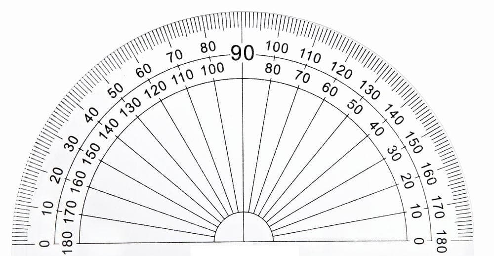
To draw an accurate pie chart, use a protractor, which is the tool for measuring and drawing angles.

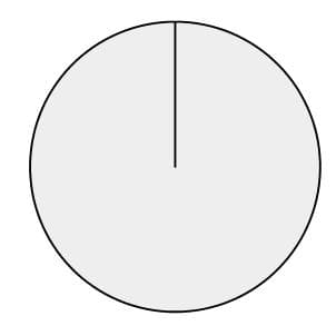
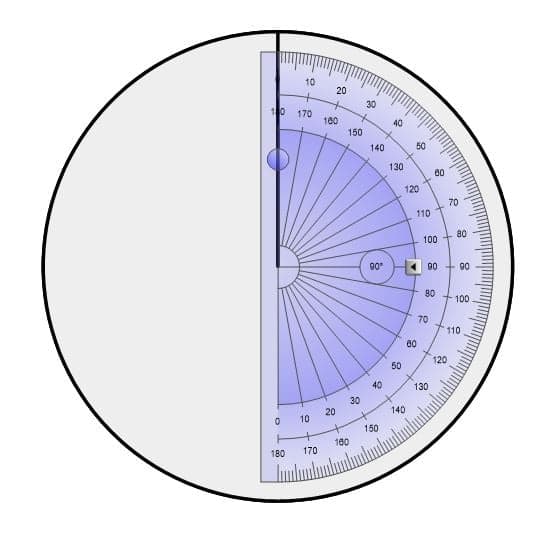
Start with a radius, which is a straight line from the centre of the circle to the edge. Measure each sector angle from the centre, going around the circle.

When drawing a pie chart, sector angles are measured from the centre using radii.

The mode is the category with the highest frequency.

Example

Drawing from a table

A group of people choose their favourite biscuit:

The completed biscuit pie chart has sectors of 90°, 126° and 144° for Plain, Cream and Chocolate.

  • Plain: 10
  • Cream: 14
  • Chocolate: 16

Draw a pie chart.

  1. Add the frequencies: 10 + 14 + 16 = 40.

  2. The mode is Chocolate, because 16 is the highest frequency.

  3. Plain angle: 1040×360∘=90∘\frac{10}{40}\times 360^\circ=90^\circ4010​×360∘=90∘.

  4. Cream angle: 1440×360∘=126∘\frac{14}{40}\times 360^\circ=126^\circ4014​×360∘=126∘.

  5. Chocolate angle: 1640×360∘=144∘\frac{16}{40}\times 360^\circ=144^\circ4016​×360∘=144∘.

  6. Check the angles: 90° + 126° + 144° = 360°.

  7. Draw a circle, draw one radius, then use a protractor to measure 90°, then 126°. The final sector should be 144°. Label each sector clearly.

Tip

Quick check

Your sector angles should add to 360°. If they do not, check your total frequency and your calculator work.

Fractions and probability from tables

A fraction in simplest form has been divided down as far as possible.

If someone or something is chosen at random, each person or item has an equal chance of being picked.

Definition

Probability

A probability is the chance that an event happens. An event is the outcome you are interested in, such as “the car is white”.

Example

Fractions and not probability

In a car park there are 18 black cars, 12 silver cars, 15 white cars and 5 blue cars.

  1. Total cars: 18 + 12 + 15 + 5 = 50.

  2. The fraction that are white is 1550=310\frac{15}{50}=\frac{3}{10}5015​=103​.

  3. There are 5 blue cars, so there are 45 cars that are not blue.

  4. The probability of picking a car that is not blue is 4550=910\frac{45}{50}=\frac{9}{10}5045​=109​.

Comparing two pie charts

A proportion is a share of the whole group. Pie charts are very good for comparing proportions, but not always actual numbers.

Common Mistake

Comparing two pie charts

Do not say one pie chart has more people in a category unless you know the total number of people for both charts.

Example

Can you compare the numbers?

School A has 48 students studying French. School B has a pie chart where French is the largest sector. Can you say School B has more French students?

A large French sector for School B shows a proportion, but without School B’s total it cannot be compared with School A’s 48 students.

  1. The sector for French in School B shows a proportion of School B.

  2. You do not know the total number of students at School B.

  3. So you cannot tell whether School B has more French students.

Exam technique

In the exam

  1. Look for the total frequency first. If it is not given, add the frequencies.

  2. Remember that the full pie chart is 360°, so all sector angles must add to 360°.

  3. When comparing two pie charts, check whether the totals are the same or given.

Self review

Check yourself

  • What fraction of a pie chart is a right angle?

  • How do you find a sector angle from a frequency table?

  • Why can two pie charts be hard to compare if the totals are missing?

Recap questions

Test yourself with 5 quick questions on this guide. Answer them all correctly to complete it.

How was this guide?

Pie Charts Revision Guide

  1. GCSE
  2. /Maths
  3. /Pie Charts