Plot production data to get the curve
Supply schedule: a table of prices with the quantity a firm would offer for sale at each of those prices.
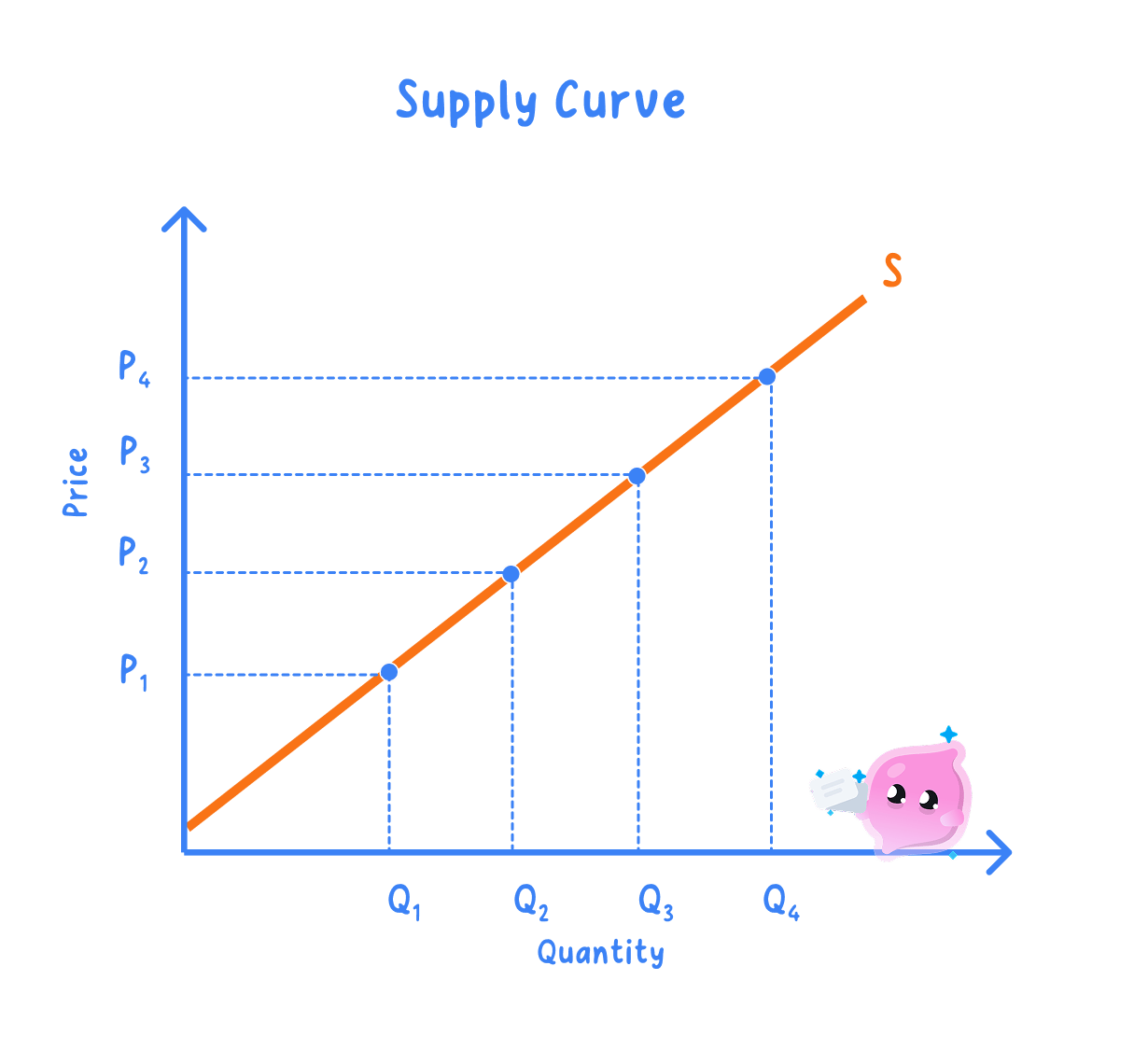
Supply curve: the same information drawn as a line, with each row of the schedule plotted as one point and the line labelled S.
- Price goes on the vertical axis and quantity supplied on the horizontal axis, exactly as on a demand diagram.
- Plot each row as one point, join them into a single line rising from bottom left to top right, and label it S.
- The finished curve holds ceteris paribus, so costs, technology, taxes and the weather are all frozen while price alone changes.
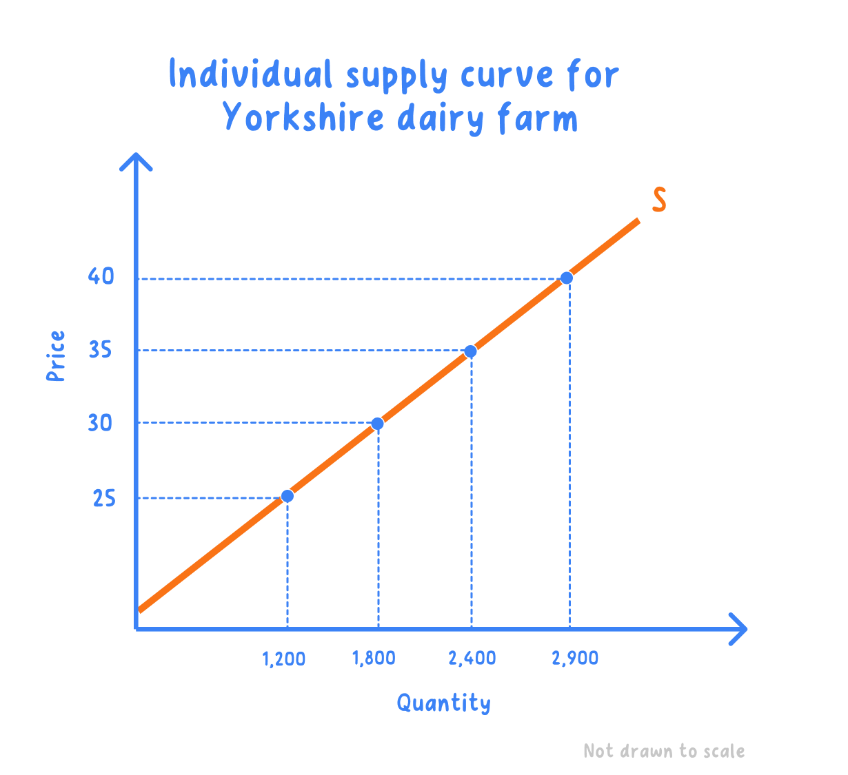
- A Yorkshire dairy farm: the schedule shows the litres of milk a day the farm would sell at each farmgate price.
| Price per litre | Litres a day |
|---|---|
| 25p | 1,200 |
| 30p | 1,800 |
| 35p | 2,400 |
| 40p | 2,900 |
Step 1: plot 25p against 1,200 litres, 30p against 1,800, 35p against 2,400 and 40p against 2,900, then join the points and label the line S.
Step 2: subtract the quantity at the cheapest price from the quantity at the dearest:
2,900−1,200=1,700 litres a day 2{,}900 - 1{,}200 = 1{,}700\text{ litres a day} 2,900−1,200=1,700 litres a day- A rise from 25p to 40p a litre raises quantity supplied by 1,700 litres a day, and all four points sit on the one curve S.
Individual supply is one firm's selling plan
Individual supply: the quantities one firm would offer for sale at each price.
Market supply: the quantities all the firms in a market would offer at each price, found by adding their individual supplies together.
- One farm's line is an individual supply curve, which is what the schedule above draws.
- The market curve is the one that matters for a price, because a price is set by everything on offer rather than by one seller.
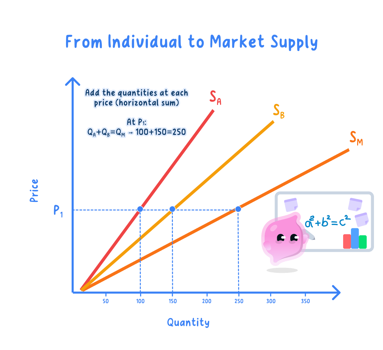
Add the quantities across at each price
- Take one price, read off what every firm would offer at that price, and add those quantities together.
- Repeat at each price in the schedule, then plot the totals to get the market supply curve.
- The market curve slopes up like each individual curve but is flatter and lies further to the right, because it counts more producers at every price.
- A second dairy farm's plans are added to the first to build market supply for this small market.
| Price per litre | Farm A | Farm B | Market supply |
|---|---|---|---|
| 25p | 1,200 | 800 | 2,000 |
| 30p | 1,800 | 1,200 | 3,000 |
| 35p | 2,400 | 1,600 | 4,000 |
| 40p | 2,900 | 2,000 | 4,900 |
Step 1: at 35p, add the two quantities:
2,400+1,600=4,000 litres a day 2{,}400 + 1{,}600 = 4{,}000\text{ litres a day} 2,400+1,600=4,000 litres a dayStep 2: repeat at every price to complete the final column, then plot those totals against price.
- Market supply rises from 2,000 to 4,900 litres a day across the same price range, which is the reaction of the whole market rather than one farm.
- Plot from the table you are given rather than sketching a rough upward line, because the data is what the question is testing.
- Keep the supply curve rising and the demand curve falling, since the direction of the slope is the first thing a marker checks.
- Which variable goes on the vertical axis of a supply diagram?
- Using the dairy schedule, how many litres a day would the farm supply at 30p?
- What is the difference between individual and market supply?
- At 25p, Farm A supplies 1,200 litres and Farm B supplies 800. What is market supply at 25p?
- Why does the market supply curve lie to the right of one firm's curve?
