What you'll learn
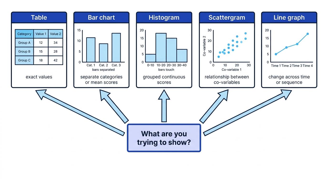
- How to choose between tables, bar charts, histograms and scattergrams.
- How the type of data affects the best display.
- How to label graphs clearly and avoid misleading presentation.
- How to apply and evaluate data displays in AQA A-Level Psychology answers.
Start here: what kind of numbers do you have?
Before you present quantitative data, you need to know what the data actually represent.
Quantitative data
Quantitative data are numerical data, such as a memory score, number of errors, reaction time, aggression rating, or frequency of helping behaviour.
A raw score is one participant’s individual result. A frequency is the number of times a score or category occurs. A descriptive statistic is a number that summarises data, such as the mean, median, mode or range.
You also need to identify the variables. In an experiment, the independent variable is what the researcher changes, and the dependent variable is what is measured. In a correlation, there is no independent variable; instead, there are two co-variables, which are the two measured variables being related to each other.
Levels and types of data
- Nominal data are named categories, such as “male/female” or “helped/did not help”.
- Ordinal data are ordered or ranked data, such as rating anxiety from low to high.
- Interval/ratio data are numerical scores with equal intervals between values; ratio data also have a true zero.
- Continuous data can take many values along a scale, such as scores on a questionnaire.
- Discrete data come in separate values, such as number of words recalled.
Identifying the data type
A researcher records whether each participant chooses “help” or “do not help”. The researcher also records each participant’s empathy score out of 40.
- The helping choice is nominal data because each participant is placed into a named category.
- The empathy score is quantitative score data because each participant has a numerical result.
- If the researcher compares how many people helped in each condition, a frequency table or bar chart would suit the categorical data.
- If the researcher examines whether higher empathy scores are associated with more helping behaviour, a scattergram would suit the paired numerical scores.
Displays are descriptive, not inferential
A table or graph can suggest a difference, pattern or relationship, but it does not prove that a result is statistically significant. Significance needs an inferential statistical test.
Tables: organising exact values
Table
A table presents data in rows and columns so that exact values can be read clearly.
Tables are useful when the reader needs the precise numbers, not just the overall pattern. In psychology reports, tables may show raw scores, frequencies, percentages, means, ranges or standard deviations.
A good table should have:
- a clear title
- labelled rows and columns
- consistent decimal places
- sample size or number of participants where relevant
- no unnecessary detail
- anonymised participant labels if raw scores are shown
For example:
| Condition | Number of participants | Mean recall score | Range |
|---|---|---|---|
| Background noise | 10 | 7.2 | 4 |
| Silence | 10 | 9.1 | 3 |
Building a summary table
A psychologist compares recall scores in a background-noise condition and a silence condition.
- The two conditions become the rows because the researcher is comparing two levels of the independent variable.
- The dependent variable, recall score, is summarised using a mean because the researcher wants to compare average performance.
- The range is included to show how spread out the scores were, so the table does not only report the average.
- The table uses the same number of decimal places for both means, making the comparison fair and easy to read.
Raw scores with names
Do not present identifiable participant information. Use participant numbers or summarised data to protect confidentiality.
Graphs: showing patterns at a glance
A graph is a visual display of data. Graphs are useful because they make patterns easier to see than a long list of numbers.
The x-axis is the horizontal axis. The y-axis is the vertical axis. In experiments, the independent variable usually goes on the x-axis and the dependent variable on the y-axis. In correlations, each axis represents one co-variable.
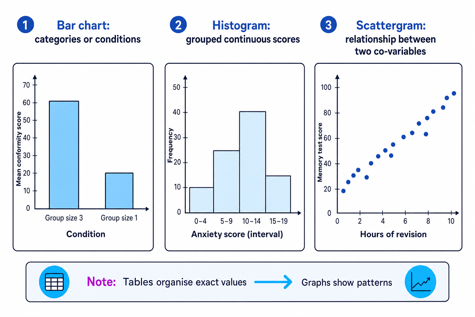
The three named visual displays have different jobs. Use the overview below as a mental checklist: bar charts compare categories, histograms show distributions of continuous scores, and scattergrams show relationships between paired scores.
Good graph titles
For experiments, use “The effect of [independent variable] on [dependent variable]”. For correlations, use “The relationship between [co-variable 1] and [co-variable 2]”.
Bar charts: comparing categories or conditions
Bar chart
A bar chart displays data using separate bars, usually to compare categories, groups or experimental conditions.
Bar charts are used for categorical data or for comparing summary statistics, such as mean scores across conditions. The bars do not touch because the categories are separate.
For example, a bar chart could show:
- mean conformity score in a group-size-three condition versus a group-size-one condition
- number of participants who obeyed versus disobeyed
- percentage of participants diagnosed with different attachment types
Choosing a bar chart for two conditions
A researcher compares anxiety reduction after CBT with anxiety reduction in a waiting-list control group.
- The design involves two separate groups, so the x-axis should show the two conditions: CBT and waiting-list control.
- The dependent variable is anxiety reduction score, so the y-axis should show the mean anxiety reduction score for each condition.
- A bar chart is appropriate because the researcher is comparing separate conditions, not showing a continuous distribution.
- If the anxiety scores are treated as interval/ratio data and the groups are independent, the later inferential test could be an unrelated t-test. The researcher would compare the observed t-value with a critical value at a chosen level such as p<0.05p < 0.05p<0.05, rejecting the null hypothesis if the observed value is at least as large as the critical value.
Making bars touch
Bars in a bar chart should be separated because the categories are distinct. Touching bars suggest a continuous scale, which is a histogram feature.
Histograms: showing a distribution of continuous scores
A distribution is the pattern of scores in a dataset, including where scores cluster and how spread out they are.
Histogram
A histogram displays the frequency of continuous data using touching bars, usually after the data have been grouped into intervals.
Histograms are useful for showing how scores are distributed. For example, a psychologist might group anxiety scores into intervals such as 0–4, 5–9, 10–14 and 15–19, then show how many participants fall into each interval.
The bars touch because the intervals are continuous: a score moves from one range into the next without a real gap.
Choosing a histogram for grouped scores
A researcher records anxiety scores from 40 participants and groups them into score intervals.
- The anxiety scores are continuous numerical scores, so the researcher should preserve the order of the scale.
- The x-axis should show the anxiety score intervals in sequence, while the y-axis should show frequency.
- A histogram is appropriate because the researcher wants to show the distribution of scores, not compare named categories.
- The tallest bar shows the most common score interval, helping the researcher describe where scores cluster.
Keep intervals equal
At A-Level Psychology, histograms usually use equal-width intervals. Unequal intervals can mislead the reader because bar height alone no longer represents frequency fairly.
Scattergrams: displaying correlations
Scattergram
A scattergram is a graph that plots paired scores for two co-variables, with each dot representing one participant or case.
Scattergrams are used in correlational research. They show whether two variables appear to be related.
- A positive correlation means that as one variable increases, the other tends to increase.
- A negative correlation means that as one variable increases, the other tends to decrease.
- No correlation means there is no clear relationship between the variables.
Interpreting a scattergram
A psychologist records hours of sleep and stress score for each participant.
- Each participant provides a pair of scores: one for sleep and one for stress, so a scattergram is suitable.
- If the points slope downwards from left to right, this suggests a negative correlation: more sleep is associated with lower stress.
- If both variables are interval/ratio data and the relationship is linear, the later inferential test could be Pearson’s r. If the data are ranked or ordinal, Spearman’s rho would be more suitable.
- The researcher would look up the critical value using sample size, direction of hypothesis and significance level such as p<0.05p < 0.05p<0.05. For correlations, the null hypothesis is rejected if the observed correlation is equal to or greater than the critical value in magnitude.
Correlation as causation
A scattergram can show an association, but it cannot show that one variable caused the other. A third variable may explain the relationship.
Choosing the best display quickly
| If you want to show... | Best display | Why |
|---|---|---|
| Exact numbers, means, ranges or frequencies | Table | Values can be read precisely |
| Differences between categories or conditions | Bar chart | Separate bars suit separate groups |
| Distribution of continuous grouped scores | Histogram | Touching bars suit continuous intervals |
| Relationship between two co-variables | Scattergram | Each dot shows a paired score |
Link to statistical tests
Presentation is not the same as analysis, but your display often hints at the later test.
- Nominal frequencies in independent groups may link to Chi-square.
- Nominal related data may link to the Sign test.
- Ordinal scores in independent groups may link to Mann-Whitney U.
- Ordinal related scores may link to Wilcoxon signed-ranks.
- Interval/ratio scores in independent groups may link to an unrelated t-test.
- Interval/ratio related scores may link to a related t-test.
- Correlations may link to Spearman’s rho for ordinal/ranked data or Pearson’s r for interval/ratio linear data.
A critical value is the value from a statistical table used to decide whether to reject the null hypothesis, which predicts no difference or no relationship. Always use the table’s decision rule: some tests require the observed value to be greater than or equal to the critical value, while others require it to be less than or equal to the critical value.
AO3: evaluating presentation choices
For this methods topic, AO3 is about evaluating how well data are communicated.
Strong presentation has real advantages. Tables show exact values, while graphs make patterns easier to notice. This helps researchers, teachers, clinicians or policy makers understand findings quickly.
However, presentation can mislead. A truncated y-axis can exaggerate differences. Too many decimal places can imply false precision. A bar chart can hide variation within groups because it often shows only the mean. A scattergram may be affected by outliers, which are unusual scores that do not fit the main pattern.
The best display depends on the data type and research aim. A histogram is inappropriate for named categories, and a bar chart is inappropriate if the aim is to show the shape of a continuous distribution. Ethical presentation also matters: raw tables should protect confidentiality by avoiding names or identifiable details.
In the exam
- Identify the data type first: categories, continuous scores, or paired co-variable scores.
- Match the display to the aim: exact values need a table, category comparisons need a bar chart, distributions need a histogram, and correlations need a scattergram.
- Describe graph features clearly: title, x-axis, y-axis, scale, and whether bars should touch.
- Do not overclaim: graphs show patterns, but statistical tests decide significance, and correlations do not prove causation.
Check yourself
- Which display would you use for mean memory scores in two experimental conditions, and why?
- Why do histogram bars touch, but bar chart bars usually do not?
- How would you display the relationship between anxiety score and hours of sleep, and what conclusion should you avoid?