What you'll learn
- How to distinguish quantitative, qualitative, primary and secondary data.
- How to summarise data using measures of central tendency and measures of dispersion.
- How to choose suitable graphs and interpret normal, positive skew and negative skew.
- How to choose an appropriate inferential statistical test and make a decision about significance.
The big picture: from raw data to a conclusion
In Psychology, researchers collect raw data: the original scores, responses, observations or recordings gathered during a study. Data handling is the process of organising these findings so we can describe patterns and decide whether results support a hypothesis.
Data handling in one sentence
Data handling turns messy results into clear summaries, visual displays and evidence-based conclusions — but it cannot rescue a poorly designed or unethical study.
Psychologists usually do two things with data:
- Descriptive statistics summarise what the data show, such as the average score or the spread of scores.
- Inferential statistics help decide whether a result is likely to be a real effect or could reasonably have occurred by chance.
Types of data
Quantitative and qualitative data
Quantitative data are numerical data, such as anxiety scores or reaction times. Qualitative data are non-numerical data, such as interview comments, diary entries or descriptions of behaviour.
Quantitative data are useful because they are easier to compare, graph and analyse statistically. Qualitative data are useful because they can give richer detail about experience, meaning and context.
You also need to know whether data are primary or secondary. Primary data are collected directly by the researcher for the current study. Secondary data already exist and are re-used, such as official statistics, previous research findings or published case reports.
A meta-analysis is a form of secondary research that statistically combines findings from several studies on the same topic to estimate the overall effect.
Classifying data from a memory study
A researcher repeats the idea of Loftus and Palmer’s 1974 study by asking participants to estimate the speed of a car after hearing different verbs.
- The estimated speeds are quantitative data because each participant gives a number.
- If participants also explain why they chose that estimate, those explanations are qualitative data because they are written responses.
- The researcher’s own newly collected scores are primary data. If another psychologist later combines this study with similar published studies, that later analysis uses secondary data and may become a meta-analysis.
When using named studies such as Loftus and Palmer (1974), remember that data handling links to ethics too: deception about the true aim should be followed by debriefing, participants should have the right to withdraw, and individual responses should remain confidential.
Levels of measurement
The level of measurement tells you what kind of numerical information you have. This matters because it affects which descriptive statistics and inferential tests are appropriate.
- Nominal data are categories, such as attachment type, gender category or “conformed / did not conform”.
- Ordinal data are ordered or ranked data, such as rating anxiety from 1 to 10.
- Interval data have equal intervals between values, such as standardised test scores.
- Ratio data are like interval data but have a true zero, such as number of words recalled.
In A-Level Psychology, interval and ratio data are often grouped together when choosing statistical tests.
Measures of central tendency
Measures of central tendency
A measure of central tendency is a single value that represents the typical or average score in a dataset. The three main measures are the mean, median and mode.
The mean is found by adding all scores and dividing by the number of scores. It uses every value, so it is sensitive to extreme scores.
The median is the middle score when scores are placed in order. It is less affected by extreme scores.
The mode is the most frequent score. It is useful for nominal data because categories cannot be meaningfully averaged.
Measures of dispersion
A measure of dispersion shows how spread out the scores are.
The range is the highest score minus the lowest score. It is quick to calculate but can be distorted by one unusual score.
The standard deviation shows the average amount that scores differ from the mean. A small standard deviation means scores are tightly clustered; a large standard deviation means scores are more spread out.
Summarising recall scores
Five participants recall this number of words: 4, 5, 5, 8, 18.
-
Calculate the mean by adding all scores and dividing by the number of scores:
xˉ=4+5+5+8+185=405=8 \bar{x} = \frac{4+5+5+8+18}{5} = \frac{40}{5} = 8 xˉ=54+5+5+8+18=540=8 -
Identify the median by putting the scores in order and finding the middle value. The ordered scores are 4, 5, 5, 8, 18, so the median is 5.
-
Identify the mode by finding the most frequent score. The score 5 appears twice, so the mode is 5.
-
Calculate the range:
18−4=14 18 - 4 = 14 18−4=14 -
Interpret the summaries. The mean is pulled upwards by the extreme score of 18, so the median may better represent the typical participant.
Assuming the mean is always best
The mean is often useful, but if the data are skewed or contain extreme scores, the median may give a fairer summary.
For standard deviation, you do not usually need a long manual calculation in an exam unless the question guides you. You do need to interpret it. For example, if two conditions have the same mean but one has a larger standard deviation, participants’ scores were less consistent in that condition.
Presenting data clearly
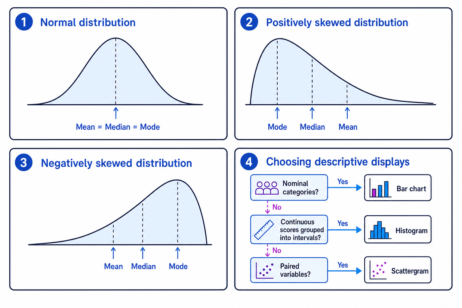
Psychologists use visual displays to make patterns easier to see. A table organises numbers precisely. A bar chart is used for separate categories. A histogram is used for continuous data grouped into intervals. A scattergram is used for correlations, where each point shows a pair of scores from one participant.
Choosing a graph
A researcher has three possible datasets from a study on stress and memory.
- If the data are the number of participants in each stress category — low, medium and high — choose a bar chart because the data are categorical.
- If the data are memory test scores grouped into score intervals, choose a histogram because the data are continuous and grouped.
- If the data are each participant’s stress score and memory score, choose a scattergram because the researcher is looking for an association between two co-variables.
Distributions: normal and skewed
A distribution is the pattern of scores in a dataset.
In a normal distribution, most scores cluster around the centre, with fewer scores at the extremes. The mean, median and mode are the same or very close.
In a positively skewed distribution, most scores are low and a few very high scores create a long tail to the right. The mean is pulled upwards.
In a negatively skewed distribution, most scores are high and a few very low scores create a long tail to the left. The mean is pulled downwards.
Interpreting a skewed distribution
A clinical psychologist records symptom scores after therapy. Most clients have low symptom scores, but a small number still have very high scores.
- The scores are likely to be positively skewed because most scores are low and the tail is towards the higher end.
- The mean will probably be higher than the median because the few high scores pull it upwards.
- The median may be the better summary of a typical client outcome because it is less affected by those extreme scores.
Correlation coefficients
A correlation is an association between two co-variables. A correlation coefficient shows the direction and strength of the relationship.
The coefficient is often written as rrr. It ranges from −1-1−1 to +1+1+1.
- A positive correlation means both variables increase together.
- A negative correlation means one variable increases as the other decreases.
- A coefficient close to zero means little or no relationship.
Interpreting a correlation coefficient
A study finds a correlation of r=−0.72r = -0.72r=−0.72 between hours of sleep and stress score.
- The minus sign shows a negative correlation: as sleep increases, stress tends to decrease.
- The value is fairly close to −1-1−1, so the relationship is relatively strong.
- This does not prove that lack of sleep causes stress, because another variable, such as workload, could affect both.
Treating correlation as causation
A correlation can show a relationship, but it cannot show cause and effect on its own.
Inferential statistics and significance
Statistical significance
A result is statistically significant if it is unlikely to have occurred by chance, based on a chosen probability level. In Psychology, the usual level is p<0.05p < 0.05p<0.05.
A null hypothesis predicts no significant difference or relationship. An alternative hypothesis predicts that there will be a significant difference or relationship.
A p-value is the probability of obtaining the result, or a more extreme result, if the null hypothesis were true. So p<0.05p < 0.05p<0.05 means there is less than a 5% probability that the result would occur if there were really no effect.
A critical value is the value from a statistical table used to decide whether the result is significant.
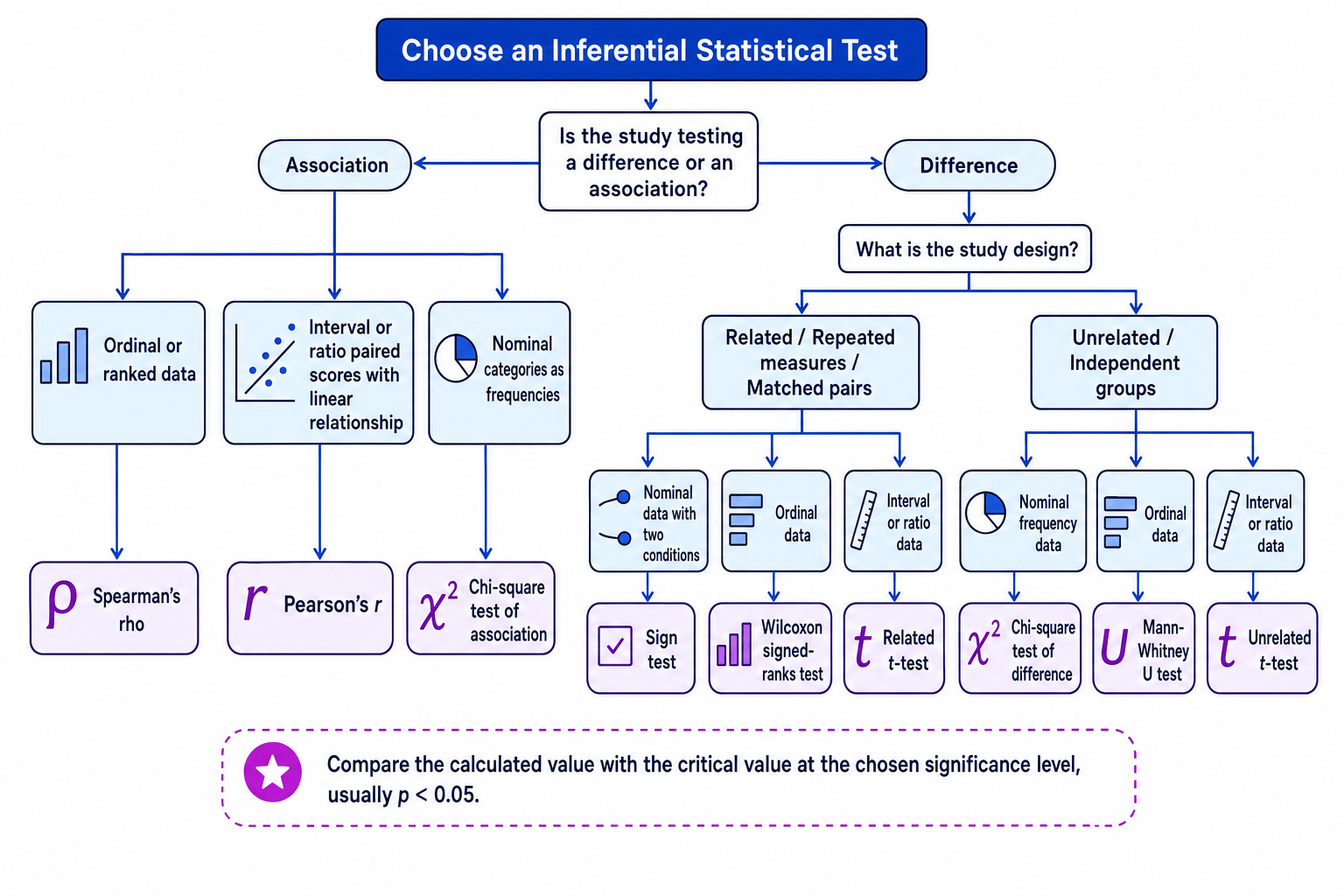
The main test choices are:
- Sign test: difference, related design, nominal sign data.
- Wilcoxon signed-ranks test: difference, related design, ordinal data.
- Mann-Whitney U test: difference, unrelated design, ordinal data.
- Chi-square test: nominal frequency data, often for associations or differences.
- Spearman’s rho: correlation with ordinal or ranked data.
- Pearson’s r: correlation with interval or ratio data and a linear relationship.
- Related t-test: difference, related design, interval or ratio data.
- Unrelated t-test: difference, independent groups, interval or ratio data.
Using the Sign test
A researcher predicts that background music will reduce recall. Ten participants complete a memory test in silence and with music. Nine recall fewer words with music, one recalls more, and there are no ties.
- This is a test of difference because the researcher compares recall in two conditions.
- The design is related because the same participants take part in both conditions.
- The scores are converted into signs: “lower with music” or “higher with music”. This makes the analysed data nominal sign data, so the appropriate test is the Sign test.
- The less frequent sign occurs once, so the calculated value is S=1S = 1S=1.
- The researcher looks up the critical value for the Sign test with 10 usable pairs, a one-tailed hypothesis and p<0.05p < 0.05p<0.05. If the table gives a critical value of 1, the decision rule is: reject the null hypothesis if S≤1S \le 1S≤1.
- Since S=1S = 1S=1, the researcher rejects the null hypothesis and concludes that music significantly reduced recall.
Decision rules for critical values
For Spearman’s rho, Pearson’s r, chi-square and t-tests, larger calculated values usually need to meet or exceed the critical value. For the Sign test, Wilcoxon and Mann-Whitney U, smaller calculated values usually need to be equal to or below the critical value.
AO3: evaluating data analysis
Good data handling improves objectivity because other researchers can see exactly how conclusions were reached. It also supports replication, because later researchers can compare their findings using the same measures and tests.
However, statistics do not automatically make a study valid. If the sample is biased, the task lacks realism, or participants were affected by demand characteristics, the final analysis may still be misleading. For example, findings from artificial laboratory tasks may not generalise well to everyday behaviour.
Quantitative summaries can also lose detail. A mean score may hide individual differences, while qualitative data can capture richer experience. However, qualitative analysis can be more subjective, so researchers often improve reliability by using coding systems and inter-rater agreement.
Statistical significance is not the same as real-world importance. A very small effect can become significant in a large sample, while a meaningful effect might fail to reach significance in a small sample.
A Type I error is a false positive: the researcher rejects the null hypothesis when it is actually true. A Type II error is a false negative: the researcher fails to reject the null hypothesis when there really is an effect.
Ethically, researchers must handle data responsibly. This includes gaining consent for data use, protecting confidentiality, anonymising records where possible, and debriefing participants if deception was used, as in classic studies such as Milgram (1963) and Zimbardo (1973).
In the exam
- Identify the aim of the analysis first: are you describing data, testing a difference, or testing a relationship?
- For statistical tests, state the design, level of measurement, test name, critical value rule, and conclusion about the null hypothesis.
- Avoid overclaiming: significant results support a conclusion, but they do not fix weak sampling, poor controls or ethical problems.
Check yourself
- When would the median be a better measure of central tendency than the mean?
- Which graph would you use for categorical data, continuous grouped data, and correlational data?
- How do you choose between the Sign test, Spearman’s rho and an unrelated t-test?
