Scatter diagrams and paired data
Scatter diagrams and paired data
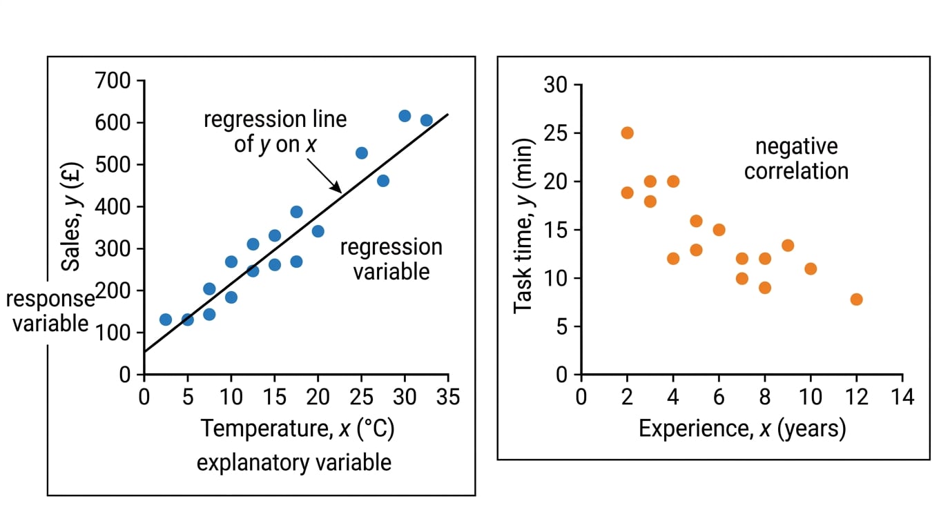
Bivariate data means each point comes from a matched pair of values, such as temperature and sales from the same day. In a scatter diagram, we place the explanatory variable on the horizontal axis as xxx and the response variable on the vertical axis as yyy.
Regression, Correlation and Hypothesis Testing Lesson
Step-by-step lessons on Edexcel A Level Maths Regression, Correlation and Hypothesis Testing, covering 1.1 Exponential Models, 1.2 Measuring Correlation, and 1.3 Hypothesis Testing for Zero Correlation. Each one builds up to exam-style questions. Build fluency with the core pure algebra and calculus toolkit early, since almost every mechanics and statistics topic on the course depends on it.