Question 51
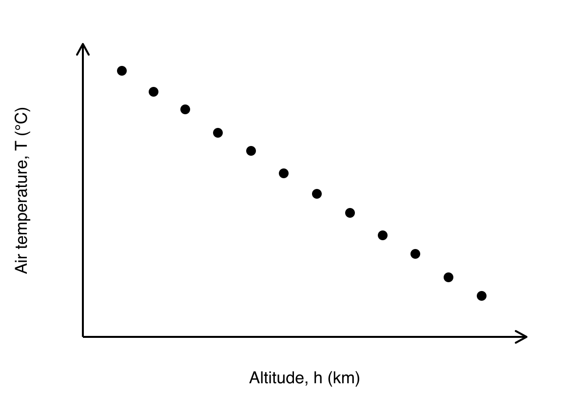
An atmospheric scientist records the relationship between the altitude hhh (in km) and the air temperature TTT (in ∘C{}^\circ\text{C}∘C) above a fixed ground location. The resulting scatter graph shows that as altitude increases, the temperature decreases consistently. The data points are positioned extremely close to a straight line of best fit, with almost no visible deviation from the linear path.
Which of the options below best describes the correlation between hhh and TTT?
-
moderate positive
-
strong positive
-
moderate negative
-
strong negative
2.5 Data presentation and interpretation Questions
278 exam-style questions on CCEA A Level Maths 2.5 Data presentation and interpretation, covering 2.5.1 Data presentation and interpretation, 2.5.2 Data presentation and interpretation, 2.5.3 Data presentation and interpretation, 2.5.4 Data presentation and interpretation, 2.5.5 Data presentation and interpretation, 2.5.6 Data presentation and interpretation, 2.5.7 Data presentation and interpretation, 2.5.8 Data presentation and interpretation, 2.5.9 Data presentation and interpretation, and 2.5 Data presentation and interpretation. Each one has a worked solution and a mark scheme showing where the marks go.